We've licensed some very nice Kai and Song style fonts and we plan to offer those as optional add-on downloads; however, that may get punted to a minor update after the Big One, and we haven't yet decided whether to support those in examples / body text and not just in headwords, and we haven't yet decided whether to charge for them.
You are using an out of date browser. It may not display this or other websites correctly.
You should upgrade or use an alternative browser.
You should upgrade or use an alternative browser.
New Version Screenshot Thread
- Thread starter mikelove
- Start date
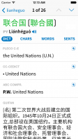
I like the tabs being labeled with words rather than cryptic little symbols... "STROKE" is certainly preferable to ` , which I would never have been able to decipher on my own. But on the other hand, neither "SENT" nor "SENTS" is exactly ideal... maybe "SENTC" ?
Have you considered including an option for Chinese language interface? I've wanted this feature for a long time just for a language-learning standpoint, but it would definitely also help with the difficulty of squeezing English labels into small UI buttons. An all-Chinese UI would be much easier to use for intermediate/advanced learners, not to mention better-looking
Have you considered including an option for Chinese language interface? I've wanted this feature for a long time just for a language-learning standpoint, but it would definitely also help with the difficulty of squeezing English labels into small UI buttons. An all-Chinese UI would be much easier to use for intermediate/advanced learners, not to mention better-looking
I like the tabs being labeled with words rather than cryptic little symbols... "STROKE" is certainly preferable to ` , which I would never have been able to decipher on my own. But on the other hand, neither "SENT" nor "SENTS" is exactly ideal... maybe "SENTC" ?
True, maybe "EXMPLS"? (though I like "sentences" better since they relate more clearly to characters and words)
Have you considered including an option for Chinese language interface? I've wanted this feature for a long time just for a language-learning standpoint, but it would definitely also help with the difficulty of squeezing English labels into small UI buttons. An all-Chinese UI would be much easier to use for intermediate/advanced learners, not to mention better-looking
That's basically just waiting on our getting the UI to a place where we're actually happy with it - once we do that then we can certainly translate it, but there's no sense on hiring someone to translate a whole bunch of text which you'll then immediately need to throw away and replace with new text.
True, maybe "EXMPLS"? (though I like "sentences" better since they relate more clearly to characters and words)
Now that you mention it, I think calling them Examples instead of Sentences is much better just for ease of understanding.
Maybe in order to make more room in the tab bar, you could consider taking the Stroke button and putting it up next to the character? Logically, it could belong there just as well
That's basically just waiting on our getting the UI to a place where we're actually happy with it - once we do that then we can certainly translate it, but there's no sense on hiring someone to translate a whole bunch of text which you'll then immediately need to throw away and replace with new text.
Good to know—sounds exciting!
Maybe in order to make more room in the tab bar, you could consider taking the Stroke button and putting it up next to the character? Logically, it could belong there just as well
I'm worried that would add to the sense of clutter that we're trying very hard in this release to reduce - the fewer different types of control people have to deal with, the better.
character
状元
Since you're not going with the standard UI control, you're free to create something out of the box. Perhaps some sort of menu which is shown initially when the user navigates to the view and then quickly animates closed to just a button to free up screen space.
Even if you go with something static, you can have some of the buttons one place and the rest somewhere else.
Even if you go with something static, you can have some of the buttons one place and the rest somewhere else.
Since you're not going with the standard UI control, you're free to create something out of the box. Perhaps some sort of menu which is shown initially when the user navigates to the view and then quickly animates closed to just a button to free up screen space.
I think that could be kind of distracting, to be honest - something like that really needs to hint at extra content without any animation, e.g. a bar with four and a half tabs visible to indicate that you can drag-scroll it, or something with a multi-page indicator.
Even if you go with something static, you can have some of the buttons one place and the rest somewhere else.
Possibly, but I guess I'm just not seeing the problem with 5 tabs - adding another bar / button somewhere would almost certainly create more confusion than having a slightly-less-than-straightforward label for the example sentence tab does.
Why didn't you make the iOS 7 navigation bar blue as it is in the current version? Otherwise the app just looks too white. I saw some redesign mockups on the following website and I have to say that the Facebook one looks really slick with the blue status and navigation bars: http://ios7redesigns.tumblr.com
Don't give up the lovely Pleco blue in the upcoming version.
Don't give up the lovely Pleco blue in the upcoming version.
Why didn't you make the iOS 7 navigation bar blue as it is in the current version? Otherwise the app just looks too white. I saw some redesign mockups on the following website and I have to say that the Facebook one looks really slick with the blue status and navigation bars: http://ios7redesigns.tumblr.com
Don't give up the lovely Pleco blue in the upcoming version.
Actually, that change pre-dates the iOS 7 announcement - the mockups we got from our type designer used a light gray toolbar too, I imagine to get out of the way of the text.
Personally I think I like it a bit better this way - in a text-centric app the content ought to take center stage - and there's also the practical consideration that we'd really like a shot at being featured in all of the various articles / reviews / etc (both on iTunes and elsewhere) that are going to pop up showing off apps redesigned for iOS 7; the more iOS-7-like our app looks, the better our chances.
We'd eventually like to make the toolbar color configurable, as it is now, but I'm not sure if we'll support that initially aside from offering some sort of Night Mode - it's really tricky to offer customizable colors while simultaneously supporting both iOS 6 and iOS 7, which we're going to have to do at least until early 2014.
But nothing's set in stone - if the feedback from our beta-testers is similarly negative on this point we can certainly consider changing it. (and making it customizable is not impossible, but we have limited time between now and the OS 7 launch and I'm not sure if we can make it a priority unless a lot of people share in your opinion)
Will this affect anything?
http://typographica.org/on-typography/beyond-helvetica-the-real-story-behind-fonts-in-ios-7/
http://typographica.org/on-typography/beyond-helvetica-the-real-story-behind-fonts-in-ios-7/
... The good news: this means the seamless integration of animation and text ... for the first time ever in the history of iOS. The bad news: this means existing text-heavy apps will have to be redeveloped in order to support all these nifty new features.
Will this affect anything?
http://typographica.org/on-typography/beyond-helvetica-the-real-story-behind-fonts-in-ios-7/
Not right away, since it's iOS-7-only and would be difficult to backport to iOS 6; also, we actually have our own system to do pretty much the same thing anyway, originally developed for iOS 3, and ours is optimized around Chinese in a way that Apple's isn't (it fails to take advantage of some inherent efficiencies in processing Chinese text - e.g. the lack of kerning and the fact that every character is the same width - and so ends up rendering much much more slowly than our system does).
alanmd
探花
I really liked the simplicity of the first version Mike uploaded, with the icon and hanzi, although I was a bit confused by the last entry on the right.
I think the abbreviated English suggestions for the furthest right SENTENCES button a bit ugly, with the abbreviations 'SENT', 'SENTS', 'SENTC', and 'EXMPLS' are all a bit ugly and cryptic. That button "searches for examples containing the word in all entries" so how about 'SEARCH', or a search icon?
I hope it's OK to suggest my own mockup, if so here's one with a simplified icon tab bar, I also reduced the thickness of the vertical indentation bar, and used icons instead of the words that seem to be preferred in the last few mockups as I prefer their look:
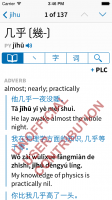

Thanks, but "SEARCH" would be a bit too confusing, I think - these are all search tabs, they're just searching for different kinds of content. (characters versus words versus sentences) "SENTS" may be somewhat ugly, but it's pretty clear what it stands for, particularly in relation to "CHARS" and "WORDS."
alanmd
探花
these are all search tabs, they're just searching for different kinds of content. (characters versus words versus sentences)
Maybe I misunderstand what is in these tabs, but character components and synonyms/antonyms/compounds don't feel like the results of a search to me as a user - that is information that a paper dictionary for example could include as part of the main entry. The SENTS tab seems to be doing something similar to the existing full-text search. Are these tabs doing something different to this?
I don't think my suggestion is any more confusing than having example sentences both in the DICT tab, and also in another dedicated SENTENCES tab - it's not immediately obvious to a new user what the difference is between those two areas.
It's probably not possible to completely explain the subtleties of this functionality with a few characters or an icon, so given a choice between two slightly confusing options I would go with the one that looks better in the long run. I felt your first version with the icons is a much cleaner look than the abbreviated text. Easier to localise too!
Maybe I misunderstand what is in these tabs, but character components and synonyms/antonyms/compounds don't feel like the results of a search to me as a user - that is information that a paper dictionary for example could include as part of the main entry. The SENTS tab seems to be doing something similar to the existing full-text search. Are these tabs doing something different to this?
It's actually not, it's giving you sentences and only sentences, without the rest of the entries that contain them and without matching entries that contain that word in some other place. (works for English too, incidentally - can find every example containing "that" e.g.) At some point there'll also be the ability to make flashcards out of them. So it's a distinct enough feature that I feel like it ought to be explicitly described as sentence-related.
I don't think my suggestion is any more confusing than having example sentences both in the DICT tab, and also in another dedicated SENTENCES tab - it's not immediately obvious to a new user what the difference is between those two areas.
DICT gives you dictionary entries for a word, CHARS gives you a character breakdown of a word (or related characters for a single character, but in both cases they're "related"), WORDS gives you words related to the word, SENTS gives you example sentences related to the word - doesn't seem problematic to me.
It's probably not possible to completely explain the subtleties of this functionality with a few characters or an icon, so given a choice between two slightly confusing options I would go with the one that looks better in the long run. I felt your first version with the icons is a much cleaner look than the abbreviated text. Easier to localise too!
To me it just breaks up the visual flow of the screen too much - the words fit in better, they're no different from NOUN / INFORMAL / etc labels except that they're blue to indicate that they're tappable.
But as always, I recognize that not everyone responds to designs the same way, and all of this stuff is still potentially changeable / customizable - if lots of other people also like the look of the segmented bar better / prefer characters and icons instead of English words, we can consider adding an option to make it work that way.
I didn't understand the original symbol for strokes; I thought that it looked like the list-separating comma(、)and I didn't know why that would be there. "Stroke" is a lot better. If you did wanna do a Chinese characters version (and I'd love to see a Pleco with a Chinese interface), perhaps you could consider labelling that as "笔划".
Also I didn't understand the + symbol next to the dictionary name was for adding flashcards.
I get that "+" means "add", but right next to PLC, ABC etc it seems to say "Add PLC" or "Add ABC" which I find nonsensical. After reading that it was for adding Flashcards, it then made sense to me as "Add a flashcard using the PLC entry for this word", but I don't think I would have "gotten" it without being told. I don't think a star is a good option either; as to me it means "Add favourite" or "Add bookmark"; which is a very different thing to adding a Flashcard.
Could I suggest:
- Move the + symbol away from the dictionary code, so that I don't think that it's got something to do with an action relating to the dictionary.
- Consider returning a border or box around the plus sign, to indicate the flash "card" (I realise perhaps it's less visually "pure"; but you know what they say about form vs function )
)
And overall I do like this new look quite a lot
Also I didn't understand the + symbol next to the dictionary name was for adding flashcards.
I get that "+" means "add", but right next to PLC, ABC etc it seems to say "Add PLC" or "Add ABC" which I find nonsensical. After reading that it was for adding Flashcards, it then made sense to me as "Add a flashcard using the PLC entry for this word", but I don't think I would have "gotten" it without being told. I don't think a star is a good option either; as to me it means "Add favourite" or "Add bookmark"; which is a very different thing to adding a Flashcard.
Could I suggest:
- Move the + symbol away from the dictionary code, so that I don't think that it's got something to do with an action relating to the dictionary.
- Consider returning a border or box around the plus sign, to indicate the flash "card" (I realise perhaps it's less visually "pure"; but you know what they say about form vs function
And overall I do like this new look quite a lot
Well, another possibility would be to put the + button in the header somewhere - centered on the right side, probably - and then make the dictionary version of it an alternate option for users who actually care about picking a particular dictionary entry for their card; at our default headword font size, all 1/2/3- and the vast majority of 4-character words (any with at least one -ed traditional character) would still fit in one line even with that 44-pixel chunk taken out of the right side. We could also make it a two-phase thing - add the card from the header, then a little indicator comes up next to each dictionary and a different indicator next to the one that the card currently uses.
Here's how that would look:
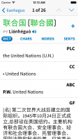
Here's how that would look:

I agree that looks a bit more pleasing and less confusing, but I'm not sure that the function of the + sign is obvious enough. I know that a plus "adds" something or sometimes "reveals" something. I suppose with my background knowledge of Pleco, I also know that I (probably) can't add a new entry from this screen, I can't add a note (since Pleco doesn't support that), and I can't add a bookmark (because Pleco doesn't have that either), so it must be a Flashcard. But I need that background knowledge, and I need to go through that process of elimination in order to decipher the meaning of the plus sign here.
I also really *do* like to pick the dictionary when creating a card (although perhaps that will be less relevant soon, depending on how definitions/examples are shown in flashcards), so I'd be a bit disappointed if that functionality goes away or gets put into a 2nd step (although I'd live with it if it's the most elegant way, given all of the trade-offs).
What about something like one of these?:
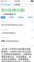
1) Gets the + away from the dictionary name; and uses the full dictionary name instead of a potentially confusing abbreviation.
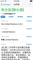
2) Text makes the purpose of the + more obvious: it says "Flash Add" now. More meaningful, but at the expense of extra clutter.
3) Use some sort of iconography to show that the "+" relates to a flashcard, at the expense (perhaps) of a "cleaner" look.
I also really *do* like to pick the dictionary when creating a card (although perhaps that will be less relevant soon, depending on how definitions/examples are shown in flashcards), so I'd be a bit disappointed if that functionality goes away or gets put into a 2nd step (although I'd live with it if it's the most elegant way, given all of the trade-offs).
What about something like one of these?:

1) Gets the + away from the dictionary name; and uses the full dictionary name instead of a potentially confusing abbreviation.

2) Text makes the purpose of the + more obvious: it says "Flash Add" now. More meaningful, but at the expense of extra clutter.

3) Use some sort of iconography to show that the "+" relates to a flashcard, at the expense (perhaps) of a "cleaner" look.
