i prefer a less cluttered interface, but can understand that it would be confusing for a first time user, perhaps you can do an "intro" the first time the app is opened. I have seen this being more popular recently. There are several screens that shows basic functionality. Some people will still skip it of course, but then they can refer to the manual. If the flashcard module isnt purchased, will the "+" still show up? If not, then maybe when the flashcard option is bought there can be a short tutorial as well.
You are using an out of date browser. It may not display this or other websites correctly.
You should upgrade or use an alternative browser.
You should upgrade or use an alternative browser.
New Version Screenshot Thread
- Thread starter mikelove
- Start date
Flashcards are also our bookmarking system, or at least that's how we look at it - '+' as a general "add to something" has been a standard iOS icon since the beginning (though Apple turned it into an 'action' button in Safari a few releases ago since they ran out of places to put functions). If a user sees a word that they want to save to look at later then + is the way to do that, even if they have absolutely no interest in flashcards.I agree that looks a bit more pleasing and less confusing, but I'm not sure that the function of the + sign is obvious enough. I know that a plus "adds" something or sometimes "reveals" something. I suppose with my background knowledge of Pleco, I also know that I (probably) can't add a new entry from this screen, I can't add a note (since Pleco doesn't support that), and I can't add a bookmark (because Pleco doesn't have that either), so it must be a Flashcard. But I need that background knowledge, and I need to go through that process of elimination in order to decipher the meaning of the plus sign here.
I also really *do* like to pick the dictionary when creating a card (although perhaps that will be less relevant soon, depending on how definitions/examples are shown in flashcards), so I'd be a bit disappointed if that functionality goes away or gets put into a 2nd step (although I'd live with it if it's the most elegant way, given all of the trade-offs).
Lack of clutter is important, though - a graphically complicated icon in the middle of the dictionary entry really breaks things up in a pretty significant way - and keeping the dictionary abbreviations on the right side makes them both easier to browse and easier to spot when scrolling, so I'm not inclined to change either of those. The best other option I can think of is to put + in the top toolbar - makes it much more obvious that it's a button, and fits reasonably well functionally with the scroll buttons and back button.
i prefer a less cluttered interface, but can understand that it would be confusing for a first time user, perhaps you can do an "intro" the first time the app is opened. I have seen this being more popular recently. There are several screens that shows basic functionality. Some people will still skip it of course, but then they can refer to the manual. If the flashcard module isnt purchased, will the "+" still show up? If not, then maybe when the flashcard option is bought there can be a short tutorial as well.
+ will still show up, yes - we're getting rid of that old text-based wordlist-for-free-users feature and replacing it with a severely limited version of our flashcard system (but not limited in its organization / import / export capabilities, only in flashcard-testing-related ones).
An intro is something we'll probably do in a dot-dot update, but I think all we can manage for the initial release is some sort of "guide for previous-version users" so that people who were already using some old function happily can easily find it again.
alanmd
探花
I like the idea of a single flashcards '+' button in the top toolbar. I accidentally create flashcards occasionally and I could see that happening more with little plus icons distributed through the entry. Which dictionary would be the default? The first dictionary in the list seems sensible, if I have ordered them. Could the dictionary be selected along with the category when the plus button is long-pressed?
First take on our new iOS-7-style app icon:

We'll still keep the textured one (already used in our Android app and posted here back when we first came up with it) on iOS 6, but that icon looks terrible on OS 7 so we're leaning towards a nice simple minimalist gradient instead.
We'll still keep the textured one (already used in our Android app and posted here back when we first came up with it) on iOS 6, but that icon looks terrible on OS 7 so we're leaning towards a nice simple minimalist gradient instead.
I like the idea of a single flashcards '+' button in the top toolbar. I accidentally create flashcards occasionally and I could see that happening more with little plus icons distributed through the entry. Which dictionary would be the default? The first dictionary in the list seems sensible, if I have ordered them. Could the dictionary be selected along with the category when the plus button is long-pressed?
I think the first one would indeed be the default. A long-press option seems problematic to me because you aren't actually looking at the dictionary entries while you're in there - I think at that point I'd prefer to keep an option to have the buttons next to the dictionary abbreviations, since aside from its poor discoverability it seems like a good way to handle it.
Nice.
How does it look with a similarly blue background? Just curious—it'll most likely be an issue with Apple's slightly bizarre iOS7 stock app icons as well.
Actually looks OK thanks to the gradient - I think this is the reason they used so many gradients, actually, makes it almost impossible for the icon not to stick out from the background a bit.
goldyn chyld
状元
Any info on when does the beta testing start?
When it's ready - we were delayed a bit by the last-minute discovery of a way that we could potentially get flashcards working with iCloud after all, something that requires a dramatic enough change to our flashcard database system that we really really want to make sure it's in the first beta (even if people can only test it on a single device).
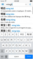
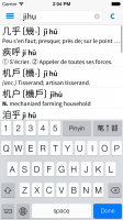
Here's a look at the main screen. Note the new input method / language selection options along with the permanently-integrated tone bar (in landscape we'll most likely remove this bar and move the relevant buttons to the navigation bar, but we haven't 100% decided about that yet). Subtle additional detail is the fact that the scrollbar is visible - this is because we've replaced it with an Android-like draggable scrollbar (pops out when you tap it) as a way of avoiding the need for that silly horizontal-scrolling arrow button we used to have for getting through long lists.
The list layout can still be configured in all of the ways it can be now, BTW, this is just a version of that with the Pinyin colored blue and the headword characters in bold (both optional).

The list layout can still be configured in all of the ways it can be now, BTW, this is just a version of that with the Pinyin colored blue and the headword characters in bold (both optional).

Last edited:
Hi Mike,
In terms of the headword/pinyin colors/font will you be making it set or will there be options? I prefer to have some color to further separate the entries besides the horizontal line. like the current version allows the option to have the headword colored according to tone. Personally, I would prefer a combination of the two versions, with the headword not in bold, but in color.
In terms of the headword/pinyin colors/font will you be making it set or will there be options? I prefer to have some color to further separate the entries besides the horizontal line. like the current version allows the option to have the headword colored according to tone. Personally, I would prefer a combination of the two versions, with the headword not in bold, but in color.
Now, I haven't trawled through every of hundreds of suggestions so this may have slipped past me, but have you considered a toggle for removing the secondary character set? For example, if I study standard simplified Chinese, the traditional characters in brackets just behind the entry add an awful lot of "noise". Maybe add them as a secondary character in the full dictionary entry after pressing the list entry?
And also, instead of having black characters, black pinyin and black translation, how about breaking it up a bit, for example, like "Japanese" for iOS does. Black characters followed by a different color of pinyin, and below a translation in a 3rd color? Personally I've never been intrigued by pinyin color coding, as I've never learned to read in colors, in any language

And also, instead of having black characters, black pinyin and black translation, how about breaking it up a bit, for example, like "Japanese" for iOS does. Black characters followed by a different color of pinyin, and below a translation in a 3rd color? Personally I've never been intrigued by pinyin color coding, as I've never learned to read in colors, in any language

Now, I haven't trawled through every of hundreds of suggestions so this may have slipped past me, but have you considered a toggle for removing the secondary character set? For example, if I study standard simplified Chinese, the traditional characters in brackets just behind the entry add an awful lot of "noise". Maybe add them as a secondary character in the full dictionary entry after pressing the list entry?
Already an option, Settings / Dictionary / Entry Display / Headword character set -> One set only.
And also, instead of having black characters, black pinyin and black translation, how about breaking it up a bit, for example, like "Japanese" for iOS does. Black characters followed by a different color of pinyin, and below a translation in a 3rd color? Personally I've never been intrigued by pinyin color coding, as I've never learned to read in colors, in any language
We actually tried that - see post 90 just a little higher in this thread - but the problem is that it really only looks good if the characters are bold (as they are in Japanese); otherwise the pinyin tends to draw too much attention away from the characters and the whole layout feels unbalanced. And after universally negative reactions by email / Facebook / etc to our recent screenshot with bold Chinese text we're not inclined to make that the default; we do have / will probably keep around options for both of those changes, though, so if you really want that bold text + colored Pinyin combination you should be able to get it.
Ducksausage
秀才
I hope this doesn't come across as too pushy, but...
How's the progress on the upcoming update? Any new time frame info?
Again, sorry for asking, but I simply can't wait for this new update (and, more especially, the Cantonese dictionary)!
How's the progress on the upcoming update? Any new time frame info?
Again, sorry for asking, but I simply can't wait for this new update (and, more especially, the Cantonese dictionary)!
The current plan is to submit it to Apple shortly after we test it on the iPhone 5S - we're antsy about that because last year there was a horrific bug on the iPhone 5 (handwriting crashed instantly when you tried to use it) and we'd rather not have a repeat of that.
So with the 5S going on sale on the 20th (and yours truly waking up very very early in the morning to stand in line to get us one) we'll hopefully be submitting a few days after that.
So with the 5S going on sale on the 20th (and yours truly waking up very very early in the morning to stand in line to get us one) we'll hopefully be submitting a few days after that.
Ducksausage
秀才
Great to hear Mr. Love!
Again, can't wait for the new update / dictionaries. Judging by the quality of previous pleco updates, I can only assume that the upcoming update will be amazing as well, so thanks in advance!
Again, can't wait for the new update / dictionaries. Judging by the quality of previous pleco updates, I can only assume that the upcoming update will be amazing as well, so thanks in advance!

