New Version Screenshot Thread

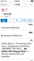
Thinner vertical blues: that's better. More subtle. The tabs as grey ghosts, though, seem too recessive, apologetic, as if they're trying to get out of the way.

Blue here is tricky, semantically, if multi-use: it now means 1) character examples 2) example bars (ok, logical tie in) 3) active tab-able elements?
 

mikelove

皇帝
Staff member
Thinner vertical blues: that's better. More subtle. The tabs as grey ghosts, though, seem too recessive, apologetic, as if they're trying to get out of the way.

Interesting point... I'm seeing that too now. So probably best to downplay them in some other way.

Blue here is tricky, semantically, if multi-use: it now means 1) character examples 2) example bars (ok, logical tie in) 3) active tab-able elements?

Well bear in mind that the characters in the examples are tappable too (popup reader). But yes, basically - Apple does something similar in the Contacts app (see the last batch of screenshots at the bottom of the page on http://www.apple.com/ios/ios7/design/), uses blue to identify both headers and tappable elements.
 
True. And the ultimate goal isn't rigorous semantic consistency, but semantic consistency that clarifies usability, right? So blue suggests "go ahead, tap me and something relevant happens". That's good. And the tap-ability of the characters in the examples is logical. So there's no actual problem :)
 

character

状元
Removing the border makes sense (or at least the end caps), but I'm worried that if we just have text and nothing else (as was actually the case in an earlier design) it won't be sufficiently obvious that these are tappable. The tick mark isn't great - I like the double metaphor (each tab is also an example of the thing it describes, except for the first one) but perhaps we'd be better off just doing it all in English.
Colored English text without a border does seem to be the way iOS 7 is going for buttons.

Actually it's how you pick a specific dictionary's entry to create a flashcard from (flashcards remain one-dictionary-at-a-time for brevity's sake). Though the fact that the + is non-obvious suggests that we ought to either make it bigger or add another flashcard icon somewhere else to automatically create one from the first entry. Or perhaps pick a better icon than +, like a star or a bookmark.
Plus alone is what I'm used to for adding flashcards, but you had talked about combined dictionary entries before, so I didn't know if that was what was being indicated. How do you cycle through dictionaries on the screen? To me, the + and PLC are too close together to reliably press separately.


Interesting perspective, but I like the brackets because they suggest the "alternative" nature of the bracketed text - the vast majority of users prefer one character set or the other and parenthesizing the other set makes it easier to ignore it.
Even some spacing would help the brackets and the characters from running together.

Here's an alternate version with the quote bars gray instead of blue - does that work any better for you?
It's a little bit better (iOS 7 seems to use colors such as blue to indicate something is clickable in some way). Have you tried a light grey background for the example sentences instead? The other thing is that your screenshot has very few horizontal lines, so you could use thin horizontal lines to separate example sentences.
 

mikelove

皇帝
Staff member
Plus alone is what I'm used to for adding flashcards, but you had talked about combined dictionary entries before, so I didn't know if that was what was being indicated. How do you cycle through dictionaries on the screen? To me, the + and PLC are too close together to reliably press separately.
PLC is just a label, it's not used for dictionary switching - the new UI puts every dictionary's entries in a single scrolling box. So tapping anywhere in that vicinity gets you the add flashcard command.

It's a little bit better (iOS 7 seems to use colors such as blue to indicate something is clickable in some way). Have you tried a light grey background for the example sentences instead? The other thing is that your screenshot has very few horizontal lines, so you could use thin horizontal lines to separate example sentences.

We have indeed tried that - having any kind of differently-colored background for / boxes around content seems to really bring the whole design down. And we do use horizontal lines now to separate entries from different dictionaries, it's just that in this particular entry there's enough content to keep the other dictionaries' entries from displaying properly.
 

yoose

探花
Thanks!

Actually I was talking only about the design of it, not the fact of having the bar at all - I'm pretty happy with that. The current Character Info screen is not very discoverable - this is useful information that we would like to make easier to find / get at. In fact I'd go so far as to say that for a lot of people the ability to access single characters from a multi-character word or compounds / stroke order from a single character is nearly as important as the ability to view the original dictionary entries.

And since it scrolls away along with the header (at the moment at least) I don't really view it as that big a burden space-wise - there are very few words for which that bit of space would make a difference, either it's rare enough that it only gets a one-sentence definition or it's common enough that it gets several pages of notes and examples to scroll through. We get very few complaints about this on Android in spite that the tabs are permanently at the top of the screen there.

Information-design-wise, it feels to me like this is a really logical way to do this because all of the information is related to the word in the header - here's the word that this page is going to tell you about, here are all of the things that it can tell you about it, pick one. A bar on the top (be it in the toolbar or scrolled out of the way) doesn't do that - it implies that everything below it will change if you tap on a different section. Likewise a bar on the bottom which at least on iOS implies that everything above it will change.

As for making it optional, we'll be happy to consider that if we get a lot of complaints about it in the finished app (wouldn't be difficult to make it hidden on top, as you suggest), or maybe even in the beta test, but we've got so many options already that I'm disinclined to add a new one to disable a feature that nobody outside of Pleco has even tried yet. But we certainly don't want to force people into a new UI they don't like.

I agree that it is currently not quite discoverable and if it were to be hidden at the top then the problem would persist. For me I do not use it too much, before i use to use it more to access the cantonese pronunciation, but with Cantonese support I will be using it less. However, with the new options of related words and related examples, especially the synonyms and antonyms I can see myself using it more and more as it is a feature that I have been waiting for. I do appreciate you considering my request and do agree it shouldn’t be worked on unless a lot of people have the same request as there are plenty of other things to work on. Can't wait to use it!

Have you considered making that tab bar sort of an anchor (not sure if that’s the correct word to use). As I scroll through the entry, if it is long, it might be useful to keep that bar anchored to the top so it doesn’t scroll away. Then when I want to change tabs I don’t have to scroll all the way back up. It seems like ive seen something similar in other apps, but can not remember where off the top of my head.
 

gato

状元
PLC is just a label, it's not used for dictionary switching - the new UI puts every dictionary's entries in a single scrolling box. So tapping anywhere in that vicinity gets you the add flashcard command.

Mike, could you elaborate? It's not quite clear what you mean by "label" (label for what?), and what you mean by "every dictionary's entries in a single scrolling box" (how does that differ from now?).
 

mikelove

皇帝
Staff member
Have you considered making that tab bar sort of an anchor (not sure if that’s the correct word to use). As I scroll through the entry, if it is long, it might be useful to keep that bar anchored to the top so it doesn’t scroll away. Then when I want to change tabs I don’t have to scroll all the way back up. It seems like ive seen something similar in other apps, but can not remember where off the top of my head.

Yes, we're thinking about that - it's used in the App Store app among other places.

Mike, could you elaborate? It's not quite clear what you mean by "label" (label for what?), and what you mean by "every dictionary's entries in a single scrolling box" (how does that differ from now?).

They're all together - no dictionary switch button to tap on. Here's a screenshot that demonstrates it more clearly:

manyentries.png
 

gato

状元
I see. Looks good. The "+" for adding to flashcards probably should be bigger and thicker to be more prominent (and maybe to distinguish it from the expanding list usage, which is sometimes indicated with a "+").
 

mikelove

皇帝
Staff member
I see. Looks good. The "+" for adding to flashcards probably should be bigger and thicker to be more prominent (and maybe to distinguish it from the expanding list usage, which is sometimes indicated with a "+").

Good point on the +, though for aesthetic reasons I'm more inclined to keep it around its current size but make it blue (if we're going to embrace Apple's "it's colored, you can tap on it" concept we might as well embrace it all the way)
 

character

状元
They're all together - no dictionary switch button to tap on.
Would it be possible to have a setting which listed all the definitions one after the other, without the example sentences (or have the example sentences listed later)? I think example sentences are great, but most of the time I just want to see definitions to find one which makes sense in the material I'm reading. With the combined dictionaries, now I have to scroll much more to see other dictionary definitions instead of tapping the dictionary button.

WRT the plus button, if you make it blue, I would suggest making the dictionary name blue as well and making the tap target cover both.
 

mikelove

皇帝
Staff member
Would it be possible to have a setting which listed all the definitions one after the other, without the example sentences (or have the example sentences listed later)? I think example sentences are great, but most of the time I just want to see definitions to find one which makes sense in the material I'm reading. With the combined dictionaries, now I have to scroll much more to see other dictionary definitions instead of tapping the dictionary button.

We're still debating how to handle that, actually - there's probably going to be some sort of optional "scrub bar" at the bottom of the screen to let you quickly jump between long entries, and we might include an example sentence visibility toggle button in there. We could also consider making them individually collapsible though I'm not wild about that since it can often seem rather "fiddly."

WRT the plus button, if you make it blue, I would suggest making the dictionary name blue as well and making the tap target cover both.

The tap target will definitely cover both, but I'm not sure yet if the dictionary button ought to be blue since we end up with a *lot* of blue that way (plus it might seem too similar to the dictionary switching button in the main search screen).
 

mikelove

皇帝
Staff member
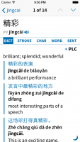
Here's another experiment, with a different tab bar, no tone colors (they'll remain an option but I think the design looks better without them), Zhuyin disabled, blue + and audio icons and an icon to hide examples at the bottom right. (not going to actually use a quarter moon, though, since in the Chinese-speaking world that icon is very strongly associated with toggling between half / full-width character input)

An added benefit to this sort of tab bar is that we can potentially make it sideways-scrollable and add more sections in the future.

tweaks.png
 

gato

状元
How about moving the dictionary name to the left margin, away from the "+", since the two have nothing to do with each other?

I think it might be good to change the "+" to a star, which is used for favorites in IE. The "+" is not as self-explanatory and could be potentially confusing.
 

mikelove

皇帝
Staff member
I like the dictionary name on the right better, but it might make sense to move the flash button below it instead of next to it.

+ is more recognizable to previous Pleco users but I agree that a star is more universal.
 

mikelove

皇帝
Staff member
Iterating again, not sure about the just-a-tiny-bit-off-white background for the header but I think this is a sufficiently unobtrusive tab bar:

tweaks2.png
 

character

状元
This site has an overview of the iOS 7 controls: http://kintek.com.au/blog/portkit-ux-metaphor-equivalents-for-ios-and-android/ The segmented control, with non-bold English text, might be the best choice for the tab bar. It looks a little heavy on the page, but it is standard.

I feel the example sentences, having the side bar and Chinese in the same color used to indicate buttons, are more problematic the more I think about it. So far color is the big way to distinguish primary tap targets in iOS 7. I wonder if getting rid of the side bar, making the Chinese text black, and adding a little extra space above and below each example, might work better. That plus the existing indent would set the examples off from the definitions. The Chinese in color looks nice, but in iOS 7 it is confusing.

WRT showing/hiding the examples, one thought I had was to have a pinch gesture to hide the examples for that viewing of the dictionaries. If you make the pinch gesture, then go through the tabs and come back to the dictionary tab, the examples are still hidden. If you hit the back button, then the next time you come to this or any other dictionary tab, the examples are shown. Just a thought.
 

mikelove

皇帝
Staff member
This site has an overview of the iOS 7 controls: http://kintek.com.au/blog/portkit-ux-metaphor-equivalents-for-ios-and-android/ The segmented control, with non-bold English text, might be the best choice for the tab bar. It looks a little heavy on the page, but it is standard.

That was actually the feedback from Apple's UI designers too (at WWDC you can sign up for a 30-minute session), in fact before that the tab bar design was actually much closer to the above screenshot. But on playing with it (see earlier screenshots) it really does seem kind of heavy / intrusive, and when you're already in the midst of a bunch of other non-standard tappable things I'm not sure the consistency is all that important.

I feel the example sentences, having the side bar and Chinese in the same color used to indicate buttons, are more problematic the more I think about it. So far color is the big way to distinguish primary tap targets in iOS 7. I wonder if getting rid of the side bar, making the Chinese text black, and adding a little extra space above and below each example, might work better. That plus the existing indent would set the examples off from the definitions. The Chinese in color looks nice, but in iOS 7 it is confusing.

I definitely think the sidebar is necessary, but we're still considering going black with a gray sidebar - aesthetically I like it much better in blue, and I don't think it's inconsistent to have the characters blue since they are in fact tappable, but we don't want to confuse people. The sidebar itself seems necessary, though; it wouldn't be if we never had more than one example for a particular definition, but we do - sometimes a page or more - and indenting alone doesn't adequately separate them off from the rest of the text.

That being said, the more I think about it the more I feel like Apple's original description of color as a way of denoting tappability was really just a crude simplification; I think the real purpose of color in a flat / grayscale / non-skeuomorphic UI is to replace texture. Provide some of the same cues that 3D buttons / linen backgrounds / etc used to do but without relying on increasingly-silly real-world metaphors.

WRT showing/hiding the examples, one thought I had was to have a pinch gesture to hide the examples for that viewing of the dictionaries. If you make the pinch gesture, then go through the tabs and come back to the dictionary tab, the examples are still hidden. If you hit the back button, then the next time you come to this or any other dictionary tab, the examples are shown. Just a thought.

I generally feel like pinch gestures should only be used in places where whatever you're doing can a) follow along "live" with the gesture and b) be stopped at any point along the way, neither of which would apply here - a pinch that doesn't do anything until you've pinched enough to trigger it (and then does the whole thing immediately) feels very odd. Same for swipe gestures, though with those, since you have a clear sense of the direction of motion it's OK to have it end up on only one end of the transition or the other.
 

mikelove

皇帝
Staff member
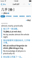
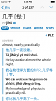
Small tweak, we've just enabled Core Text support, so for anyone who doubts the value of good kerning here are some before and after shots (click on the first one to bring up a gallery view and then use the arrow button on the right side of the screen to flip to the second).

Still a few bits I'm not happy with (the 'ph' in 'physics' e.g.), but since this a font we're embedding rather than a system-supplied one we can edit the kerning for that manually.

(also, pro tip for anybody else working with Chinese in apps: Core Text is incredibly slow for Chinese and doesn't seem to make any difference whatsoever in the rendering, so it's best to combine Core Text for English text runs with a simpler system for Chinese ones)

nokerning.png kerning.png
 

BanMai

秀才
Are we able to change the fonts on iOS? I just really prefer the serif non-modern looking fonts for Chinese characters. I think they retain more of the "spirit" of Chinese characters, and it's much easier to learn from for writing...
 
Top