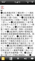
I would like to support this idea of expanding the size of the buttons at the bottom of the reader. I've complained about this already, but I was just using the reader and trying to create flashcards as I read through the text. I kept missing the + button and making the text selection advance instead--pretty irritating. I REALLY think these buttons are too small on the iPad. There is so much space to work with, what would be the harm in making them easier to hit?
You are using an out of date browser. It may not display this or other websites correctly.
You should upgrade or use an alternative browser.
You should upgrade or use an alternative browser.
Beta 10 Bug Report / Feedback Thread
- Thread starter mikelove
- Start date
denmitch
探花
I keep checking the App Store anticipating the iOS 3.0 release and I noticed by chance that there are only 35 current reviews and only 1870 total reviews for all versions. I encourage all 4000 forum members to update their review or actual send one. This may be Pleco's best advertising online. I know word of mouth is by far much better but reviews help business too.
alanmd
探花
I keep checking too- I have App Store auto updates on, so I am waiting to see the icon change on my home screen.
Remember that you can only see the App Store reviews in your region (I assume you are in the U.S. as we have 188 Pleco ratings in Canada). Yes we all should rate and review, especially important to re-review when 3.0 comes out.
I imagine that Twitter and Facebook are important too, I'll be forwarding links about 3.0 to anyone who might be interested in the new version.
I keep checking the App Store anticipating the iOS 3.0 release and I noticed by chance that there are only 35 current reviews and only 1870 total reviews for all versions. I encourage all 4000 forum members to update their review or actual send one. This may be Pleco's best advertising online. I know word of mouth is by far much better but reviews help business too.
I don't believe that people don't know about Pleco as much as they are just simply unwilling to throw down *BIG* bucks for, what they believe are just, "some" dictionaries.
I can't find the forum anymore but there just used to be a twenty-something page long thread on another site specifically just talking about a "crack" for Pleco. While a lot of other people I know are just getting their friend(s) to pop-in their own reg so they don't need to pay for dictionaries themselves. Some Chinese people I've recommended Pleco to think it's "不好用" because they just reverse search English words...my two cents
golden chyld - thanks, easy 3.0.1 fix.
radioman - where is Pinyin tied to the highlight color? Example sentences are, but the Pinyin shouldn't be unless you've specifically turned on the option to make it that way.
Taller button tap areas on iPad are a reasonable change, we really thought we'd made them big enough in the last few betas but if they're still not there we can make them taller still.
denmitch - thanks; star ratings actually seem to have a very minor impact, if any (we've had our average go as low as 2.5 thanks to competitor sabotage - we know it was competitor sabotage because the same number of 1-star reviews were left for every other popular iOS Chinese dictionary except theirs - and even that had a negligible impact on downloads) but a few nice written reviews certainly do help.
alanmd - thanks. We've got it as "hold for developer release" because after they approve it we're going to do a bit of testing to make sure the integration with their IAP system etc works OK (and because if they approve it at 11pm I'd rather wait until the next morning to deal with the ~2000 emails we'll probably get in its wake), so you'll probably find out about it from our Twitter / Facebook / etc feeds before you see the icon change.
ACardiganAndAFrown - true; the bundles especially hurt us, since they lead to the perception that we're more expensive than we are. We're trying to do a better job with "Add-ons," which should help a good bit - adding screenshots, more detailed descriptions, sample entries, better dictionary demos (no more searching for 'a' words, now you just tap on the "Browse" button from within the add-ons page for that dictionary and can scroll through the whole thing easily), etc.
We actually see very little flagrant abuse of Registration IDs - only a handful have even hit a double-digit # of devices - though since casual piracy does tend to make people feel like suckers for actually paying for the app we should probably do a bit more on that front. It's kind of a stupid thing to give out, frankly, since they're very easy to steal once you have them - e.g., one of your friends can transfer your iOS license to Android and then if you ever try to transfer it yourself you'll discover that you can't. And we certainly have no qualms about blocking people who do abuse them.
Cracks are actually less of a problem because most iOS users at least don't have jailbroken devices and so simply have no way to run a cracked version of Pleco. (the crack you mention was for a very old version and AFAIK nobody's managed to crack a more recent one)
Chinese users we've frankly never expected much from - even back in 2000 金山 was selling Chinese dictionaries on CD for like $3 and still seeing them heavily pirated; there are too many good free options for them, we could theoretically make a product to address that market but it would be very different from our current app both in its design and its business model.
Alexis
状元
When using radical input with the FZKaiTi font, the 2-stroke right-side 阝gets partially covered by the left-side 阝.
When i go into the chars tab for 乞, click on *, highlight that headword, copy-to-clipboard, then paste in another program, it pastes "耀耀*".
Edit: * is where the top-of-乞 radical was before I submitted the post. Not unicode?
When i go into the chars tab for 乞, click on *, highlight that headword, copy-to-clipboard, then paste in another program, it pastes "耀耀*".
Edit: * is where the top-of-乞 radical was before I submitted the post. Not unicode?
Last edited:
radioman
状元
This might be related to measure words - for instance 观众 (ABC Dictionary) - the measure words are specified and provided in highlighted. But that is not a big deal to me. Obviously the sentences are my larger concern.
And not sure if I was clear previously, but the ability to rotate through the dictionaries when viewing a popup dictionary, I thought there was reference to extending to the right the area where you could press to rotate through the dictionary. My hope was that it would be extended down, so you could just press on any part of the right side of the bubble (top, middle, or bottom).
And not sure if I was clear previously, but the ability to rotate through the dictionaries when viewing a popup dictionary, I thought there was reference to extending to the right the area where you could press to rotate through the dictionary. My hope was that it would be extended down, so you could just press on any part of the right side of the bubble (top, middle, or bottom).
So I just got a new 5s and obviously it's not running the beta, so please don't delay the official update longer as necessary, I really don't want to use the old Pleco version anymore ")
___
The following idea came to me as soon as you introduced the "hold the sidebar button (3 lines) to go back to search" functionality, and by now I really think it's a necessary one (for the next minor update, obviously):
Please enable the same functionality app-wide, meaning "hold the backbutton to go back to search".
Example:
I go into settings to change something, eg stroke order drawing speed. Now once I've done that, I probably want to go back to the search screen, or to flashcards or something else, I'm probably not gonna stick around and change other settings. But in order to go back, I have to press the backbutton two times and then longpress for search or tap for the the sidebar to appear. This might not take significantly longer than my proposal, but it FEELS overly complicated, since the functionality is there, just not implemented everywhere.
Once again: 谢谢 for all your hard work
Alexis - thanks - another character sizing problem for the first one, second one means we're not sanitizing the clipboard properly.
radioman - the bottom of that bubble is actually used for the intermittently-visible scroll buttons that show up in cases where you have more than one entry in a particular dictionary. (e.g. for characters with multiple pronunciations like 得) So we can't give that space over to dictionary switching because we're already using it for something else.
weingin - turn on the option to show the sidebar button everywhere in Settings / Miscellaneous.
FY collective I: we put the updated Guifan in the file catalog for the beta, so if you go into your Updates tab you should see an option to download it - let us know if you notice any problems (or if you have any feedback on the typography, since this is our most aggressive attempt so far at translating the new design to a C-C dictionary).
Alexis - yes, that's a bug - thanks.
A swipe to expand the definition to the fullscreen on iPad is possible, but I'd like to get a better handle on where we're going with iPad design in general (still a lot to do, I think) before we consider adding it - it's very much in the category of features that I'm worried we might regret adding because they interfere with other things we'd like to do.
denmitch
探花
would it be possible to visually indicate this in the menu (perhaps a number in a circle beside "add-ons")?
Addons went straight to a pop-up notification with options to start download or see list. Are you asking for notice on the menu too?
I just spent 30 minutes, my only question may not be related to the new Guifan download. In History > Cards > Select from list: what are the up/down arrows for? No obvious action takes place.notice any problems (or if you have any feedback on the typography
goldyn chyld
状元
Hm, entries being separated is indeed a positive change, but:
1. I miss the circled numbers.
2. I would prefer if parts of speech were in brackets or in squares rather than just grayed out. I really like how it's done on OS X (see screenthot). Any chance you could do the same?
3. Is it possible to turn off the "voice" option in example sentences? I find those speaker icons distracting.
4. I don't know... there is something that bothers me with the way definitions and example sentences are displayed... I miss the arrows etc. separating the definitions and example sentences. I think that was better than just the colons in the current version... Better in terms of separating the examples from the definitions. I quite liked the old GF format (see screenshot), so I thought simply separating the ①②③.. entries would probably look just fine.
5. Is there anything that could be done about the font of the example sentences? You do use a different color for it now, but somehow I think it'd look better if a) perhaps they used a slightly smaller font than the definitions b) different font if using Kaiti as the default c) were in italics? I like how the fonts in definitions and example sentences differ in OS X (see screenshot).
6. I miss the ~ replacements of headwords... Without ~, you can't immediately spot the headword in example sentences...
Attachments

Alexis
状元
Addons went straight to a pop-up notification with options to start download or see list. Are you asking for notice on the menu too?
Yes, a bit of a chicken and an egg dilemma. I'd only open add-ons if there's something new to download/update, but currently I'd only know there's a new update if I opened add-ons.
I like the parsing done on guifan entries now. Was there any reason not to use the same format as the updated C-E dictionaries?
Alexis - we do that now with our automated background update check, though that pops up an alert instead of just an unobtrusive dot. In general we're trying very hard to minimize routine bandwidth usage (since we know a lot of our users are severely bandwidth-constrained) so we'd rather not have that check run more often than its current once-a-week, but a shift to a dot instead of an alert might make sense.
denmitch - glad you like the new layout. The issue with card scrolling looks like a bug, thanks.
golden chyld: thanks for the detailed feedback.
1) Those we had to drop for consistency, since we're pretty confident that they're an improvement in other dictionaries.
2) This was an attempt at consistency as well - matches the way parts of speech are formatted in C-E/E-C dictionaries - though we're open to changing it if we find that it's too ambiguous when it involves Chinese instead of English text.
3) That will go away in 3.0.1, we forgot to add a flag to disable it in C-C dictionaries but I agree it looks distracting and ought to be changed.
4) The arrows actually just acted as prefixes to the numbers, they never had anything to do with examples, but we did change the : from full- to half-width and changed the full-width | into a half-width /, so those are certainly changes we could reverse if it seems too crowded now.
5) Actually both of those ideas were rejected by our type designer in the original design, the feeling being that it made the layout look too chaotic. I do like how Apple's version puts examples in a block on a separate line, though - that might be worth considering.
6) That was one of many options that we took out in the interest of simplifying our settings screens - the impression we've gotten from making no ~-replacement the default on Android is that very few people want them left in. However, as with (nearly) all of these removed options we're happy to add it back if we get a lot of user interest in doing so.
Alexis: the fact that it's C-C necessitated some minor changes but in general we're trying to keep them pretty close to each other.
Alexis
状元
bug: I noticed that when I turned on traditional characters, 雜志 is using a simplified character for the second character.
Glad to hear about the auto-update. Just though the dot might still be obvious enough for those that want to update, but not as in-your-face for those who get annoyed by such things (like all the apps that ask you to rate them).
The main difference seems to be white space. There are a lot more carriage returns in the E-C. Also, the part-of-speech is in bold blue in E-C, but light grey in the C-C. I actually like both, but consistency may make them easier to scan. That being said, since I have a lot of dictionaries, I appreciate the compactness of Guifan since It allows more dictionaries to show up on the screen at the same time.
Alexis - we do that now with our automated background update check, though that pops up an alert instead of just an unobtrusive dot. In general we're trying very hard to minimize routine bandwidth usage (since we know a lot of our users are severely bandwidth-constrained) so we'd rather not have that check run more often than its current once-a-week, but a shift to a dot instead of an alert might make sense.
Glad to hear about the auto-update. Just though the dot might still be obvious enough for those that want to update, but not as in-your-face for those who get annoyed by such things (like all the apps that ask you to rate them).
Alexis: the fact that it's C-C necessitated some minor changes but in general we're trying to keep them pretty close to each other.
The main difference seems to be white space. There are a lot more carriage returns in the E-C. Also, the part-of-speech is in bold blue in E-C, but light grey in the C-C. I actually like both, but consistency may make them easier to scan. That being said, since I have a lot of dictionaries, I appreciate the compactness of Guifan since It allows more dictionaries to show up on the screen at the same time.
We just updated Guifan again to clean up the example formatting a bit - please let us know if this seems like an improvement.
Alexis - looks like a glitch in PLC specifically, actually, a dictionary that (perhaps ironically) has seen little updating outside of formatting since we're busily working on a whole new edition of it.
The ABC parts of speech are blue because they're hyperlinked to explanations, though perhaps it would be better if we kept them consistent even if they are tappable. Newlines could use some tweaking; basically in GF parts of speech are normally tied to specific sub-definitions and thus it makes sense to put them inline with those definitions to avoid wasting huge amounts of space, but in ABC they appear by themselves at the start of an entry.
+ button shows card updated if you already have a flashcard for that entry, yes - this is by design since at that point all you can do is pick a different definition.