Beta 10 Bug Report / Feedback Thread

mikelove

皇帝
Staff member
Alexis - ah, that explains it - thanks. Actually appears to be gone in the release version because as a way of avoiding these sorts of errors we made the input dismiss in a couple of situations where it didn't before (so it actually shouldn't be possible to ever have the input still open while you're in one of those deeper screens).

denmitch - sorry, could you clarify? It seems to work fine when the program is already open, but it only works if you're copying text in from outside of Pleco - i.e., if you copy text from one part of Pleco it won't immediately bring up the clipboard reader with that text. Is that what you were looking for, or is it failing to open the clipboard reader even with text from outside of Pleco?
 
Last edited:

denmitch

探花
Does not seem to matter if the program was open or not. Copy from forum, switch to Pleco beta and have to select clipboard to view. Same with iBooks selection and within Pleco. No copied text activates the clipboard reader automatically. What setting does this?
 

Alexis

状元
Just to clarify, I hadn't gone "deeper" (as in a pop-up). Rather the Pinyin linked to another definition. Maybe we mean the same thing, so just wanted to make sure I had conveyed my initial report properly.
 

dcarpent

榜眼
Are you going to post here when you have submitted to Apple? Just curious (and impatient!) I'm really looking forward to being able to use iCloud to sync flashcards between devices.
 

dcarpent

榜眼
Great! Thanks so much for your commitment to making Pleco better and better. I know it's a business aimed at making a living, but it also seems to be a labor of love at the same time, and your customers really benefit from that.
 

radioman

状元
Here are some observations.

1) Dictionary screen comes up blank (see link to photos below ). Maybe this is by design if nothing is in the lookup box. But if that is the case, then there should be something that indicates to the user that the program is indeed up and running. (e.g., Place your definition here). When it came up, I thought the program was broken or misinstalled.

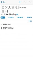
2) Highlighting is still an issue for me. I realize this was asked and answered before. However, the Highlight color is creating contrast issues for me (see see links to photos below) My hope is that you just create a different highlight color that is devoted to highlighting of text. Especially an issue for Pinyin representation (and I believe sample sentences as well, where I need high contrast.

Link to Photos below.
https://plus.google.com/photos/1111...s/5939139936862675361?authkey=CKroi-Lv3qLkqgE


Some unrelated comments per previous posts under Beta 6 for which I had not yet responded.

- Popup of definitions are faster now, no long lag.

- Pull bars now appear at first but disappear as you advance. Cleaner. Whatever you are doing, I like it.

- The tap area of the dictionary popup still appears only at the top. I still think it should be expanded along the entire right side of the bubble so I do not have to just target the “abc” or whatever reference text. I am certainly seeing it in “non-expanded” form on the spyglass text version of web browser sites and articles.

- I spoke of center scrolling, and dismissing the popup definition bubble. From my perspective, there are two modes to this. One is for casual lookup, and the other is permanent dictionary presentation, where you just want to cascade through the document always doing a lookup. So for casual, yes, dismiss. However, for popup, yes, keep the bubble active. From an implemnetation perspective that is not easily done, then at least have it so that if the definition box is anchored to the bottom, that it will not be shut. And in all cases, when swiping the center area up or down, the previously highlighted words will remain active and highlighted, so that the user does not have to again fish around for where he was and what word was last highlighted.

- With regard to going backword on the side tap area, I would respectfully disagree. I think it would take 2 seconds for someone to figure that out moving your thumb a half inch to the left would move the cursor to the left, and vise versa for the right. As for people that do not hover their finger over the screen, I do not disagree. But I think it is much more likely for those that are using the side press to advance will have their fingers hovering over the screen (or just having a hand resting there like any reader holding their device does. Otherwise, why else have the side advance mode? That is, it would just always put up a block to them trying to get to a definition, because as they read through a document, if they want to look up a word, they will have to press the center area to free up the screen prior to pressing the word of interest. It seems to me side area is there for people that want to just advance throught the document, every word of it.

One implementation idea I had is that, first time that someone does it, you put up a small “info box” that explains to the user that they are invoking this mode for the first time. And if the approach I noted is arguably not intuitive, then perhaps add a mode so that the user can swipe forward a character or back a character, while still maintaining his thumb on the right side for control (swipe during this reading mode appears to not be used). But I still think the original idea is the best approach.

And I saw the comment about perhaps subtle overlays. Not quite sure what that would look like. However, I think the bottom line is that I am hoping there is a way that you can cascade through the document word by word, and not have to move your control finger more than an inch.
 

mikelove

皇帝
Staff member
1) Startup isn't very good right now, yes - we do show a 'Welcome' message there the first time you run it, but that's it. We had something more elaborate but it was stubbornly buggy and we had to leave it out of the initial version - should show up in a minor update soon, though.

2) We can consider adding an option for this if we get a lot of other complaints, but we're just finally starting to get a handle on our past Settings Bloat and we can't really justify adding new ones unless we see significant demand for them. For people who don't mind the current level of highlight color brightness, it seems like this particular option would actually make matters worse, since they'd need to change two different colors to keep them coordinated.

Glad to hear we've improved on the first two points.

Tap area does stick out to the right, but we can look at sizing it to go a bit farther on iPad at least.

Regarding center scrolling, that seems reasonable if the popup is indeed anchored to the bottom.

Regarding tap-to-go-back, another part of what's bugging me about this, and why I've never cared for this tap-side feature in general and wish in retrospect that we hadn't added it, is that it feels like if you're leaving the popup open for long enough for this to be useful (and not just tapping on a particular part of the screen to see a few words), it's no longer a major imposition to move your fingers to the top / bottom of the screen; in fact you're probably going to want them there anyway since they're liable to get in the way of (or even end up blocked by) the definition bubble. For quick lookups, leaving the entire screen tappable to easily dismiss the bubble seems best, and for advancing through longer passages, tapping the arrows on the bottom (or top, if you've enabled that option and prefer to grip your iPad that way) is the best way to keep your hand from blocking your view of the text.
 

Alexis

状元
Just reporting this in case it affcts more than this character:

When looking up 辰 today, pleco doesn't seem to pull all sentences in the "sents" tab.

For example, it is missing:

PLC
约莫半个时辰 ☕
Yuēmo bàn ge shíchen
about an hour

PLC
日月星辰 ☕
Rìyuè-xīngchén
the sun, the moon and the stars

ABC
今天是老人的寿辰。 ☕
Jīntiān shì lǎorén de shòuchén.
Today is the old man's birthday.
 

mikelove

皇帝
Staff member
Thanks - very obscure case (essentially it requires that a character never appear in any example *except* as the last character) but we'll fix it in the first bug-fix release.

EDIT: also appears that there was an encoding bug in ABC that may have caused a few to drop off, but that one we can fix without even needing to patch the app.
 
Last edited:
For some reason the characters in "roman letter+character" entries appear as neutral tones in CEDICT:
 

Attachments

  • image.jpg
    image.jpg
    54.1 KB · Views: 439

radioman

状元
Just a quick comment that, with regard to the highlight, perhaps the most challenging thing is that real informational text, like Pinyin and sample sentences, are pegged to the highlight. I personally would prefer just peg those against the text colors, so I can utilize the same contrast setting as that set with the background and text colors. In fact, given the choice, I would prefer English be put in the highlight color, rather than the text characters that I really need to see and for which I am not as familiar (i.e., Pinyin, Hanzi).

As for advancing through text, rather than side tapping, I have no problem hitting the buttons at the bottom, except that they have been made even smaller in this version. And if you are using the arrows to rifle through the text, it is was kind of easy before on the previous version to fall off the track due to not cleanly hitting the arrow. And now in this version, the buttons are even smaller (even though the area I think has now been expanded a bit). Honestly, if you could expand the area on the forward and reverse arrow vertically, to say an inch high on my Mini screen (which is about 2x what it is now), it would work for me. In this way I would not have to tap any center area if in fact I did want to reposition the cursor on other characters, but could still rapidly tap with a much higher degree of confidence if I wanted to advance. And maybe highlight the extended button area with the semi-transparent highlight color ... seriously :) ... If this extended area was done, maybe it could be toggled on and off by just holding the forward or reverse arrow for 2 seconds. And the first time someone does it, they could get an info popup saying "You are extending the size of the forward and advance buttons extended buttons, press and hold again to return to original sized buttons".
 

denmitch

探花
Honestly, if you could expand the area on the forward and reverse arrow vertically

I too read with my finger hovering over the screen. It is faster to tap past learned words and stop/slow down for new words than to scroll and tap for the definition when desired. Anything that would make the Reader definition navigation more convenient is welcome.
 

radioman

状元
Yes this is exactly what I do. I can move through a document very quickly if employing this. But the implementation leaves it easy to get "derailed", needing to go back and re-highlight the word of interest before you can continue.

I referenced this previosly in the forum previously.
As part of my lengthy comments at the time, I wrote…

“…Mind you, I am in no way advocating the looking up of every word along the "track". That would be another issue entirely. But I can arrow through about 6 lines of text in about 12 seconds (16-20 words per line) and not "fall off track". Maybe it is just me, but Its much less laborious for me to press the arrow key rapidly 20 times than it is to reach up and touch the next character. And I always press the same place, conveniently in the lower right. “ Oct 4, 2012. Plecoforum.com http://goo.gl/g52H0T
 
Top