typing or making characters I can't type : )

alex_hk90

状元
1) For example, the left side of 帥 (without 巾), doesn't display properly in any font (got it from zisea.com). It is visible in any font, but none of them do the lines the way they do as part of a common character like 帥.

2) Thanks. I guess you mean this: http://www.7tutorials.com/use-special-characters-windows-7-character-map ? I am looking at that now.

3) The big thing is trying to find a way to make characters. It sort of seems like I can do that now, but it will be March before I can fully test all the ones I want (I guess only a few dozen, but I am not sure), since I am busy with something else right now. Most important, I need to see if a font can display them in the standard way for Taiwan and also for the PRC (as was the problem with my 風 on 風 example above, though that was just a test; I don't need that character).

1) So does this character exist in any of your fonts or not? How does it display if not "properly"?

2) Yes, you could use that for Windows to see what the shortcut is for the character (provided it exists in the font).

3) If you are adding new characters to a font you might want to have a look at this:
http://designwithfontforge.com/zh-CN/index.html
It's about designing a new font but I think you might be able to use FontForge to add new characters to existing fonts (would have to double-check this).

Regarding your Taiwan and PRC distinction, are there existing characters (in existing fonts) which do this? I don't understand what you mean by "standard way for Taiwan and also for the PRC" - do you mean that there are two separate characters you need or that the same character somehow displays differently in different situations?
 

feng

榜眼
1) A few posts up I noted, regarding this 風 on 風 character that "my example character above can only display with the line above the 虫 as a 平撇 (PRC traditional form), not a 短橫 (Taiwan official form)."
For practical purposes this sort of thing is not important, and it was a poor example since I don't need that particular character, but I am working on a project that needs to note these little details. If you read my post # 16 for this thread, that hopefully answers your question in detail. If not, tell me. Maybe you would know why Taiwan's MoE font is using the space set aside for special characters? Or so it seems to me, but I am quite ignorant of these matters.

2) Thanks.

3) Thank you. I will look at this. If it works with a Mac, I might just go back to a Mac since character display on Windows is hideous. I was going to start a whole other thread involving that and input methods on both Mac and PC. It is odd how little attention they both put into Chinese, since more and more Macs and non-pirated copies of Windows are being sold.

4) Yes, there are characters which display the Taiwan or the PRC way, depending on the font chosen, regardless of whether you choose simplified or traditional as the input method (and I recently learned that typing traditional characters in Microsoft pinyin which is fundamentally PRC is different from typing traditional characters choosing Taiwan for an input angle, from the computer's point of view). I have not counted them yet, but the number is not too insignificant. I would have to get back on the Mac to check for an example. I will try to do that at some point. I have not transferred everything over yet. I was using a Mac and Pages for close to eight years fairly exclusively, so Windows and Word have taken some time for me to get re-acquainted (which means I am paranoid about screwing something up in the work I have already done).

Thanks for your help!
 

alex_hk90

状元
OK, so for these characters they should show one way (PRC) with one font and another way (Taiwan) with another? That should be simple enough because every font will need to have each character (glyph) defined so you would just define it differently (which you would have to anyway to be consistent with the rest of the font).

Could you send me a link to the MoE font you are referring to? I'm guessing they use the space reserved for additional characters because they are not in the standard Unicode set. Does this font have all the characters you need (or at least more than others) or is it still missing some?

1) A few posts up I noted, regarding this 風 on 風 character that "my example character above can only display with the line above the 虫 as a 平撇 (PRC traditional form), not a 短橫 (Taiwan official form)."
For practical purposes this sort of thing is not important, and it was a poor example since I don't need that particular character, but I am working on a project that needs to note these little details. If you read my post # 16 for this thread, that hopefully answers your question in detail. If not, tell me. Maybe you would know why Taiwan's MoE font is using the space set aside for special characters? Or so it seems to me, but I am quite ignorant of these matters.

2) Thanks.

3) Thank you. I will look at this. If it works with a Mac, I might just go back to a Mac since character display on Windows is hideous. I was going to start a whole other thread involving that and input methods on both Mac and PC. It is odd how little attention they both put into Chinese, since more and more Macs and non-pirated copies of Windows are being sold.

4) Yes, there are characters which display the Taiwan or the PRC way, depending on the font chosen, regardless of whether you choose simplified or traditional as the input method (and I recently learned that typing traditional characters in Microsoft pinyin which is fundamentally PRC is different from typing traditional characters choosing Taiwan for an input angle, from the computer's point of view). I have not counted them yet, but the number is not too insignificant. I would have to get back on the Mac to check for an example. I will try to do that at some point. I have not transferred everything over yet. I was using a Mac and Pages for close to eight years fairly exclusively, so Windows and Word have taken some time for me to get re-acquainted (which means I am paranoid about screwing something up in the work I have already done).

Thanks for your help!
 

feng

榜眼
http://www.edu.tw/pages/detail.aspx...ex=7&WID=c5ad5187-55ef-4811-8219-e946fe04f725
It says it has 13,067 characters. It has all the 4,808 characters of Taiwan's list of most common characters, all but seven or eight (I forget) of the 6,343 characters in Taiwan's list of the second most common characters, and it has a small number of other characters. I have come across a few characters used in Taiwan that are not in this font. I have another Taiwan specific font (I might be able to find the link) that seems to do more (e.g. it makes 艹 by itself (not in a character) a four stroke element).

The larger issue for me is if they have used all the spaces meant for additional characters, then I can not use that font with them. This brings me back to the 風 issue in the earlier post. Even though I made it a 短橫, not a 平撇, in the character making program (image in an earlier post), perhaps it has to do with what I typed in the box before I began editing? I mean, if I typed it in Microsoft pinyin as a traditional character, I know that for example Word sees it as in the simplified set (e.g. the ruby function in Word will give me Hanyu pinyin rather than juyin fuhao if I type in Microsoft pinyin).
 

alex_hk90

状元
http://www.edu.tw/pages/detail.aspx...ex=7&WID=c5ad5187-55ef-4811-8219-e946fe04f725
It says it has 13,067 characters. It has all the 4,808 characters of Taiwan's list of most common characters, all but seven or eight (I forget) of the 6,343 characters in Taiwan's list of the second most common characters, and it has a small number of other characters. I have come across a few characters used in Taiwan that are not in this font. I have another Taiwan specific font (I might be able to find the link) that seems to do more (e.g. it makes 艹 by itself (not in a character) a four stroke element).

The larger issue for me is if they have used all the spaces meant for additional characters, then I can not use that font with them. This brings me back to the 風 issue in the earlier post. Even though I made it a 短橫, not a 平撇, in the character making program (image in an earlier post), perhaps it has to do with what I typed in the box before I began editing? I mean, if I typed it in Microsoft pinyin as a traditional character, I know that for example Word sees it as in the simplified set (e.g. the ruby function in Word will give me Hanyu pinyin rather than juyin fuhao if I type in Microsoft pinyin).

A quick search suggests it is very unlikely they have used all the space available (Unicode has space for over 1,000,000):
http://en.wikipedia.org/wiki/Plane_(Unicode)
It has already mapped out where over 74,000 characters should go in the font as well:
http://en.wikipedia.org/wiki/CJK_Unified_Ideographs
So first I would check to see if the characters you want to type are covered in here (and if so add/create them in this location of the font) and then only if it hasn't been defined a space here then use the extra "Private Use Areas" (which have over 100,000 spaces).

Regarding what you typed - I'm not familiar with the Windows tools but that should only (at most) determine the location in the font of the character. In theory a Chinese font should have both simplified and traditional characters (see links above), and the IME would determine which character to use.
 

feng

榜眼
A quick search suggests it is very unlikely they have used all the space available (Unicode has space for over 1,000,000):
http://en.wikipedia.org/wiki/Plane_(Unicode)
It has already mapped out where over 74,000 characters should go in the font as well:
http://en.wikipedia.org/wiki/CJK_Unified_Ideographs
So first I would check to see if the characters you want to type are covered in here (and if so add/create them in this location of the font) and then only if it hasn't been defined a space here then use the extra "Private Use Areas" (which have over 100,000 spaces).

Regarding what you typed - I'm not familiar with the Windows tools but that should only (at most) determine the location in the font of the character. In theory a Chinese font should have both simplified and traditional characters (see links above), and the IME would determine which character to use.
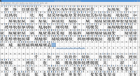
Are you suggesting that I search in that font for the character I want to type/make? The problem is that these characters I am looking to make are not normally typable. I was able to find a few at the bottom of the list in the Windows program Character Map for the font KaiTi (see attached image). That is the sort of odd thing I am looking to do: character elements. I realize now I had not explained this well previously.

I am aware that there are oodles of characters in Unicode, but how can I type them? On both the Mac and Windows I can not type 74,000. I think BIG-5 has something like 12,000 or so. The GB set is still about 7,000 (not updated to 8,105 yet I think).

Turns out U+E001 is taken in Taiwan's MoE font (which is odd since various websites claim that to be in the private character domain). I can see in Character Map things around it, so I should be OK with that in the future with a little fumbling around.

Thank you again for your help. I am starting to understand this a little bit. The biggest remaining question is how one can get these character sets of 30,000 or 74,000 on one's computer to type or somehow choose from?
 

Attachments

  • elements.PNG
    elements.PNG
    5.6 KB · Views: 750

alex_hk90

状元
Are you suggesting that I search in that font for the character I want to type/make? The problem is that these characters I am looking to make are not normally typable. I was able to find a few at the bottom of the list in the Windows program Character Map for the font KaiTi (see attached image). That is the sort of odd thing I am looking to do: character elements. I realize now I had not explained this well previously.

I am aware that there are oodles of characters in Unicode, but how can I type them? On both the Mac and Windows I can not type 74,000. I think BIG-5 has something like 12,000 or so. The GB set is still about 7,000 (not updated to 8,105 yet I think).

Turns out U+E001 is taken in Taiwan's MoE font (which is odd since various websites claim that to be in the private character domain). I can see in Character Map things around it, so I should be OK with that in the future with a little fumbling around.

Thank you again for your help. I am starting to understand this a little bit. The biggest remaining question is how one can get these character sets of 30,000 or 74,000 on one's computer to type or somehow choose from?

Yes, to an extent. If you have a character you don't know how to type (and don't have in electronic format so you can just copy/paste it), then the first thing I would do is try to find it in the CJK part of Unicode (with 74,000 characters defined I would be surprised if it wasn't there - if it really isn't then use the Private Use Area instead):
http://en.wikipedia.org/wiki/CJK_Unified_Ideographs#Charts
If you can find it there then you will have the code for where that character should be in a Unicode font.

Then open the font you want to check and navigate manually to this code to see if the font has got an appropriate glyph for this character.
If it is there then you can just copy/paste it or use the code to input this character.
If it is not there then you will need to add the glpyh to the font (essentially, design the character for the font).

Once the fonts you want to use have glyphs for all the characters you want to type then you can look at extending an input method to type these characters (using Pinyin, for instance).

Regarding the MoE font, I'll download it later today when I get back from work to have a look at it, but my guess would be that they released it before Unicode standardised the location of the CJK ideographs:
http://en.wikipedia.org/wiki/Unicode#Versions
So at the time there was no space predefined for the characters, and hence they put them in the Private Use Area.
 

feng

榜眼
Yes, to an extent. If you have a character you don't know how to type (and don't have in electronic format so you can just copy/paste it), then the first thing I would do is try to find it in the CJK part of Unicode (with 74,000 characters defined I would be surprised if it wasn't there - if it really isn't then use the Private Use Area instead):
http://en.wikipedia.org/wiki/CJK_Unified_Ideographs#Charts
If you can find it there then you will have the code for where that character should be in a Unicode font.

Then open the font you want to check and navigate manually to this code to see if the font has got an appropriate glyph for this character.
If it is there then you can just copy/paste it or use the code to input this character.
If it is not there then you will need to add the glpyh to the font (essentially, design the character for the font).

Once the fonts you want to use have glyphs for all the characters you want to type then you can look at extending an input method to type these characters (using Pinyin, for instance).

Regarding the MoE font, I'll download it later today when I get back from work to have a look at it, but my guess would be that they released it before Unicode standardised the location of the CJK ideographs:
http://en.wikipedia.org/wiki/Unicode#Versions
So at the time there was no space predefined for the characters, and hence they put them in the Private Use Area.

Thank you again.

I downloaded the PDF from Wiki with all the CJK characters. At my first search it seems to be missing most of the things I can't type. Also missing about 50 standard individual strokes, and some additional multi-stroke calligraphic designations -- stuff I thought they might have add with 70,000 other things in there. I may find them with more looking, but they don't seem to be there. Kind of odd since Wiki says Unicode consulted 'experts' in Chinese. Just mentioning this since this thread may be useful for others.

This
http://www.edu.tw/pages/list.aspx?Node=3691&Index=7&wid=c5ad5187-55ef-4811-8219-e946fe04f725
suggests the MoE came out with this version of the font just over a couple years ago, or at least they announced it on December 28, 2012. Not sure if I mentioned this already, but the MoE font does not do simplified characters, or even unofficial traditional ones (or about 16,000 rarely used official ones). There are even a few commonly (or sort of) used characters in Taiwan that are not official and so don't get supported by the font.

Might I pester you with two more questions?
Since I am using two different programs in Windows to make characters and to dig around in fonts, and you mentioned you aren't familiar with Windows for this, are you using a Mac and if so what would one use to dive into fonts and place new characters or make them with a Mac? You did mention FontForge, and I am investigating it.

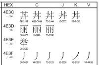
In the attached image, each character has a separate code beneath it (not Unicode?). For example, the PRC 丽 with one line on top, and the archaic 丽 with two lines on top as in the character 麗. What are these codes? I ask since I may need them. Is this the difference between characters and glyphs? Several websites meaning to explain the difference left me not very clear.
 

Attachments

  • pye.PNG
    pye.PNG
    10.3 KB · Views: 659

alex_hk90

状元
Thank you again.

I downloaded the PDF from Wiki with all the CJK characters. At my first search it seems to be missing most of the things I can't type. Also missing about 50 standard individual strokes, and some additional multi-stroke calligraphic designations -- stuff I thought they might have add with 70,000 other things in there. I may find them with more looking, but they don't seem to be there. Kind of odd since Wiki says Unicode consulted 'experts' in Chinese. Just mentioning this since this thread may be useful for others.

This
http://www.edu.tw/pages/list.aspx?Node=3691&Index=7&wid=c5ad5187-55ef-4811-8219-e946fe04f725
suggests the MoE came out with this version of the font just over a couple years ago, or at least they announced it on December 28, 2012. Not sure if I mentioned this already, but the MoE font does not do simplified characters, or even unofficial traditional ones (or about 16,000 rarely used official ones). There are even a few commonly (or sort of) used characters in Taiwan that are not official and so don't get supported by the font.

Might I pester you with two more questions?
Since I am using two different programs in Windows to make characters and to dig around in fonts, and you mentioned you aren't familiar with Windows for this, are you using a Mac and if so what would one use to dive into fonts and place new characters or make them with a Mac? You did mention FontForge, and I am investigating it.

In the attached image, each character has a separate code beneath it (not Unicode?). For example, the PRC 丽 with one line on top, and the archaic 丽 with two lines on top as in the character 麗. What are these codes? I ask since I may need them. Is this the difference between characters and glyphs? Several websites meaning to explain the difference left me not very clear.

You're welcome. It's interesting that even in the 70,000+ they don't have the characters you need, as you say I would have thought they might try to cover everything.

Out of interest, what happens when you try to enter a simplified character in the MoE font? Does it just show a placeholder (i.e. blank box or Unicode codepoint)?
I didn't get a chance to try it yesterday evening but will try to have a look tonight.

On your two questions, of course. :)

1. I use Linux so not sure about Mac either, sorry! I think FontForge is cross-platform though.

2. It's an interesting diagram and I had to have a quick search to decode it:
http://codepoints.net/U+4E3C
ftp://unicode.org/Public/5.0.0/ucd/Unihan.html#kIRG_GSource

The main Unicode code point is on the left (e.g. 4E3C, and see first link above) - this is where that glyph/character (I don't see a distinction in the context of fonts) is stored in the font.
The codes underneath (e.g. GE-212B) refer to (Unihan, I think) metadata about the character (see from "IRG_GSource" in the first link, and then the second for an explanation).
See also: http://unicode.org/reports/tr38/#N10106

Hope this is helpful and not just causing more confusion!
 

feng

榜眼
You're welcome. It's interesting that even in the 70,000+ they don't have the characters you need, as you say I would have thought they might try to cover everything.

Out of interest, what happens when you try to enter a simplified character in the MoE font? Does it just show a placeholder (i.e. blank box or Unicode codepoint)?
I didn't get a chance to try it yesterday evening but will try to have a look tonight.

On your two questions, of course. :)

1. I use Linux so not sure about Mac either, sorry! I think FontForge is cross-platform though.

2. It's an interesting diagram and I had to have a quick search to decode it:
http://codepoints.net/U+4E3C
ftp://unicode.org/Public/5.0.0/ucd/Unihan.html#kIRG_GSource

The main Unicode code point is on the left (e.g. 4E3C, and see first link above) - this is where that glyph/character (I don't see a distinction in the context of fonts) is stored in the font.
The codes underneath (e.g. GE-212B) refer to (Unihan, I think) metadata about the character (see from "IRG_GSource" in the first link, and then the second for an explanation).
See also: http://unicode.org/reports/tr38/#N10106

Hope this is helpful and not just causing more confusion!

The MoE font displays all characters not in its purview (simplified or traditional) in an ugly Songish font. I am not able to get Word to do the simplified characters in the MoE font. Pages does, but Word is rebelling. I guess since they are not in that font, Word is not allowing it to be picked (I pick it, but it doesn't get picked). What Pages is really doing then is another question.

I will study the links you gave me.

Again, thank you very much for all of your help! The computer end of Chinese characters is not something I am familiar with.
 

alex_hk90

状元
The MoE font displays all characters not in its purview (simplified or traditional) in an ugly Songish font. I am not able to get Word to do the simplified characters in the MoE font. Pages does, but Word is rebelling. I guess since they are not in that font, Word is not allowing it to be picked (I pick it, but it doesn't get picked). What Pages is really doing then is another question.

I will study the links you gave me.

Again, thank you very much for all of your help! The computer end of Chinese characters is not something I am familiar with.

I have had a very quick look at the MoE font in FontForge and it does not have (at least some) simplified characters - see attached for 马 (arbitrary example).

Word must be falling back to a different font to Pages, as (at least some of) the simplified characters will not be coming from the MoE font. When you use the MoE font, the word processor (Word, Pages, etc.) will look for the glyph at the expected location for the character (e.g. 马 in the attached screenshot), see that it is not there and then choose a fallback font which has a glyph for that character so it can display something.
 

Attachments

  • Screenshot_2015-02-04_23-04-27.png
    Screenshot_2015-02-04_23-04-27.png
    346.7 KB · Views: 732

feng

榜眼
I have had a very quick look at the MoE font in FontForge and it does not have (at least some) simplified characters - see attached for 马 (arbitrary example).

Word must be falling back to a different font to Pages, as (at least some of) the simplified characters will not be coming from the MoE font. When you use the MoE font, the word processor (Word, Pages, etc.) will look for the glyph at the expected location for the character (e.g. 马 in the attached screenshot), see that it is not there and then choose a fallback font which has a glyph for that character so it can display something.
That makes perfect sense, and FontForge looks much nicer than Character Map!
 

alex_hk90

状元
That makes perfect sense, and FontForge looks much nicer than Character Map!

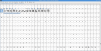
Following up on the use of the Private Use Area, you can see in the attached how the MoE font uses some of this area for Chinese characters, whereas the font being used in the titles (some kind of Linux one, looking at the penguin in U+E000; Libertine maybe, looking at U+E00A) has other uses for this part of the font. And actually these characters don't look overly rare, so I would be surprised if at least some of them couldn't be moved into the appropriate Unicode location.
 

Attachments

  • Screenshot_2015-02-05_00-33-20.png
    Screenshot_2015-02-05_00-33-20.png
    142.1 KB · Views: 729

feng

榜眼
Following up on the use of the Private Use Area, you can see in the attached how the MoE font uses some of this area for Chinese characters, whereas the font being used in the titles (some kind of Linux one, looking at the penguin in U+E000; Libertine maybe, looking at U+E00A) has other uses for this part of the font. And actually these characters don't look overly rare, so I would be surprised if at least some of them couldn't be moved into the appropriate Unicode location.
Do you mean an individual user can move them, or the MoE could move them in their next version of the font?

I made two 風 left to right just now (not bothering to adjust the line above 虫) to be sure I had not missed something the first time. Comparing with a single typed 風 there is a huge difference in appearance between the two characters I made (moved to free spaces, rendered in Word as the MoE font) and the typed one (see image). The original is a beautiful kaiti, the other two are anything but. I guess that the font will only render the characters originally put into it by the font maker? However many thousands or tens of thousands of characters a font has, they each had to be done one at a time? Makes sense, but I had assumed they used elements as templates and bent them into shape, so to speak, for individual characters. So, it really doesn't matter what font I use. Even if I just pull an element out of a character, like the left side of 師 (see image), it will look like hell. None of the other Chinese fonts make any of these look nice either. Short of using PNG or GIF files, I would have thought there was a way to make attractive homemade characters.
 

Attachments

  • fengs.PNG
    fengs.PNG
    4.9 KB · Views: 736
  • dwei.PNG
    dwei.PNG
    610 bytes · Views: 808
Last edited:

alex_hk90

状元
Do you mean an individual user can move them, or the MoE could move them in their next version of the font?

I made two 風 left to right just now (not bothering to adjust the line above 虫) to be sure I had not missed something the first time. Comparing with a single typed 風 there is a huge difference in appearance between the two characters I made (moved to free spaces, rendered in Word as the MoE font) and the typed one (see image). The original is a beautiful kaiti, the other two are anything but. I guess that the font will only render the characters originally put into it by the font maker? However many thousands or tens of thousands of characters a font has, they each had to be done one at a time? Makes sense, but I had assumed they used elements as templates and bent them into shape, so to speak, for individual characters. So, it really doesn't matter what font I use. Even if I just pull an element out of a character, like the left side of 師 (see image), it will look like hell. None of the other Chinese fonts make any of these look nice either. Short of using PNG or GIF files, I would have thought there was a way to make attractive homemade characters.

Either; an individual user could move them (using FontForge or similar) or the MoE could move them in their next version (assuming there is now a designated space for them in the latest Unicode specification).

Exactly, the glyph for each character in the font would have been individually designed (i.e. drawn) by the font maker. Of course you can copy/paste elements you have already designed for consistency, so for the fengs you could find the character in the font for the individual feng and copy/paste that, resizing and modifying as necessary. There is no intelligent linking of related characters in the font (as far as I know) - each are fully independent from each other. I should probably note at this point that there may be copyright restrictions on fonts, so you might not be able to modify/use parts of a font to create new characters without some kind of license from the font copyright holder.
 

feng

榜眼
Either; an individual user could move them (using FontForge or similar) or the MoE could move them in their next version (assuming there is now a designated space for them in the latest Unicode specification).

Exactly, the glyph for each character in the font would have been individually designed (i.e. drawn) by the font maker. Of course you can copy/paste elements you have already designed for consistency, so for the fengs you could find the character in the font for the individual feng and copy/paste that, resizing and modifying as necessary. There is no intelligent linking of related characters in the font (as far as I know) - each are fully independent from each other. I should probably note at this point that there may be copyright restrictions on fonts, so you might not be able to modify/use parts of a font to create new characters without some kind of license from the font copyright holder.
Good point. Luckily the MoE font is CC.

Does FontForge have the tools to let me, for example, take the left half of 師 and make it as attractive as when it was attached to 師 in the first place? If so, I'll dive into that. I just need to modify certain elements, and since I recently found some of them (attached in an earlier post, such as 春字頭), the number is now getting pretty small.
 

alex_hk90

状元
Good point. Luckily the MoE font is CC.

Does FontForge have the tools to let me, for example, take the left half of 師 and make it as attractive as when it was attached to 師 in the first place? If so, I'll dive into that. I just need to modify certain elements, and since I recently found some of them (attached in an earlier post, such as 春字頭), the number is now getting pretty small.

I just had a look in FontForge and you can copy/paste the left half of 師 (which appears to be : http://www.unicode.org/cgi-bin/GetUnihanData.pl?codepoint=200A4&useutf8=true) into a new glyph in its Unicode location (U+200A4), but you'll need to read up on how to use FontForge (c.f. the guide I linked to before) to do anything fancy like stretch it out - it's not overly obvious or simple. If it is too complicated (I don't know to be honest, before opening the MoE font I hadn't used FontForge before) at worst you could probably export to vector graphics (e.g. SVG) and manipulate using a standard vector graphics editor then re-import.
 

feng

榜眼
I just had a look in FontForge and you can copy/paste the left half of 師 (which appears to be : http://www.unicode.org/cgi-bin/GetUnihanData.pl?codepoint=200A4&useutf8=true) into a new glyph in its Unicode location (U+200A4), but you'll need to read up on how to use FontForge (c.f. the guide I linked to before) to do anything fancy like stretch it out - it's not overly obvious or simple. If it is too complicated (I don't know to be honest, before opening the MoE font I hadn't used FontForge before) at worst you could probably export to vector graphics (e.g. SVG) and manipulate using a standard vector graphics editor then re-import.
Again, thank you very much for your time and assistance!
 
Last edited:

feng

榜眼
I have come back to this recently, as I have worked on other parts of the project, putting off this problem. You mentioned SVG before, but it went in one ear and out the other. Today I downloaded a free, open source program from inkscape.org. It's really neat.

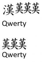
Important to this thread is that it seems like it may be my best bet since I just need to take existing characters and erase pieces from them. Unlike Microsoft Paint or Paint.net, one can import such a monstrosity into Word at high quality (if one chooses a high enough dpi), and it looks as nice as the typed character. The odd thing is that it made me even more aware that Chinese characters add too much line spacing to English text (regardless of what font the Chinese is in). Below I have a screen shot from Word. First, a typed 漢, followed by three non-characters made from it by erasing the 三點水 and saved as PNG files (saved at 90, 180, and 360 dots per inch; 1 to 2 kb in size). Second, the same stuff without the typed character, and note that the three PNGs sit like English text. Any idea why Chinese characters sit on a line differently than English text or how one might remedy this (not character by character)?
 

Attachments

  • inkscape - han.PNG
    inkscape - han.PNG
    16 KB · Views: 632
Last edited:

alex_hk90

状元
I have come back to this recently, as I have worked on other parts of the project, putting off this problem. You mentioned SVG before, but it went in one ear and out the other. Today I downloaded a free, open source program from inkscape.org. It's really neat.

Important to this thread is that it seems like it may be my best bet since I just need to take existing characters and erase pieces from them. Unlike Microsoft Paint or Paint.net, one can import such a monstrosity into Word at high quality (if one chooses a high enough dpi), and it looks as nice as the typed character. The odd thing is that it made me even more aware that Chinese characters add too much line spacing to English text (regardless of what font the Chinese is in). Below I have a screen shot from Word. First, a typed 漢, followed by three non-characters made from it by erasing the 三點水 and saved as PNG files (saved at 90, 180, and 360 dots per inch; 1 to 2 kb in size). Second, the same stuff without the typed character, and note that the three PNGs sit like English text. Any idea why Chinese characters sit on a line differently than English text or how one might remedy this (not character by character)?
So if I understand correctly, the issue is that Chinese text has different line spacing compared to English text or image files (PNGs in this case)?
I think this is a Microsoft Word feature - have a look at the Paragraph spacing options.

Glad to hear you found a way that works for you. :) Exporting to PNGs is probably a good simple workaround if you don't have time to learn about how fonts work. A possible disadvantage though (compared to updating the font with the new vector graphic / glypth data) is that PNG is raster (i.e. bitmap) graphics so it will not resize as nicely as SVG (or other vector) graphics.
 
Top