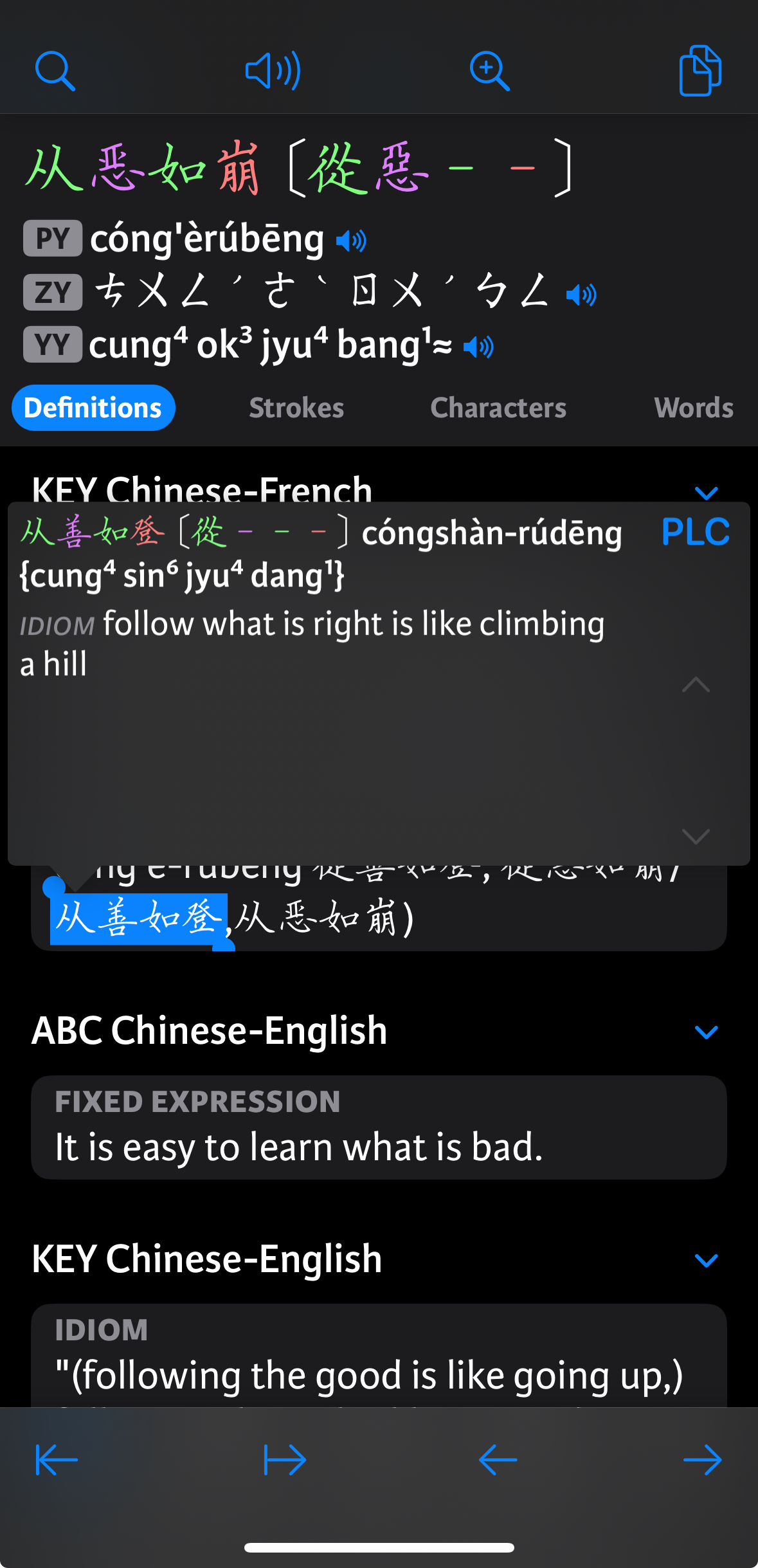
(Also) Looking for the "Popup Definition" settings. Can't seem to locate them for love nor money.
You are using an out of date browser. It may not display this or other websites correctly.
You should upgrade or use an alternative browser.
You should upgrade or use an alternative browser.
Popup Definition
- Thread starter ACardiganAndAFrown
- Start date
Looking specifically for: "Show zoom button" if possible.
Any chance it could be moved back to the popup def interface?
The popup definition is smaller than in 3.x right? I wonder if the size of that could be customizable.
It's possible now if you build a custom reader screen, but there are a lot of steps involved for that; we're probably going to add a 'simple' reader screen with customizable buttons and an easier way to make that the default, and that should provide a way to make that customization without having to go too deep into settings.Any chance it could be moved back to the popup def interface?
Did you migrate your settings from 3.x? It should have matched the size if so - if not that would be a bug. You can adjust the scale of fonts in the reader in Settings / Adjust font sizes / Reader (way too many options there, we're culling them).The popup definition is smaller than in 3.x right? I wonder if the size of that could be customizable.
I'm also interested in getting back the search function from the pop-up dictionary.
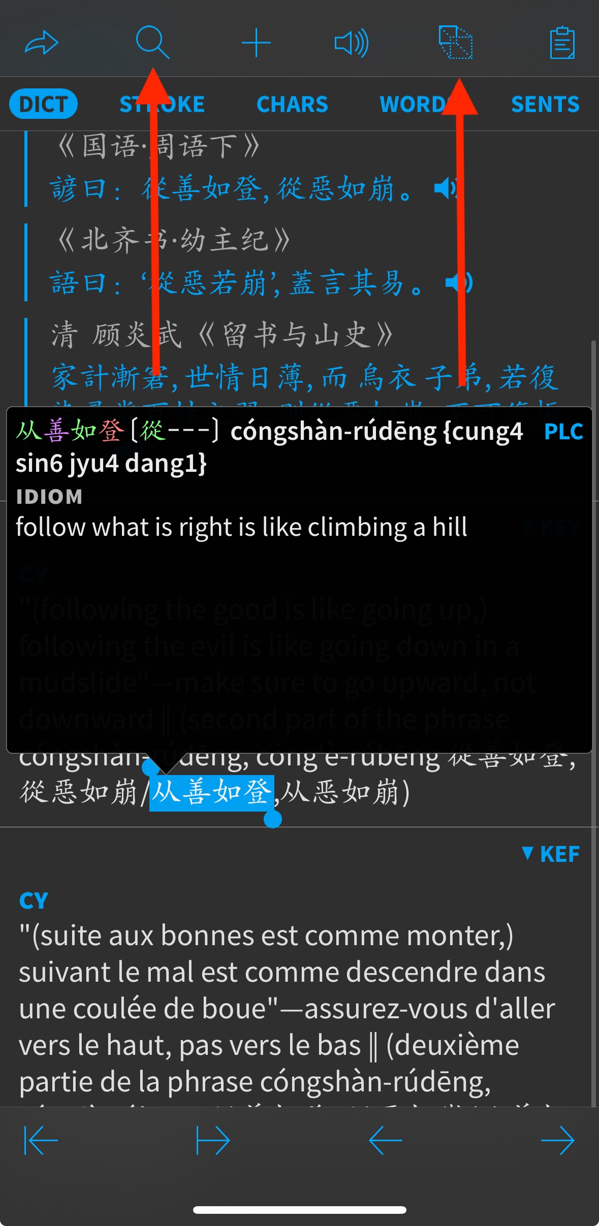
These are the two functions I'm looking to reinstate in 4.0:

Which screen is this called in 4.0?
These are the two functions I'm looking to reinstate in 4.0:
Which screen is this called in 4.0?
Both of those commands are in the share menu - "Search Text" and "Magnify Text" respectively.
If you wanted to customize this in the current beta, you'd need to:
1) Go into Expert Settings and create a new Reader Screen.
2) Save it, reopen it, and "convert to custom reader screen."
3) For each of the 7(!) different interface layouts - or at least any relevant to your device - modify the top toolbar to add the buttons you want.
4) Exit/save.
5) Create a new Content Screen.
6) Save it, reopen it, and "convert to simple content screen."
7) Set the 'reader screen' at the bottom to your new reader screen.
8) Go into Card Types, tap Chinese Entry, tap "convert to custom type."
9) Select your new content screen under 'default content screen.'
To use it in a reader document you'd want to tap on the settings icon in that document, scroll down, convert *those* settings to custom, and then select that new reader screen. (you can however then save those as the defaults for other documents)
This is obviously more work than most people want to do, so in a future beta we plan to a) add an intermediate 'simple' reader screen so you only have to change the toolbar options once, and b) allow that reader screen to be set as the default everywhere.
That all sounds good. I like how everything is open to the user, but at the same time it makes any advanced settings changes much more intimidating than before. I like how the settings screen is much simpler now with "additional settings" in each category hidden away. Maybe more advanced settings could be added without having to go into the expert mode settings, as you describe here.
One thing I've hoped to do for a while is to have dictionary groups in reader just like I have in search. So example, when I'm reading a classical Chinese text I choose the classical Chinese dictionary group and the only pop-up definitions are from those dictionaries. Is something like that possible? I remember you said that in 4.0 it is also possible to use one set of dictionaries to segment a document and a different set for look-up.
A few other things related to settings/UI for reader mode:
1. I wonder how hard it would be to make an option to put both toolbars at the bottom of the screen, stacked. That might look ugly but would make one-handed use much easier.
2. I wonder if it’s possible to have the bottom tabs and the navigation slider display together (i.e., when the tabs are visible they move the slider up instead of hiding it).
3. I love the new reader bookshelf. Will make selecting documents and switching between documents much easier. I use list view in the reader bookshelf and plan to keep doing so, but in icon view the icons seem too big and there is a weird gap between the two columns. I would have expected a view more like the Files app: three across with even margins on all sides.
4. Occurrences feature in the reader is super helpful. Just last month I was looking online for a feature like.
I meant the size of the box, rather than the text in the box.The popup definition is smaller than in 3.x right? I wonder if the size of that could be customizable.
I think I got it working:

Default interface layout for phone seems to be #07.
The button for "play entry audio" doesn't seem to work. Not sure why?
Default interface layout for phone seems to be #07.
The button for "play entry audio" doesn't seem to work. Not sure why?
Is there an 'audio profile' configured under it?The button for "play entry audio" doesn't seem to work. Not sure why?
Is there an 'audio profile' configured under it?
The only option is "customⓘ" - does that need to be configured also?
Yes, if you tap on the (i) the default settings it prepopulates will probably be OK, but there should probably be a generic 'default' there too.The only option is "customⓘ" - does that need to be configured also?
Sorry, didn't reply to this one:
Yes, for that you'd want to create another Reader Screen for classical with your desired dictionary order and then select that in those documents. (reader screen is another option that probably shouldn't require custom settings)One thing I've hoped to do for a while is to have dictionary groups in reader just like I have in search. So example, when I'm reading a classical Chinese text I choose the classical Chinese dictionary group and the only pop-up definitions are from those dictionaries. Is something like that possible? I remember you said that in 4.0 it is also possible to use one set of dictionaries to segment a document and a different set for look-up.
That's not so much an 'ugly' problem as an ergonomic one - it's really, really hard to accurately tap buttons in stacked bottom toolbars. I'd be more inclined to support that by cramming your most used 7 buttons in a single bottom toolbar.1. I wonder how hard it would be to make an option to put both toolbars at the bottom of the screen, stacked. That might look ugly but would make one-handed use much easier.
The dicey thing there is that then we have to repaginate the whole document whenever you make the tabs visible.2. I wonder if it’s possible to have the bottom tabs and the navigation slider display together (i.e., when the tabs are visible they move the slider up instead of hiding it).
Maybe a scaling problem - there should be 3 columns consistently.I use list view in the reader bookshelf and plan to keep doing so, but in icon view the icons seem too big and there is a weird gap between the two columns. I would have expected a view more like the Files app: three across with even margins on all sides.
Adjustable in a custom reader screen.I meant the size of the box, rather than the text in the box.
Yes, if you tap on the (i) the default settings it prepopulates will probably be OK, but there should probably be a generic 'default' there too.
The "customⓘ" page looks like this:
Can't really tell what it has to do with audio.
The audio still doesn't play on tap. If I press & hold the audio button I can select the voice I want to hear - and that works.
Great, thanks.Yes, for that you'd want to create another Reader Screen for classical with your desired dictionary order and then select that in those documents. (reader screen is another option that probably shouldn't require custom settings)
Oh, that makes sense.The dicey thing there is that then we have to repaginate the whole document whenever you make the tabs visible.
Here's a screenshot of what I see—iPhone Xr, I've reset the settings and haven't adjusted any.Maybe a scaling problem - there should be 3 columns consistently.
Awesome.Adjustable in a custom reader screen.
Bump on the ⓘ audio profile page:
The "customⓘ" page looks like this:
The page is correct, actually, though the title is weird (should say something about a custom audio profile instead). If you email me a backup of your flashcard database I can take a look at why the settings aren't working.
This is still broken in .20
