Pleco for Android 3.1 GM

If you were a firsthand witness to my reality, you'd understand it's a basic usability thing, just as I described--but all I can do is report. I suggested two ways of thinking of it because either way can be gainsaid: "one more" is always different for everyone, so if you really fear that, why not add an expert mode for longtime, experienced users and accumulate "one mores" there. Perhaps the one-more's won't materialize.

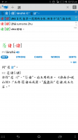
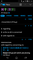
And come on, of course I also use the dictionary to study Chinese--and often the definition screen is also useful on the fly. So a compact definition has a lot of utility, as well as a readable headword offering a needed real-time capability. I might also suggest profiles, where the user can select between suites of settings, as many apps do. If one wants to, profiles are easily gainsaid also. Personally, I think expert settings and profiles are overkill in the present situation, but they're both common ways of doing things that do answer your objections. My guess is that this one really does fill in the last missing font size in the way the dictionary presents itself to the user.
 

mikelove

皇帝
Staff member
I recognize that it's a basic usability thing for you, as someone who does in fact like to make definition text that small - the question is whether it's a basic usability thing for enough other users to justify adding the option.

Honestly, we spend way too much time right now on options - that 'back button behavior' option in Settings / Miscellaneous took days and days of programming to get right, time that could have been spent on something that would benefit everybody using Pleco instead of just the people who wanted that option. Even ignoring clutter or the need for an "expert mode," every new option is another little bit of code we have to test / maintain, in most cases across two different platforms - the cumulative effect of all of those options is to significantly slow down the pace at which we can make more wide-ranging improvements to our app.
 
Seriously now, this is a dictionary and what piece of text could be more central than the headword? Can control over the headword's appearance really be compared to this arcane back button behavior option? Particularly given the fact that we control the other font sizes? It looks like mis-weighted priorities to me, or perhaps weightings that got unduly affected by people who happened to participate in the beta and developed a common mania. Can't you let design logic rule in this case: I mean, it's weird that we can control the other font sizes *except* for the pinyin headword.
 

mikelove

皇帝
Staff member
That "arcane back behavior option" was an extremely popular request, actually - lots of beta-testers asked for / ended up using it, and since the official release we've had to refer quite a few support emails / reviewers to it too.

I'm not unreceptive to adding the option, I just need to see more demand for it than I'm seeing right now - the fact that the iOS version has been out with the same set of font options since November makes it hard to view this simply as beta tester myopia. I don't see it as necessitated by design logic - to me the characters are the only 'headword' - and I don't see a practical need to magnify them either except again in this one very specific scenario of setting your definition font size too small to be able to make out Pinyin clearly.
 
@ohlordamen - does this apply to any two sections, or is there a specific one that seems to be slow? Any chance that the flashcards might only be in one character set or be missing Pinyin?

Of course everything is working nice and fast when you looking for it. Only one I can find is when opening the app it takes around 4 seconds get up and running.

Looks like all the words are two character words like 見面,號碼,高興 etc. All have Pinyin. I thought it happened with some single character words, but can't find any at the moment.


I was looking up radicals comparing it to a printed sheet that I have, I noticed that the order is different. They both have an order number. Like 亅 is number 6, but shows up third in the order. This isn't a problem for me just thought I would mention. A problem I did find is if you try to look at CHAR for some radicals/ words, if there is no information Pleco crashes. I was looking through the list of wan4, when I get to 卍 it would crash.
 
Last edited:

jiacheng

榜眼
The new interface looks very nice, but here are a couple of snags I've run into with the new version:

First, I'm really missing the look up by pinyin feature that used to be accessible in flashcards. In the old version, I'd highlight the word or character, push the > symbol, then there was an option to look up the entry by pinyin. I found this really handy when I was doing flashcards because I could easily identify homonyms like 骑士 and 歧视. If i miss this card and am able to check quickly as to whether homonyms exist, then the next time I see qi2shi4, I know that it could correspond to either of those two meanings. Not having the ability to look up by pinyin quickly from a flashcard session makes this process much less efficient. Seems like back in the WM days, you could just click the pinyin and it would give you this option. Previously, I could do it in 2 or 3 taps, but now I don't see a way to do it short of going to the dictionary search and typing in the pinyin myself.

[EDIT] looks like I just figured out the answer to this one on my own, but in case anyone else is wondering how to do it: highlight the word or characters in the flashcard session, hit the magnifying glass search button, then in the list entry, tap and hold and you'll get the option to search by pronunciation.

Second, Seems like the old version would highlight headwords in the definition, where as now they are in bold. I find that the highlighted terms really stood out better to me, but I'm not seeing a way to change this behavior in the settings.
 
Last edited:

jiacheng

榜眼
Just noticed a strange bug in flashcards, purely asthetic:
I have a flashcard entry:
既…又…
既…又…
ji4…you4…
both … and …, … as well as …
It is showing up with two different font sizes in the headword. 既 shows up with the font size usually reserved for the secondary character set, where as …又… is the expected size.
 

mikelove

皇帝
Staff member
@ohlordamen - are Pleco's data files on an external SD card? If so, how fast is it?

Do those words include simplified versions as well or only traditional?

CHAR bug we've seen a few crash logs for so that should be fixed in 3.1.1.

@jiacheng - thanks!

> was replaced by that button with four arrows expanding outwards, but it's the same function. The old menu command to search for the pinyin can now be accessed by tap-holding on one of the dictionary abbreviations (PLC, CC, ABC, etc).

We still highlight full-text search matches, but I don't believe we ever highlighted headwords in example sentences - we colored them red before but we thought bold was nicer looking and no harder to spot. If we get a lot of complaints about that change we can certainly consider bringing back an option to color them again.

With the 既…又… entry, could you possibly post a screenshot of the Edit Card Text screen for it? Want to figure out exactly which characters are there.
 

jiacheng

榜眼
Yes, the red highlighting was what I was referring to. I definitely preferred that over the bold. I'll definitely put my vote to have the option in.

I tried to transcribe the text exactly as it was in the edit screen previously. Here are the screenshots:
 

Attachments

  • Screenshot_2014-06-14-00-49-41.png
    Screenshot_2014-06-14-00-49-41.png
    60.8 KB · Views: 472
  • Screenshot_2014-06-14-01-01-54.png
    Screenshot_2014-06-14-01-01-54.png
    59.7 KB · Views: 419

Wan

榜眼
Like ohlordamen wrote, firing Pleco up takes a long time. On my snail phone (xperia mini, 1gHz single core, 512MB Ram, 32GB class 10 microSD) the Pleco window opens instantaneously, but it takes seven more seconds until it goes from black to showing content/input ready. Other than that, Pleco and all other software run perfectly, so it's not time to get a new model yet. The market for tiny powerhouse Android phones seems small enough.

edit: It takes that long to start once Pleco has been kicked out of the phone's memory. If I only run Pleco, there's no delay for "re"opening it. Also, I have installed almost all there is to install concerning addons, including dictionaries. This might slow things down as well. Once it works, it works fast.
 
Last edited:

alex_hk90

状元
That "arcane back behavior option" was an extremely popular request, actually - lots of beta-testers asked for / ended up using it, and since the official release we've had to refer quite a few support emails / reviewers to it too.

Although I don't think I posted about it at the time, I also appreciate the option of changing the back button behaviour - I use the "Back to Dictionary, then exit" option. :)
 

jmu3

Member
@mikelove - I'm still having trouble in this version using the hardware menu button in the OCR module. Sorry I didn't have a chance to reply to your question on the Beta 8 thread - I'm using a Samsung Galaxy S4. Just to summarize, the first time I press the hardware menu button, nothing happens. The second time I press the hardware menu button, the menu briefly appears and then instantly disappears.
I notice that if I open the menu by tapping the icon in the upper right corner of the screen, I can close the menu by pressing the hardware menu button. However the hardware menu button is not able to open this menu.

Also, how does one try the demo of the stroke order diagram add-on? The demo does not show me any character (I tried both night & day display modes).
 

Taichi

榜眼
Traditional Char 諸 has weird result. Simplified 诸 is fine.
 

Attachments

  • Screenshot_2014-06-15-00-12-52.png
    Screenshot_2014-06-15-00-12-52.png
    190.6 KB · Views: 505
I'm not unreceptive to adding the option, I just need to see more demand for it than I'm seeing right now.

Actually, like JimmyTheSaint I'd also very much like the ability to independently set the Pinyin font size in the dictionary header (as well as removing that superfluous grey 'PY')! Also, why has the audio icon become so small & tricky to activate? Is there a way to put it into the main tool bar as in v2 or make the icon bigger?

These minor issues aside - congratulations on an awesome new version!
 
(as well as removing that superfluous grey 'PY')! Also, why has the audio icon become so small & tricky to activate? Is there a way to put it into the main tool bar as in v2 or make the icon bigger?
+1 on the "PY"--it's a minor thing, but redundant information: the Latin alphabet with tone marks already make it abundantly clear that it's pinyin.

+1 on the size of the audio icon. In the previous version, it ate up valuable tool bar space, so I'd hide it wherever possible. But now there's a ton of wasted space to the right of the headword and the pinyin, so placing the audio icon there is a welcome extra, even if I will hardly ever use it. But it's quite tiny. I haven't had a problem pressing it, but without a visual or tactile feedback, it's surprisingly annoying. Perhaps adding the pinyin font size I've requested could also enlarge the audio icon so that the proportion remains the same and adding back one parameter provides two desired functionalities instead of one?
 

NomekSan

举人
A little feedback on the Search Flashcards function:

The AND condition seems not to work. I tried to search for all cards in a certain category AND priority 3. I always get all the cards in the category.
If I search for priority 1 then I only get those cards but if i search for priority 3 I get all of them including priority 1 and I only want those which priority 3.

Edit:
After some testing I can confirm that the search works fine for all categorys, except normal. A search for normal will always result in all cards.

Another nice thing would be to search for >=, <>, <= etc. for priorities.

Another input on the overlaying menu issue: It seems only to happen when I'm switching between organizing cards, a running test and the test options. Last time it was the switch from a running test to new test.
 
Last edited:
I haven't had a problem pressing it, but without a visual or tactile feedback, it's surprisingly annoying. Perhaps adding the pinyin font size I've requested could also enlarge the audio icon so that the proportion remains the same and adding back one parameter provides two desired functionalities instead of one?

Agreed - I too find the new audio icon feels unresponsive & scaling it along with larger pinyin might help. Unfortunately I now feel this about the 'DICT', 'STROKE', 'CHARS' &c buttons *and* the various dictionary name toggles also. After spending a few hours playing with v3.1 last night all these just felt too small & fiddly. They all need much bigger 'hotspots' in my view & more obvious feedback on press. And this is on a 7" tablet using a stylus - with finger alone I find them even more awkward.

As for the pinyin font size issue - it seems we *can* set this for the List view making it all the odder that it's now been removed for the main dictionary view.

It also now seems that with v3.1 I can no longer run the main dictionary & flashcards as separate instances that I can quickly flip between with Android's app list. This has been incredibly useful in my study so it's a real nuisance to lose this feature.
 

jiacheng

榜眼
In the Backup Database file dialog, selecting a file does not bring up the name in the save field, so typing in the name manually is the only way to select a file name for the database backup.
 

NomekSan

举人
I don't know if this is new but I did recognize this just now:

Every umlaut in the HanDeDict is replaced by the permille sign (like %).
It should say -hinsichtlich (Präp).
Screenshot_2014-06-16-01-34-53.png
 

Attachments

  • Screenshot_2014-06-16-01-34-53.png
    Screenshot_2014-06-16-01-34-53.png
    165.1 KB · Views: 385
Top