one-handability and user interface bloat

The new user interface is totally oriented around pressing a control item that's completely unreachable at the top of the phone. Rather than go into the details of how this makes the app unusable for me, I believe the whole situation can be fixed by:

1) enabling opening the menu via the menu button, which is otherwise functionless, and

2) reducing the menu's height by four slots so that the thumb can reach the topmost item. I mean either: a) limit the menu's size so that it doesn't go all the way to the top of the phone, or b) allow the user to re-order the items, or c) pad the top of the menu with dummy items or space so that everything of use falls within the thumb's reach.
 

mikelove

皇帝
Staff member
On #2, you can re-order the items already - Settings / Miscellaneous.

On #1, you can also just swipe out the drawer from the left side of the screen - shouldn't be any harder to access that than to access the menu button. If that for some reason isn't a viable solution, the menu button doesn't seem like a sufficient fix - Samsung may be clinging to it now, but they're the only ones left, and I could easily see Google putting their foot down about it as of the next Android update - so we'd need to come up with something else that worked on every device and not just Samsung's.
 
Thanks, the re-orderability solves that aspect. But I set up my phone for 100% one-handed use using GMD Gesture Control, and my whole control regime depends on gestures that begin at the left border. In other words, the whole way I operate my phone makes the left border inaccessible to other apps. Two ideas:

1) an option to put a button that opens the menu at the bottom as well as (or instead of) at the top.

2) widen the area from which I swipe in from the left to open the menu. I currently have GMD's border width parameter set to 69 pixels. If Pleco responded to swipes beginning to the right of that, that might be a good workaround.
 

mikelove

皇帝
Staff member
1) requires more programming effort than we can really afford to devote to this (unless a few dozen other people are also experiencing the same problem), and unfortunately I'm not seeing a way to customize the drawer tap area for 2) (it's a Google-supplied control).

We could look at adding an option to put the drawer on the right side of the screen, but it's both ugly and mucks up our future plans to do other things with that side of the screen so I'm a little wary of doing it unless again we see a lot of other people reporting similar problems.

Which sections are you usually jumping between? We could look into adding a few more launcher icon options (those are easy to code and don't get in anybody's way) so that you could perhaps navigate between Pleco sections via GMD and avoid the sidebar entirely.
 
OK, long story short: I'm now able to move between dictionary, flashcards, and reader cleanly by using only launcher icons with GMD and not using the dictionary app with GMD. The rest of the menu is only seldomly used so that two-handed use wouldn't be onerous.

But one problem remains: GMD has "launchpads" where you put apps and shortcuts (launcher icons). I program a gesture to launch the dictionary launcher icon directly, and I put flashcards and reader launcher icons in launchpads. That provides the pre-3.1 behavior. But for some reason, the OCR launcher icon won't let itself be placed in a GMD launchpad. My guess is that you're doing something different with the OCR launcher icon?
 

mikelove

皇帝
Staff member
Not that we're aware of - any chance you might have an old OCR launcher (from a previous version of Pleco, say)?
 
The OCR launcher behaves differently when I go to place it in a GMD launchpad. In GMD, when I go to add it to a launchpad, a dialog pops up that says "Make OCR Shortcut. Would you like to create a shortcut to live or still image mode OCR?" Regardless of how I answer, the shortcut doesn't get placed in the launchpad, but gets placed on my home screen instead. I've never added any other item to a GMD launchpad that popped up a follow-on question. Perhaps create separate launcher icons for live and still image modes?
 
I also posted to the Gesture Control dev's thread at xda here: http://forum.xda-developers.com/showpost.php?p=53362765&postcount=2548

Other one-handed issues that I can't find options to deal with:

1) I can't reach the whole dict slider with my left thumb. It's centered in the entry window. Allow the user to place it either at the left or right side of the entry window.

2) Allow moving the DSCWE bar to the bottom. Also, is there a way to hide it? Now that multiple dictonaries display in a convenient way in the entry window, the 'D' button becomes a lot less useful, and I only use the other functions occasionally. I might try hiding the DSCWE bar completely.

3) When the keyboard is open, allow hiding the input bar. It eats up quite a bit of space up there in the unreachable part of the screen, and along with the DSCWE bar, too much of the entry is hidden while the keyboard is open, and the stuff that's doing the obscuring is completely useless and out of reach in any case. I only ever use pinyin input, so the option to switch to strokes, or those other thingies, or OCR will 100% never be used because I launch OCR with its own gesture. When the keyboard is closed, there's an option to hide that little unobtrusive input bar at the bottom; oddly, however, when the keyboard is open and space gets tight, there's no way to hide the big obtrusive bar hogging space at the top.

4) In History, once again the control items are at the top of the phone and out of reach. Why not enable swiping back and forth between "Dict," "Reader," "OCR," "Search," and "Cards"?
 
Last edited:

alex_hk90

状元
This is why I bought a sensibly-sized phone (Sony Xperia Z1 Compact) that can be used with one hand regardless of interface. ;)
 
This is why I bought a sensibly-sized phone (Sony Xperia Z1 Compact) that can be used with one hand regardless of interface. ;)
It's too bad you had to settle for a smaller phone than you originally wanted. Larger phones are common and popular these days, and it's as easy to design ergonomic UI's for them as it is to design difficult UI's. This thread aims to make Pleco easier to use on common devices that a lot of people want or already own.
 
Last edited:
Might have to structure it differently, yes - we'll investigate, thanks.
GMD's dev says he can't fix it due to the way Pleco implements shortcut creation for OCR. He says there are two ways to create a shortcut for an app: return it as a result or fire an intent to the system. Apparently, Pleco always fires an intent, which he claims isn't the right way to do it.
 

mikelove

皇帝
Staff member
Regarding smaller phones: I'm not sure whether one-handed operation of a large-screen phone is really viable with stock / unrooted firmware, which is what most users have; there are simply too many other areas of Android that make that impossible. So I'm reluctant to throw a whole lot of design effort at making one-handed Pleco viable on a Galaxy Note unless I see evidence that a lot of Galaxy Note users are trying to operate their phones one-handed and are succeeding at it outside of Pleco.

In other words, if Google and Samsung can't be bothered to improve one-handed operation on large-screen phones then I'm not sure if many people will notice or care that we do. (Samsung at least would appear to be actively favoring two-handed use through the S-Pen)

Re your specific items: on 1), how are you managing to operate your device's keyboard if you can't get your thumb all the way across the bottom of the screen?
On 2), I don't see it as obtrusive enough to require a setting to hide it unless we get a TON of complaints (and we haven't on iOS, where it's worked this way since November and where there's considerably less screen real estate available).
On 3), the reason the bar is hide-able when the keyboard is closed is that it's unnecessary (just makes it a bit easier to open input), whereas with the keyboard open it's the only way to switch between input methods; we had an option to hide it with the keyboard open too, one of the many options we removed in 3.1, and again we'll probably only bring it back if we get a lot of requests. Input method switching is tucked away much more unobtrusively on iOS but the lack of a standardized keyboard on Android makes it challenging for us to do likewise on that.
On 4), aren't tab bars at the top of the screen pretty much universal? How do you navigate between them one-handed in other apps? I'm generally against swiping within screens because I find it confuses our navigation metaphor - left/right suggest hierarchy, pushing into / popping out of a particular screen.

Re intents, we actually support both ways - we fire intents when you create a launcher in Settings/Miscellaneous and set a result when you do a CREATE_SHORTCUT action - but it appears that in some cases OCR might be using the wrong one, so we'll see what we can do about that.
 
I've totally settled on S4-sized and am completely done with phablets and tablets and any size in between a slate and a laptop. The Note 2 is my backup.

SwiftKey and Kii both offer resizable keyboards with custom placement to enable one-handability. I can swipe-type faster and more accurately one-handed with my thumb than touch type (a phone) using two hands.

I've used apps that have tabs at the top that you can tap directly and also can be changed sequentially by doing a thumb swipe (not a tap or a back button) left or right. It seems like a natural and straightforward metaphor for users at all levels. Left/right to suggest hierarchy instead of direction? Well, I suppose, but in fact I can't think of any place in Pleco where I swipe left/right to actuate a hierarchy metaphor.

DSCWE is a waste of space because I can no longer reach it, and the 'D' button is rather deprecated now due to dictionaries showing in the definition. Can't you go by the design concept instead, or perhaps consider my point of view representative of a certain segment of users--I mean, would people really complain if you offered the option of hiding it? I won't even ask what was the great advantage of moving it from the bottom of the phone where I could reach half of it to the totally unreachable top because I'd rather just accept the simpler (I would think) compromise of hiding it. And the input bar is 100% useless for me because I NEVER change input methods. The problem here is that you've designed indifferently to one-handability when you could have quite easily put controls in reachable places in the first place. I talked about one-handability on the forums in the past, and just a minimal consideration while you were designing would have covered everyone. Now your users have gotten used to the anti-one-handable design, when perhaps they might have appreciate being able to operate Pleco one-handed sometimes. Why not do a good design idea on spec? I think the middle ground I suggested covers people who have gotten used to anti-one-handed UI design; people just as easily got used to DSCWE when it was on the bottom and reachable--why on earth did you move it to where it couldn't be reached? The middle ground of simply allowing users to hide space-hogging items would leave the control items in the unreachable part of the phone for people who've gotten used to that. Right now, with the keyboard open, the input bar and DSCWE bars are 33% of the height available in my definition window--and they're 100% unusable for me. I've lost all that view space in upgrading to 3.1, and I've lost it to design choices that could easily have been decided otherwise and still pleased everyone. It's like I'm taking a major penalty for not participating in the beta discussion, but who can anticipate such an odd resistance to simply letting users hide useless things and put controls on a part of the phone that a user can reach with their phone hand?

3.1 offers no advantage to me at all, except showing the multiple dicts in the definition. And even that's marginal compared to using 2.4's 'D' button. The rest of the changes are all loss for me, and I'm simply trying to adapt and get back as much of the lost functionality as I can. It's like a corporate re-org that shuffles people around to please the brass, but ultimately all the same functions are there, just moved around--moved out of reach in this case. I'm trying to make minimal suggestions that will return the lost functionality while still offering users the same anti-one-handed UI if they want it. I would simply downgrade to 2.4, but that locks me out of any real improvements and support for the rest of the life of the program, and perhaps cause me a problem with purchased add-ons in the future. If this were you're typical "expensive" Android app (i.e. $4), it would be making a mountain out of a mole hill, but I've spent $150-$200 on Pleco and am now taking a substantial hit due to what appears to be nothing more than indifference to ergonomic UI design rather than any kind of design optimization philosophy that I could adapt to and eventually experience as advantageous.

As another example of ergonomic indifference, consider the popup definition: in the dictionary, the popup's dictionary button appears in the bottom left where I can reach it--is that by luck or design? Yet in the flashcards, the popup definition's dictionary button appears out of reach in the bottom right. Are these design *choices* or design indifference in cases where it seemed like it would amount to the same thing to the user? If the programmers had kept a general principle ergonomics in mind--and it's been on these boards in the past-- they could have made sure to put the dictionary button where it could always be reached. But, due to past indifference, it's now a thing whose inertia has to be undone before it can be done right, easily gainsaid with the "ton of complaints" response.
 

mikelove

皇帝
Staff member
Every hierarchy transition animation is left/right, on top of which there's a left arrow to go back at the top left corner of the screen, replaced by a menu icon when you're already at the top level. So I definitely see that as part of the UI. Top-of-the-screen navigation is ubiquitous on Android anyway, one of the many reasons I'm skeptical of the idea that a lot of people are trying to use Pleco one-handed in the way that you are - Android simply isn't designed around efficient one-handed use and it can only be made to work well one-handed with a lot of tweaking.

The tabs have always been on top of the standalone definition screen, which is what the vast majority of people use. They were only on the bottom in two-panel mode, and that's primarily the domain of tablet users, who aren't trying to access Pleco one-handed anyway and indeed for whom it's generally easier to hit something in the middle / near the top of the screen than on the bottom. So this was a case where moving the bar was a win for consistency (confusing to have that bar jump around depending on which iteration of the definition screen you're using) and at worst neutral for ergonomics.

The popup definition dictionary switch button isn't supposed to be on the left in the dictionary either, that's actually a bug (which unfortunately we're now going to have to fix) - it's supposed to be on the right everywhere, again for consistency. And ergonomics-wise, even if we were optimizing around one-handed use it would seem that for most people having the button on the right is better.

None of this is indifference, these were all careful, deliberate choices, but they were made in the interest of ease-of-use and clarity rather than ergonomics. The problem with making ergonomics your overriding design goal is that it almost always necessitates sacrifices in ease-of-use: the logical place to put something and the easiest-to-reach place are rarely the same. Ergonomics also tends to demand lots of hard-to-understand affordances - hidden gestures, functionality buried behind other functionality, extra buttons peeking out of the corners of things - that serve to make your app seem cluttered and confusing to those who don't understand them.

In the old Palm/WM days, we were mostly catering to an audience of fairly technical-minded users who were perfectly content to read an instruction manual and didn't even expect to be able to tap into all of our app's capabilities without a learning curve, so adding lots of extra buttons / affordances to facilitate the most efficient possible access to everything made sense. But the design considerations are very different now, we're making Chinese dictionaries for everybody - people who wouldn't have even felt comfortable with a PC before - and if our software isn't easy to use then it doesn't matter how ergonomic it is because they'll throw up their hands at it and use something else before they give it a chance.

On iOS, the number of complaints we've gotten about our UI being confusing / difficult has dropped to almost zero since we released 3.0 - with only one or two complaints about ergonomics in their place - and we're hoping for a similar shift with this release on Android. If it makes our software less usable for some longtime users then that's obviously not what we want, but if we're faced with the choice between annoying old customers or turning away new ones then the first option is the lesser of two evils, in fact it's pretty much the only way we can survive: if we can't please everybody, then we have to at least please as many people as we can, or else somebody else will and we'll find ourselves dismissed as yet another ugly holdover from the Palm days.
 
Last edited:
Fine, that all makes sense. I understand it's a business, and thanks for taking the time to explain rather than making me read through the beta threads. Yes, I know that Android is anti-one-handed, for no particularly good reason (controls always at the top rather than the bottom), and now we're stuck with having to maintain consistency for today's average user.

There's another angle of view on this same story: UI bloat. Adding options to hide never-used, entirely unwanted control items would take care of it. Let me explain. Pleco always opens to the two-panel window with the keyboard open. On my S4, I never use the standalone definition screen--ever. I see a whole lot of stuff in two-panel mode, and there's no reason to go switching to other defintion views on this full-sized phone. In fact, I don't even see right now how to get to the definition window in 3.1--but I don't care: it's an extra step that would slow down real-time operation. So I now encounter a whole bunch of useless stuff eating a large portion of the screen 100% of the time that I'm using the dictionary. Yes, there's the unergonomic aspect, which makes those control items unreachable under most conditions (I'm always carrying a bag), but quite frankly I don't even use SCW, except maybe once a month, let alone 'D' which is now totally deprecated, and 'E' which is useless to me. And I never select a different input method since I'm in the category of the fluent speaker who's 100% pinyin.

So, in real time usage, I'm always looking at two-panel mode with keyboard open using Pleco's #1 core functionality: it's a dictionary before anything else, right? Yet, that dictionary functionality is degraded by the nifty bells and whistles. Attending to ergonomics would have at least made those bells and whistles available for me, but quite frankly I just don't want those bells and whistles. Ergonomics is an issue, and you're intentionally designing it out because you're saying you're handcuffed by Google groupthink and need to show the average user consistency as Google defines it. I see the rationality in that. But at every step I've also added how I hardly even use these features. DSCWE are interesting and educational even for me, but why not provide the unfettered dictionary interface for those who want just that core functionality, defaulted to the user's last selected input method? Provide options to hide the non-core control bars in two-panel mode. Letting the dictionary simply be a dictionary would solve the whole thing, from my point of view. You've convinced me that business considerations outweigh incorporating fine-grained user-settable ergonomic parameters. But even the average user might like options to simply hide the bloat even if they shouldn't be trusted to customize its layout on the screen. Put it under "Miscellaneous" and call it "vanilla dictionary UI." Or, if maintenance cost is a concern, create a category of settings called "Expert," or "Extended," or "Experimental," or whatever, with a "use at your own risk" and a notification that such options will only be maintained on a delayed schedule as company time allows in case they break when the app is updated. That would take the pressure off you without leaving the "extended" users off the upgrade path entirely if they're willing to lag behind. But I really don't want to downgrade to 2.4 and be stuck there forever.
 

alex_hk90

状元
It's too bad you had to settle for a smaller phone than you originally wanted. Larger phones are common and popular these days, and it's as easy to design ergonomic UI's for them as it is to design difficult UI's. This thread aims to make Pleco easier to use on common devices that a lot of people want or already own.
Actually if anything I would have liked it to be smaller. :) I also have a Samsung Galaxy S4 (for work) and it is just too big and unwieldy to use one-handed (I can't root or use custom firmware due to work security). However I do take your point that manufacturers insist on pushing these oversized and overpriced phones and so it makes sense for app developers to design interfaces that work well with them. The question is whether that many people use the larger phones one-handed or whether they settle on two-handed operation (which I often have to do with my Galaxy S4).
 
Actually if anything I would have liked it to be smaller. :) I also have a Samsung Galaxy S4 (for work) and it is just too big and unwieldy to use one-handed (I can't root or use custom firmware due to work security). However I do take your point that manufacturers insist on pushing these oversized and overpriced phones and so it makes sense for app developers to design interfaces that work well with them. The question is whether that many people use the larger phones one-handed or whether they settle on two-handed operation (which I often have to do with my Galaxy S4).
I want the bigger phone simply to be able to see more info at a time. I don't even watch video. I've considered downgrading to smaller, but I use my phone for notes when I'm speaking in public, and any smaller won't work, plus I'd have to give up some premium features (e.g. removable battery and external SD card) on that smaller phone. S4-sized phones are really quite one-handable, but ONLY if you can use a couple of apps that require root. The killer app for this is here:
http://forum.xda-developers.com/xposed/modules/mod-one-handed-mode-devices-t2735815

but it still needs development.


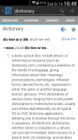
@mikelove, my last comments regard the two-panel layout. But I'm now trying the one-panel layout to see if adapting to that essentially gives me the same performance. In one-panel, the input bar is actually desirable because it pushes the top entry down just far enough to be reached with the thumb, which is a must-have. In other apps, I've used dummy items as padding to force the top item down far enough to be one-handed. But then the DICT-STROKE-... bar is uselessly unreachable, and even though I rarely use SCW, I will really want to use SENTS. In that case, it's back to the request for left-right swipability to get to the screens whose tabs I can't reach with my thumb. I really don't know what you mean about swiping left and right being a metaphor for hierarchy in this app. Where do we ever do any finger swiping? It seems to me completely normal, natural, and widespread to swipe back and forth between screen when there's a row of tabs at the top. For example, Dictionary.com's app works that way (I've attached a screenshot). Is there some misunderstanding here?
 

Attachments

  • Dictionary.png
    Dictionary.png
    445.7 KB · Views: 532

alex_hk90

状元
I want the bigger phone simply to be able to see more info at a time. I don't even watch video. I've considered downgrading to smaller, but I use my phone for notes when I'm speaking in public, and any smaller won't work, plus I'd have to give up some premium features (e.g. removable battery and external SD card) on that smaller phone. S4-sized phones are really quite one-handable, but ONLY if you can use a couple of apps that require root. The killer app for this is here:
http://forum.xda-developers.com/xposed/modules/mod-one-handed-mode-devices-t2735815

but it still needs development.

The phone I use (Sony Xperia Z1 Compact) does have an external SD card slot, but no removable battery (I agree that would have been a nice feature, but luckily the battery life is good enough without it).

And yeah I saw that app/mod on xda and would probably use it on my S4 if it wasn't a work phone (no root allowed for security reasons).

Back on topic, I think the left-right swipe for moving between those tabs was discussed on one of the 3.1 Beta threads - can't remember the conclusion though.
 

mikelove

皇帝
Staff member
I don't honestly think the "bloat" of that section bar is bothering enough people to be worth fragmenting our UI in this way; if a lot of other users write to say they never use anything but DICT either and would we please add an option to get rid of that bar then we might consider it, but I'm skeptical. I don't think we'd bury it in "expert" in any event, since that's essentially trying harder to make sure nobody uses it - if it doesn't have enough support to be worth a full-fledged option then it's probably not worth doing.

As for swiping, aside from the hierarchy problem (we use left/right in transition animations, as I said - it's not the swipe itself, it's the positional relationship it implies), three reasons I'm against that at the moment: #1, it interferes with STROKE (you might not use it, but a LOT of people do, and you're going to be swiping past it to get elsewhere), #2, in our testing it tends to get easily mixed up with edge swiping (used for the sidebar on Android and as both that and a back button on iOS) (we disable edge swiping in STROKE for that reason), and #3, if we manage to overcome #2 we've got a couple of other things we think we might like to use that gesture for in other places; for example, as a way of performing extra actions on specific dictionary entries or on specific list items. So it feels wasteful to take this very convenient gesture and use it as another way of accessing something that already has an onscreen button, at least not unless we're sure we don't have a better use for it.
 
Last edited:
Top