You are using an out of date browser. It may not display this or other websites correctly.
You should upgrade or use an alternative browser.
You should upgrade or use an alternative browser.
Feature request (various things)
- Thread starter Peter
- Start date
rizen suha
状元
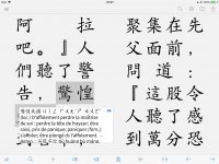
by golly. i am the one marking the text up. my attention is already on that text. all i need is all but the slightest confirmation that the text has actually been selected. underlining will be good enuff. a border (that was the translucent box "joke") will be even better but does have a minimal visual drawback when spanning lines. so, now, when can i have my way??Underlining of Chinese characters never works very well visually, at least not to me - takes too long to register them as highlighted.
Option to disable translucent dimming: I'm reluctant to go against Apple UI guidelines on that one, at least unless a *lot* of other users complain about it. When you're layering white boxes on white backgrounds you kind of do want something to set off the foreground slightly and that's the way they currently do it. (I'm hoping iOS 12 brings back shadows in a more aggressive way or does something else to provide us with a better alternative to the current approach)
rizen suha
状元
or super gollistically, just make that darn greyed box a very tenue grey. let the user select how tenue. my poor eyes are taking a toll with the current "low-lighting". many thanks.
rizen suha
状元
not at all shun. input whose intention is constructive, always contributes _something_ of value. so, i certainly appreciate your effort. thanks
rizen suha
状元
screen reader, feature request. im reading a very long novel. in that process, i get to pick out the correct "reading" (= segment words + select pronunciation + select specific meaning). it would be very handy if my "reading" could be saved alongside the document. with this, i would be able to have pleco read parts of the novel (or the entire novel) aloud to me. not a machine interpreted reading, but a (mostly) correct reading. can do? this saved reading would also (as earlier suggested) allow for "unambiguous" tone coloring to be applied to the document (although, tbh, as i progress, i can see myself living without that crutch). also, readings could be shared among users (on pleco "readers", on public domain books, etc)
That one would be a bit of a challenge - I can see that it might have some value, but we're juggling a lot of different documents in a lot of different formats and reliably saving your choice of reading for all of them at the correct word position would take a LOT of work. So another case of something that might be interesting eventually but that's likely still a while away due to the work involved.
rizen suha
状元
so how about this programming "easy" solution that will break nothing in terms of ui context and serve me (and others i am sure) perfectly: instead of "highlighting" the selected text, "highlight" (that is, dim!) everything elseUnderlining of Chinese characters never works very well visually, at least not to me - takes too long to register them as highlighted.
Option to disable translucent dimming: I'm reluctant to go against Apple UI guidelines on that one, at least unless a *lot* of other users complain about it. When you're layering white boxes on white backgrounds you kind of do want something to set off the foreground slightly and that's the way they currently do it. (I'm hoping iOS 12 brings back shadows in a more aggressive way or does something else to provide us with a better alternative to the current approach)
rizen suha
状元
rizen suha
状元
definitive solution: selected text, set saturation 100%, other text set saturation 50% (fx). specifically, with black text, set selected text to rgb 1 0 0, other text to .5 .5 .5. forget about underlining, framing, masking.That's an interesting one, actually - would have to see how it works aesthetically (and it isn't unambiguously 'easy', but it's easy enough to do some test mockups + not impossible to implement if we like how that looks).
We can't just 'set saturation,' though, this isn't a Photoshop image. Would need to capture all of that part of the screen, make sure that process didn't cause it to get mis-aligned or otherwise screwed up, adjust it, then draw that captured/adjusted image over the existing background, making sure to update it instantly whenever the view behind it updated. Not impossible, but a non-trivial amount of work.
rizen suha
状元
me not understand. im talking about an e-pub. i can already set the "foreground" color as i like for the entire text. are you saying that it would be hard to set the"foreground" color "selectively" (selected text one color/saturation and other text another color/sat)?We can't just 'set saturation,' though, this isn't a Photoshop image. Would need to capture all of that part of the screen, make sure that process didn't cause it to get mis-aligned or otherwise screwed up, adjust it, then draw that captured/adjusted image over the existing background, making sure to update it instantly whenever the view behind it updated. Not impossible, but a non-trivial amount of work.
Yes, it would be much harder.
We can set the color for the whole thing easily because that's document-wide CSS; all we have to do is change a couple of styling values in the file.
To set the color for a particular text range, we'd have to insert a totally new HTML element that happened to correspond with the current selection every time you wanted to select something (in order to be able to style just that range of text), then delete that element when you deselect it. Which can be done (very straightforward JavaScript), but it's not something I'd want to do thousands of times, as we'd have to for someone scrolling through a document word-by-word - I don't trust that it would work reliably + without memory leaks or random page reflows or other weird behavior.
rizen suha
状元
ok appreciate your answer. hoping then for the "invert" solution instead.
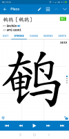
The tap areas are actually quite a bit larger than the icons - does it work if you tap a bit above / next to them?
To be honest, we did not add these buttons in the expectation that they'd be used very often - the long-term plan is to make 宋 the optional download and have 楷 the default for everyone (rather than offering both and encouraging people to switch back and forth), and lock we added in anticipation of eventually replacing it with a proper stroke order practice pad. So I'd be a little wary of making the icons themselves bigger because people who don't use them would likely find them intrusive that way, but we can certainly look at expanding the tap areas further if you're finding they're not big enough.
To be honest, we did not add these buttons in the expectation that they'd be used very often - the long-term plan is to make 宋 the optional download and have 楷 the default for everyone (rather than offering both and encouraging people to switch back and forth), and lock we added in anticipation of eventually replacing it with a proper stroke order practice pad. So I'd be a little wary of making the icons themselves bigger because people who don't use them would likely find them intrusive that way, but we can certainly look at expanding the tap areas further if you're finding they're not big enough.
The tap areas are actually quite a bit larger than the icons - does it work if you tap a bit above / next to them?
Got it.


