Beta 5 Bug Report / Feedback Thread

radioman

状元
mikelove said:
...the reader color settings only apply to the current document; the color settings in Settings apply everywhere else. (we should probably label them better) This also explains why you're seeing inconsistency when moving between reader types. Though FWIW we're considering dropping document-specific color settings in the interest of simplicity.
I would highly recommend dropping document-specific color settings. At least for me, I'm reading a Chinese text file, and whether that is a news story via the pasteboard, a PDF file, or an e-book, its all the same - 32 point white-on-black (night) or black-on-white (day), giving me high contrast. Having Hanzi provided in different ways does not make sense to me, I simply need it optimized one way for all docs.

mikelove said:
Night mode switching is really, really hard to coordinate properly so we're not eager to expand the number of places it can be toggled from.
OK on the difficulty but having a quick access cog to access settings makes sense to me.

mikelove said:
The toolbar at the top isn't supposed to be accessible even with "tap side to advance" disabled - however it looks like we may not be turning the icons in it gray to indicate that in a consistent manner.
Sorry, I don't understand. When is the tool bar (editor/cog/etc.) supposed to be accessible? This gets back to my comment about having fast access to the cog for doing things like changing font sizes and colors (e.g., switching to night reading). These cog settings seems to be typical for text readers (albeit, Pleco is no typical reader).

mikelove said:
As far as the bottom bar, as we're generally trying to make the interface less obtrusive I don't think I'd want to make the bar itself any bigger but we could consider expanding the tappable area at least.
My view would be to set the arrow area to like 3/4 inch high (or even an inch on full sized ipads). In this way, you could just be advancing off the bottom bar and not have to look.
 

mikelove

皇帝
Staff member
The toolbar is accessible when the popup is hidden. The popup interface is modal - we don't cover up the top bar any more like we used to in our old iPad app because we decided it made more sense to keep everything on the iPad in one bar, but you can't interact with anything behind the popup while it's active. So those buttons should be grayed out when the popup is visible and active when the popup is hidden.

While the reader does include arrow buttons, we actually didn't intend those originally to be used to "read along" in an entire document - we mostly meant them to be used for precision cursor positioning and perhaps the occasional tricky little turn of phrase. For learning purposes, it seems much better to only look up words you don't know; right-arrowing your way through an entire paragraph isn't going to exercise your brain nearly as much as trying to understand it on your own and only looking up the words you need help with. So if it feels like we're moving a little closer to the Kindle system in this version, it's because we think that's how people ought to be using this.
 

dcarpent

榜眼
I agree with radioman that the size of the bar at the bottom of the Reader on iPad, and the arrows there, is too small. What is the point of trying to make the interface less obtrusive if in doing so you make Pleco itself harder to use? On the iPad (not on the iPhone) I think making this bar bigger makes a lot of sense, and leaving it so small makes the Reader needlessly difficult to use.
 

mikelove

皇帝
Staff member
We don't want the bar itself getting in the way of the document, that's why it's small - particularly acute problem with our new pagination feature; to accommodate a larger toolbar we would have to either permanently make the text shorter or you can temporarily shift it when you get to the bottom of the page, neither of which is ideal. We can certainly consider expanding the tappable area, as I said, but I don't see much point to expanding the bar itself.
 

Shun

状元
I agree with mikelove that the toolbars in the Reader are high enough. I'm a little worried about something else, that is, the handwriting input. It now seems to be impossible to write characters as quickly as in Pleco 2.2, as the delay for a stroke to be recognized is longer, similar to the Android Pleco. I also preferred the slightly thicker stroke of Pleco 2.2. Did it change because of cross-platform concerns? Is there any chance Pleco could be more responsive to users' strokes again?
 

mikelove

皇帝
Staff member
You can make the strokes thicker in Settings. As far as responsiveness, I'm seeing a little bit of threading trouble here that's causing it to lag more than it should - we'll see what we can do about that, thanks.
 

Shun

状元
You can make the strokes thicker in Settings. As far as responsiveness, I'm seeing a little bit of threading trouble here that's causing it to lag more than it should - we'll see what we can do about that, thanks.

I see. Could one perhaps introduce the setting that the dictionary is checked only when the character is confirmed with a two-finger-tap or tapped in the choices? I do think it's a nice feature to check the dictionary immediately, but it would be nice to have the option to turn it off because it's bound to slow down the handwriting input, especially on slower devices, and eats more CPU cycles/battery life.
 
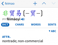
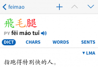
How come there is space between certain characters in Kaiti font (e.g. 非贸易)? I think headwords would look better if there were no spaces in between characters (as in 飞毛腿)... Is there anything that could be done about it?
 

Attachments

  • photo 1.PNG
    photo 1.PNG
    48.8 KB · Views: 515
  • photo 2.PNG
    photo 2.PNG
    47.3 KB · Views: 498

Shun

状元
How come there is space between certain characters in Kaiti font (e.g. 非贸易)? I think headwords would look better if there were no spaces in between characters (as in 飞毛腿)... Is there anything that could be done about it?
If I may chime in on that, I think all Chinese fonts are fixed width fonts, so the characters have to fit into a square that is always of the same size. If the character is simpler, it is in the center with more space around it; if it is more complex, it has to use more of the available square space. So I think this can't easily be changed because it's determined by the font designers.
 
If I may chime in on that, I think all Chinese fonts are fixed width fonts, so the characters have to fit into a square that is always of the same size. If the character is simpler, it is in the center with more space around it; if it is more complex, it has to use more of the available square space. So I think this can't easily be changed because it's determined by the font designers.

Ah, I see, thanks. It crossed my mind it could be related to that but I was hoping there would be a different answer... :) but it makes sense, yeah... so I guess not much can be done about that.
 

mikelove

皇帝
Staff member
afritzse - something like that, though I think we might also set it to automatically look up after say 1/4 second had passed since your last stroke (without you having begun another one).

And yes, fixed-width is a fact of life for Chinese fonts. Though we can certainly look into licensing a second, alternate Kai font at some point if we can find one that represents enough of a stylistic departure from this one to be worth getting.
 
Top