You are using an out of date browser. It may not display this or other websites correctly.
You should upgrade or use an alternative browser.
You should upgrade or use an alternative browser.
Beta 4 Bug Report / Feedback Thread
- Thread starter mikelove
- Start date
My installation has been stuck on "waiting" for a couple of days now. The obvious fixes don't work. (Rebooting changes nothing; you can't delete the stuck download.) When this happens with an App Store download, tapping to pause and then resume fixes the problem, but this app doesn't register the tap. Anyone else encountered this ridiculous situation and know how to fix it? My suspicion is that Testflight isn't setting some flag it needs to set when the download is complete... Maybe I should try deleting the web app.
alanmd - thanks! The font switch is actually unavoidable - iOS' editable UITextView control doesn't seem to handle non-system Chinese fonts well, though at whatever point we finally add editing support to our own text control we should be able to get things working much more tidily. (though personally I'd take XinGothic over a Kai font any day, a preference I get to express by making people pay to use the latter but not the former ")
I hear you on the tone color picker, but we didn't have time to come up with a large palette of tone-color-appropriate swatches (the Beta 1 ones were too bright); the current picker was easy (drop-in open-source control) and kept the same basic concept as our old not-too-frequently-complained-about color picker but with an updated look and slightly greater usability by not forcing you to manipulate two dimensions at once. Though FWIW, if you turn off tone coloring there's now an option to tint characters instead, which will get them to exactly match the color of example sentences / buttons / etc rather than forcing you to approximate with tone colors.
jlnr - very odd one, that - thanks.
Earl - ah, the joys of custom fonts - thanks. The buttons in your second screenshot seem to be from the 'Browse' screen - did this perhaps come up when you returned from a tap-hold-on-the-dictionary-icon "View in Browser" command?
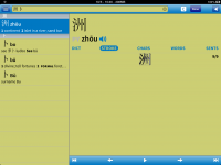
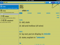
No, just once in a while.Does the stroke order diagram normally show up that tiny? Very odd.
radioman
状元
A few comments.
Overall love the new look - very clean, much better than the previous menu bar on the bottom. One small thing. In my view, the Add-Ons and Registration should be clustered with Settings and Support, because these are not active menus constantly being used. I understand about the desire not to make it difficult to find a purchasable addon. But, for me, I intuitively start looking for add-ons or registration in the setup/help sections, similar to looking for add-ons/extensions in Chrome. And having all the active menu items (i.e., Dictionary / OCR / Reader / Flashcards) clustered together makes sense. I use an iPad mini and so holding the device landscape places my left thumb right at the active menu tabs (i.e.,toward the top of the left side).
3) Too bad about the forum not being able to configure Last Message In at the top. Maybe it's just a matter of getting used to it, but I found that very convenient in the previous version of the Plecoforum board.
denmitch
探花
My installation has been stuck on "waiting" for a couple of days now. The obvious fixes don't work. (Rebooting changes nothing; you can't delete the stuck download.) When this happens with an App Store download, tapping to pause and then resume fixes the problem, but this app doesn't register the tap. Anyone else encountered this ridiculous situation and know how to fix it? My suspicion is that Testflight isn't setting some flag it needs to set when the download is complete... Maybe I should try deleting the web app.
I also was stuck waiting and finally deleted the app to start over with the download in Testflight. It was a drastic step since the data goes too, but it worked.
I want to say very strongly and I hope I speak for most Pleco users that I while I appreciate the effort of the Pleco programming team to produce the best update possible, I appreciate much more that Mike has stayed focused on the business of "the best Chinese dictionary app available". I have watched with sadness as apps change once the original designer sells out and moves on. Mike, thank you for all you do!
goldyn chyld
状元
Is it possible to turn off the vertical blue line to the left of the example sentences? Somehow I've found it to be a bit of a distraction...
radioman - you can reorder them to put them farther down via Settings / Miscellaneous, but they default to being up high because we want to make very sure that everybody is aware of their existence. (still have to get paid here - for our purposes they're even more important than Search)
denmitch - thanks! The baby + option-to-work-at-home combination makes this something I'm like to stick with for a while
golden chyld - no way to disable it, but we're weighing whether to make it a bit thinner (after a number of well-reasoned emails on the subject).
denmitch - thanks! The baby + option-to-work-at-home combination makes this something I'm like to stick with for a while
golden chyld - no way to disable it, but we're weighing whether to make it a bit thinner (after a number of well-reasoned emails on the subject).
goldyn chyld
状元
Yes, that'd definitely be appreciated - make it NON-bold, too... It seems less obtrusive here (albeit not thinner):
http://chinese.stackexchange.com/qu...-四-four-lines-the-origin-of-一-二-三-四-五-六-七-八-九
http://chinese.stackexchange.com/qu...-四-four-lines-the-origin-of-一-二-三-四-五-六-七-八-九
D
Deleted member 4086
Guest
I seem to get a 404 on the help manual.
radioman
状元
Yeah - I think that's a good approach. And as long as there is a way to move them, that addresses my concern.
radioman - you can reorder them to put them farther down via Settings / Miscellaneous, but they default to being up high because we want to make very sure that everybody is aware of their existence. (still have to get paid here - for our purposes they're even more important than Search)
Mike - I really like the new menu system, but there are times when it is a little too easy to inadvertently invoke the slide-out menu. This works well in an application like Facebook where nothing is selectable. However, in an application like Zillo, where there is selectable content, the slide-out is only invokable by tapping on the grabber.
In any case, this new version of Pleco is just awesome. Thank you for all of your hard work and dedication!
In any case, this new version of Pleco is just awesome. Thank you for all of your hard work and dedication!
Attachments
Last edited:
goldyn chyld
状元
When 3.0 is officially released, will it come with the latest version of CC-CEDICT?