2.5.0 Beta 1 Bug Report / Feedback Thread

Status
Not open for further replies.

mikelove

皇帝
Staff member
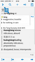
dcarpent - hmm, this actually fits with a few other reports we've had; frankly the PDF reader is misbehaving enough in code that we didn't write that I'm starting to think we should call the PDF feature "experimental" and pretend it doesn't exist for now. Bad highlight positioning usually is the PDF file's fault, though.

BanMai - the reader and user dict adding bugs should both be fixed for the next beat.

As for crashes, it looks like you're using the new custom font files - delete them (the free rare-character one too, if you've installed it), reboot your iPad and see if that improves matters; there's a bug that wastes a lot of memory if you have those installed. (posted about this earlier but it was easy to miss)
 

dcarpent

榜眼
That's a little disappointing, as the pdf reader was one of the features I was most looking forward to. Esp. on the iPad, Pleco as a Chinese ebook reader would seem to be a strong selling point. I haven't tried reading Word files much as yet; has that proved more stable? iPub? I'm interested in reading scholarly books that I have to scan myself and then bring into Pleco so that I can take advantage of Pleco's arsenal of great dictionaries (the Ricci in particular). Converting them to plain text unicode files (in the past the only supported format) destroys all the formatting and makes them more difficult to read. Pdf has the advantage of being able to preserve the original format of the page with an OCRed layer underneath to allow searching.

A separate point: it would be nice, specifically on the iPad, if the navigation arrows could be a big bigger and easier to hit, esp. with the tap margin feature no longer available.
 

gabor

探花
I kinda remember that this feature was often requested and promised but I cannot find it: adding a bookmark in the reader to the SELECTION. Currently, if you have a lomg text open on the iPad and create a bookmark, it takes quite some time the next time you open the file to find the location you stopped reading, especially so with the default or smaller fonts size. I really wish there was some highlighting...
 
LMA entries appear separately from others when you perform a search - presumably because they are in traditional characters. Do you plan to add their simplified counterparts (headwords) soon?
 

mikelove

皇帝
Staff member
dcarpent - not actually dropping it, just not advertising it, much like the character component feature in the stroke order module; we don't want somebody buying the document reader to open PDFs and then getting mad when it doesn't work well.

EPUB / Word work a lot better, yes, and those are all our own code. Tap detection is actually specifically bugged at the moment (can easily dismiss by accident by touching the wrong corner of the toolbar) but will be fixed in Beta 2.

gabor - that one got dropped, we had time for most of our planned reader updates but not for that one. Hopefully in another release or two.

golden chyld - we have a way around that but we haven't updated the LMA database for the new app yet; the only updated dictionaries available for Beta 1 are PLC, CC and the two ABCs.
 

gabor

探花
Mike, about pdf: when the user opens a pdf in the file reader and discovers he can not use it in the reqder, there could be a button there opening the file in OCR at least... I guess many users cannot even differentiate between a text PDF and a scanned PDF, which has not been OCRed. Can Pleco differentiate between the two?
 

mikelove

皇帝
Staff member
Mike, about pdf: when the user opens a pdf in the file reader and discovers he can not use it in the reqder, there could be a button there opening the file in OCR at least... I guess many users cannot even differentiate between a text PDF and a scanned PDF, which has not been OCRed. Can Pleco differentiate between the two?

We can, to-do item we haven't gotten around to yet.
 

jlnr

进士
Some screenshots I took today. Only minor layout stuff, the dictionary was rock solid all day :)

IMG_4904 - It would be nice if the popup was larger to avoid the scrolling in some cases
IMG_4915 - There's an empty toolbar overlay on the bottom of the Search Cards screen on iPhone, it persists through app restarts so it's not a one-time bug
IMG_4916 - Not sure how it happened, but after a bit of using it, the side menu could scroll further down than it should (I'm not dragging anything in this screenshot)
 

Attachments

  • IMG_4904.PNG
    IMG_4904.PNG
    90.5 KB · Views: 576
  • IMG_4915.PNG
    IMG_4915.PNG
    60.6 KB · Views: 546
  • IMG_4916.PNG
    IMG_4916.PNG
    106.1 KB · Views: 620

gabor

探花
If the popup reader is open there is all kind of arrows on the bottom. I would REALLY prefer if the tap area of these buttons were larger. I just played around on the iPad with the next word arrow (most right arrow) and realized that if you tap slightly under or right from it (corner of the scren), it closes the popup. I totally prefer the behavior in old Pleco, where you can tap all around the next word button. Even in the corner of the screen. I consider it more user friendly.

Edit: I just tried all the other buttons, same for all, I would really prefer if the ENTIRE button area is tapable. Simple rectangle shape tap areas covering the bottom of the screen when thr popup is open. Imho
 

mikelove

皇帝
Staff member
IMG_4904 - that size was picked because it's the highest box we can reliably fit (regardless of text location) on a 3.5-inch iPhone screen; however, we could look at making it a bit taller on 4-inch ones like this.
IMG_4915 - thanks.
IMG_4916 - hmm... did you maybe clear your document history?

gabor - this should be fixed in Beta 2.
 

jlnr

进士
IMG_4916 - hmm... did you maybe clear your document history?

No, I don't use the reader on my phone, and I didn't start or stop flashcard sessions either. I also don't use the personal hotspot/voice memo OS features, so my usable screen size should have been constant. Anyway, it's better to have too much than too little scrolling area :)
 

gabor

探花
The redesign of Pleco is really beautiful, but I just found these buttons in the file browser with editing enabled (delete, move, copy, pack and email), I consider those could be improved a bit if you find some time to do that. The way I think iOS is going is for example the new buttons in the AppStore on the bottom of the screen. Slightly larger area, text below line image, no border, buttons not spread over the entire area. The example is probably not very good, since the buttons in the AppStore are not file operations, so I searched on and found a similar edit feature in the Photos app, it reveals buttons on the top left.

I can see this is very (VERY) marginal, most people will not do complex or many file operations, so this is really just a small suggestion. You could just as well leave it as it is and probably noone would notice :)
 
Last edited:

mikelove

皇帝
Staff member
jlnr - heh, yeah, really a mystery then... any chance it might have to do with your rotating the screen?

gabor - we know that the trend is away from bordered buttons, but in this screen and in Organize Cards we think borders work better since there are just too many operations otherwise - Apple's unadorned text buttons work OK for 2-3 options but not for 5.
 
Two items I would like to highlight (since most of the others have already been reported).

First, as seen in the attached, occurred when I was downloading all my purchases and noticed that the progress bar was not always complete even though the downloads were all complete.

The second was, after I had installed the handwriting module, I didn't know how to access it until I was poking around and tapped on the "Radicals" button, which launched the handwriting mode, after which it turned into a Radicals and Handwriting button. I think it would make much more sense if it said so on the start… although at the same time, the abbreviations aren't all that helpful. Perhaps having an icon may be better?
 

Attachments

  • photo 1.PNG
    photo 1.PNG
    74.7 KB · Views: 579

mikelove

皇帝
Staff member
Thanks for these.

Progress bar bug should be fixed in Beta 2. As for handwriting, we've fixed the bug (so it updates immediately) and actually opted to replace "radical' with just "handwriting" since "hwr" is indeed confusing and we're not confident that icons will be any clearer; you can still get to the radical screen by switching to it from handwriting, just as you can now, but we think most people interested in radical input will still be able to find it this way.
 

gabor

探花
Thx Mike for all the answers.

New bugs:
Editing a new text file on iPad in landscape mode fails.
1. Open a textfile and tap the pen icon for editing and tap into the document so the keyboard opens.
2. Turn the iPad to landscape mode.
Current: edit area turns grey.

3. Now tap the brush(HWR) icon.
Current: broken hwr with missing buttons opens up.

See screenshots.
 

Attachments

  • image.jpg
    image.jpg
    71.5 KB · Views: 571
  • image.jpg
    image.jpg
    44.5 KB · Views: 559

gabor

探花
Another one:
Description: creating a new user entry or deleting it does not refresh the search results.
1. Create a new user entry to an existing dictionary entry.
Current: it does not appear in the results afte saving it, you need to search again.
2. Now delete this entry.
Current: the deleted entry still appears in the results.
Expected: after these operations the current search results could refresh with the new/deleted entry appearing/disappearing.
 

mikelove

皇帝
Staff member
Thanks - this one also exists in the old app so we may end up waiting until a dotdot update to fix it but we'll certainly take care of it soon.
 

gabor

探花
Desc: tapping "Card Info" when trying to add a duplicate flashcard doesnt work
1. Select a word.
2. Add to flashcards by tapping the icon.
3. Now select the word again and add to flashcards again.
4. Tap "Card Info" on the popup.
Current on iPad: popup closes, nothing opens.
 
Status
Not open for further replies.
Top