2.5.0 Beta 1 Bug Report / Feedback Thread

Status
Not open for further replies.

Shun

状元
Sorry, not quite seeing the use case here - wouldn't one normally open the menu in order to get somewhere else?

Yes, but if it's possible to do technically, it would make the right side of the screen feel more dynamic. I think that users appreciate flexibility. (for example, to quickly look something up they've forgotten to check, without having to close and reopen the menu) It would be more easter egg-like, but show off the flexibility of the technology.

However, I'm not sure if this is possible: When tapping outside the menu, the menu closes. When scrolling, it scrolls.

I believe most of that is actually defined as fractions of the current font size - to be honest, making this customizable creates so many testing headaches (not to mention more options when we're trying very hard to have fewer of them) that I'm strongly disinclined to do it, though I'm certainly open to tweaking the built-in values if there's widespread consensus that something is the wrong size.

Will dictionaries other than Plecodict also get the barred design in the future? If so, one could perhaps introduce one single setting that affects the amount of whitespace. Without a setting, I would increase the vertical distance betweeen Plecodict example sentences by 100% to maybe two thirds of a line height, then perhaps make the bar a little bit wider. As we are aware, one of the advantages of electronic dictionaries is that entries do not need to look as crammed as in a printed dictionary, where every bit of space is valuable.
 

mikelove

皇帝
Staff member
It's certainly possible technically, but frankly that space seems to me like it's more useful as a dismissal area for the section bar - if you open it by accident you tap in the window that just slid away and it comes right back.

As far as the barred sentences, yes, all of our dictionaries are getting them, but we've actually had a lot of complaints about the amount of whitespace between examples in our old app so I'm wary of separating them that much by default; we may not need to worry about wasting paper or ink, but more whitespace means more scrolling (especially with more than one dictionary involved).

But if we get a lot of complaints about them being too tightly packed after we release this, we can certainly consider adding an option - we're just generally trying to err more on the side of not having options until people actually request them.
 

Shun

状元
In the Organize Flashcards view, I would eliminate one of the magnifying glass buttons because they do exactly the same. I would keep the one on the right.
 

mikelove

皇帝
Staff member
In the Organize Flashcards view, I would eliminate one of the magnifying glass buttons because they do exactly the same. I would keep the one on the right.

Yes, I think that one was flagged in another thread - we're actually keeping the one on the left, though, since we want the results of the search to display on the right.
 

mikelove

皇帝
Staff member
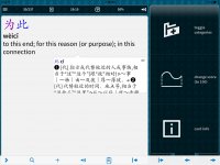
Feedback request for the soon-to-be-released Beta 2; here's a simpler redesign of the section bar - does this look like an improvement over the current one?

Screenshot 2013.09.25 01.18.52.png
 

Shun

状元
- This may have been reported before: I tried to export flashcards, but after changing a few settings, the dialog box went blank.

- Is there now some way to directly get to a flashcard after adding it? (to change it to a custom card and add notes)

- The flashcard list view doesn't follow the setting (definition lines, show statistics) I made in the Flashcard module settings. The card statistics are never shown in the list.

- I find it a little confusing that the section bar remembers the vertical position it was in the last time it was visible. If it always started at the top, I would know the individual items' position without having to look closely.

Love all the other changes like ordering by frequency of words, or sequential flashcard category splits.
 
Last edited:

weingin

秀才
Feedback request for the soon-to-be-released Beta 2; here's a simpler redesign of the section bar - does this look like an improvement over the current one?
I have to disagree with afritzse, I much prefer the new design! Maybe you could keep the lines between the individual items, but other than that: perfect. The old one doesn't really fit in with the rest of the UI, I think.
 

paschke

Member
Mike, I really like the new look for the section bar. I think the new UI is coming together really nicely. It's very intuitive, modern, and comfortable to use.

Two minor UI issues that I've noticed through continued use:

1. When clearing the search box between repeated word lookups, the little x on the right side of the box is a small and inconvenient tap-target. Would it be possible to promote that to a full-fledged button? Or, since you're already using a custom keyboard layout, could you add a clear button there? Or, I'd happily sacrifice the up-down arrows on the far right of that line for a nice delete button. (I find the up/down arrows to be of very limited use ... just tapping on the entry I want in the list on the left is far more natural.)

2. When using the document reader, changing the dictionary for popup definitions is not as easy as it could be. The tap-and-hold on the dictionary name does away with the nice cycle-through-the-dictionary function available in the old version. That might be the only UI element of the old version I miss!
 

Shun

状元
2. When using the document reader, changing the dictionary for popup definitions is not as easy as it could be. The tap-and-hold on the dictionary name does away with the nice cycle-through-the-dictionary function available in the old version. That might be the only UI element of the old version I miss!

Here, I think the cycle-through function of the old dictionary would be less intuitive and prone to over-tapping. But I would favor the option to scroll through all dictionaries in the pop-up window, as it doesn't include any example sentences, the small window shouldn't get overloaded. The pop-up window could have a more variable size, up to perhaps twice the current screen area, if there's a lot to display.
 
Feedback request for the soon-to-be-released Beta 2; here's a simpler redesign of the section bar - does this look like an improvement over the current one?

New section bar is better: icons are more quickly identifiable. And unnecessary thin horizontal lines between items in sections are gone. Usability plusses all around
 

mikelove

皇帝
Staff member
afritzse - hadn't heard of the flashcard export one before, thanks. You can get to a flashcard after adding it by tapping on the + button again and tapping Card Info in the duplicate dialog.

Not sure what's going on with the flashcard lists, perhaps our setting removal went a bit too far in this case.

Resetting the bar's scroll position is something we've had one or two other requests for too but I'm hesitant because it seems unexpected (you're not really seeing it jump up since it doesn't do it until you close it). To be honest the expectation was that most people would manage to fit all of their most used functions in one screen height's worth of area so as to make the issue moot - you can reorder the list in Settings / Miscellaneous.

weingin - yeah, the design and coding for the old one pre-dated iOS 7 actually.

paschke - thanks! On 1) I'd be more inclined to make the clear button's tap area bigger than to expand the button itself - extremely important to keep the feel of our main screen as lightweight and minimalist as possible. 2) is a bug - you can work around it for now by going into Settings / Dictionary / Manage Dictionaries and turning off "skip on button tap" for each dictionary you want to be able to switch to.

afritzse - I don't really see that working on an iPhone, but perhaps as a future iPad-only option.

Beijingmac - thanks!
 

paschke

Member
Mike,

Thanks for all the work you're doing and the great interaction on this thread, as always. I agree with your push to keep the UI simple and clean. It's great.

One observation from behind the Great Firewall -- the database update check on startup makes the app load pretty slowly, so many of us over here will probably end up wanting to turn it off. As an alternative, do you think you could set it up so that check only happens once a week or so instead of every time you start the app? (You could make that a setting, but I know you're trying to thin out the settings as much as possible as well...)

I'd be happy to live with an occasional lag in startup, but having the Great Firewall slow me down each time I start up the app is a little too much.
 

Shun

状元
New section bar is better: icons are more quickly identifiable. And unnecessary thin horizontal lines between items in sections are gone. Usability plusses all around

I like the look of everything but the spacing. The items should be a little closer together. That way, more would fit onto the screen, too.
 
Last edited:

mikelove

皇帝
Staff member
paschke - The database check is actually bugged - it's supposed to only trigger once a week and should do so correctly in Beta 2.

afritzse - That's actually a touch area problem; the spacing is currently the Apple-recommended minimum of 44 (scaled) pixels, and since this is an important / frequently-used control we'd rather not make it any smaller.
 

jlnr

进士
Feedback request for the soon-to-be-released Beta 2; here's a simpler redesign of the section bar - does this look like an improvement over the current one?

View attachment 1001

I think the status bar colour flip doesn't work very well in the top right corner. Maybe the topmost part of the menu could just be a little brighter so that the status bar text can be permanently black? - But that would clash with the flashcard session screen… :/

Would tapping sections to fold/unfold make sense? OS X has them everywhere, and the sections are big enough to be tappable. This could reduce scrolling a lot in (my :)) day-to-day usage.

Screenshot - in the WORDS section of an entry, TC/SC are flipped, or maybe SC just always comes first.
 

Attachments

  • IMG_4807.PNG
    IMG_4807.PNG
    119.3 KB · Views: 580

mikelove

皇帝
Staff member
Status bar is tricky, yeah - we tried a lighter top bar but that looked terrible so to be honest we're inclined to keep it this way for now.

As far as sections, the plan on that is to end up with few enough sidebar items that this isn't an issue - we'll probably make the file / image histories collapsible, though.

WORDS issue is a known bug, thanks - already fixed for Beta 2.
 

dcarpent

榜眼
Update on frozen screen with pdf file: I reported that my most recent attempt to open the file was successful. I just tried again, and this time I was met with the same old dark grey screen; add-on fonts still not installed. However, this time I noticed something new. While the button to open the sidebar menu is still inactive (it looks greyed out and doesn't respond when tapped), I discovered totally by chance that if I tap and hold on the button (the small three parallel horizontal lines) and then DRAG it to the right, the sidebar menu reappears and Pleco is still functioning. But tapping the button normally does nothing. The page appears as if frozen. Dragging elsewhere on the page also does nothing (except for opening iOS 7's control panel and notification panel at top and bottom). But what is weirder is that I open some other pdf files and they behave normally. So the "Chapter 14" file that I sent earlier may have some problem, even though I created it at the same time and in the same way as some of the other files that seem to be working. Odd.

One question: must the pdf reading default to showing two pages in landscape mode? I have a file that I specifically created to have only one page of a book on one page of the pdf, rather than showing two scanned pages at once (as in the originally scanned file). But it insists on showing me these pages two at a time in landscape. The highlighting of selected characters is also sometimes off. Perhaps this is an issue with the pdf file more than the pdf reader. I have no idea.
 

BanMai

秀才
In flashcards, setting a different dictionary and then looking up the words within the window would not show up anything or jst crash the app. My guess is that the pop up bubble shows up below the window...
 

Attachments

  • image.jpg
    image.jpg
    389 KB · Views: 545
  • image.jpg
    image.jpg
    375.9 KB · Views: 498
  • image.jpg
    image.jpg
    433.8 KB · Views: 519

BanMai

秀才
Also adding flashcards from a user dictionary ends in an error

Another addition: the flashcard app is so buggy. Keeps on crashing esp with the pronunciation on. Most importantly, when it crashes, my session is not saved :( and the cards I added during the session also disappears...
 

Attachments

  • image.jpg
    image.jpg
    371.8 KB · Views: 618
Last edited:
Status
Not open for further replies.
Top