Why no character standard in Pleco?

feng

榜眼
I wanted to put this in the Current Products section, but you have to pick Apple or Android, and I am guessing the problem exists in both (though I am using an iPad, so tell me if I am wrong).

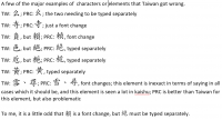
Pleco in regular (aka traditional) characters does not adhere to either Taiwan or the PRC's standards (or even make up its own reasoned standard). It is a random mix. I do not mean 為/爲, where both are listed when set for regular characters. I mean characters like 骨 and 過 which Pleco does the PRC way even as a regular character for the latter (both of which are nearly only seen that way in post-1949 PRC), whereas 爭 and certain others are done the Taiwan way (which the PRC opted out of even when traditional characters are used). There are further issues with Taiwan and PRC forms having separate entries, but also some things where example sentences use different forms than the entry uses, or a Taiwan form used for the head character when regular characters are turned off.

This is a highly abbreviated comment and question since I am not here to proofread Pleco, but I am wondering why things would be this way since Pleco has been around for some years now (15?), and the standard forms for both countries well predate Pleco as a company. I have been experimenting with the free version of Pleco as I am a Casio and 萌典 user (two different flavors, but each true to their original recipe, so to speak).

Simple questions: Why? Will this be fixed?
 

Abun

榜眼
If I may ask a side question, what is the difference between the PRC and TW ways of writing traditional 爭? If I go through my fonts, both 新細明體 (my standard TW-style font) and 宋體 (standard PRC-style font) seem to write this character the exact same way.
 

wibr

进士
Have you tried the different fonts available as Add-ons? The Source Han Sans fonts should provide a consistent standard, I think.
 

mikelove

皇帝
Staff member
The fundamental problem here is actually not with fonts or with Pleco but rather with character encoding standards; some differences like 争/爭 are manifested in separate character codes (which is why I can easily enter both forms of that character here), while others like 骨 and 過 aren't. There are ways to differentiate between multiple 骨s in Unicode, but they're awkward and tacked-on and so ignored by most font and dictionary makers. So even the body charged with standardizing Chinese characters internationally does not have a consistent standard on this :)

The built-in font in Pleco is optimized around simplified characters; this is simply a matter of download space, most of our customers use simplified, we have to embed at least one font (because pre-iOS 9 the Chinese fonts built into iOS were quite unattractive, and many Android phones even in 2015 do not ship with a Chinese font at all), and that's what the majority of our customers use. Embedding two fonts in order to render bracketed traditional characters in a separate traditional-optimized font would use a ton of download space for something that very few of our customers actually care about, and those customers can easily download a separate free traditional-optimized font.

However, in (probably) our next iOS update we plan to start defaulting to Apple's beautiful new iOS 9 Chinese font "PingFang" (along with requiring iOS 9) and making our current Chinese font XinGothic an optional download even in its simplified form, and at that point we might also consider adding code to use a different font for the TC portions of headwords. On Android the path forward is less clear - I don't imagine we will ever be able to rely on the presence of a high-quality Chinese font as we can on iOS - but once we've got the code in there anyway for iOS we'll probably support mixed-font headword rendering at least with an optional download.

If you simply prefer traditional, you can go into Settings / Languages + Text and select PingFang TC as Pleco's font now, or use the free optional add-on download "Source Han Sans TC" or "XinGothic TC" fonts, but in the current version of Pleco we would end up using that to draw both simplified and traditional characters.

Different forms in example sentences usually show up when something was originally just a "see X" entry and we linked it directly to that entry instead to save you a tap; you should also see a "VARIANT OF ..." at the top of the definition to make it clear that we did that. We don't replace the character in the example sentences in that case because there's always the chance a particular dictionary might be wrong about something being a perfect replacement for something else, or that the editor who wrote that "See" entry didn't double check against the example sentences in the entry they were "See" ing - better to keep the original character so that it's clear to the user this was a "See" and the example sentence did not originally appear in the dictionary with the variant character.

Entry splits / variants are mostly just a result of the imperfections in text encoding systems, though it also doesn't help matters that it's really really hard for us to license good content in traditional characters - even the Ministry of Education (despite their objective of promoting Taiwanese Chinese around the world) are uninterested in working with us, we only eventually got our hands on MoEDict when they open-sourced it (and even that was originally under a 'non-commercial' license that necessitated the awkward workaround of the awesome @alex_hk90 making it into a user dictionary so that we couldn't be accused of commercializing it ourselves).
 

feng

榜眼
Abun: 爭 is 争 in the PRC, whether in current or traditional form. The two forms do type separately.

Wibr: Thank you. I will try this and what Mike recommended.

Mike: Thank you for your reply.
I am talking about the official forms of the Ministries of Education for Taiwan and the PRC. I would respectfully disagree with your characterization of Unicode as "the body charged with standardizing Chinese characters internationally", unless they may have charged themselves :p

If their feelings aren't too hurt by the forgoing statement, and if you know someone in charge of Chinese for Unicode, you should put us in touch. I've spent a lot of time researching character forms. It's all well and good for Unicode to worry about tens of thousands of characters or parts that 99.9999999% of computer users will never need (though they're missing some important ones), but I would like to see them work on the five thousand or so that get used regularly, many of which have two or more legitimate forms (Taiwan, PRC, historically 'standard', calligraphically 'standard', etc.). In almost all cases, it's quite straightforward what is needed. At the very least, I wish I could find someone who would like to modify a relatively small number of characters in the Taiwan MoE font, since for the most part Taiwan's forms are historically good and currently consistent.

As for 骨 and 過, both the Taiwan or PRC versions tend to stay when typed into a webpage, except some or all (haven't kept track) PRC social networking sites change them. When typed into Word, the Taiwan or PRC versions show up automatically when I am typing in Micrcosoft's Taiwan or PRC traditional inputs.

I share your frustration with Taiwan's Ministry of Education's self-defeating policies, and I clearly expressed this to them just last year. It would be simple and cheap for them to do a lot more to popularize traditional characters. It boggles my mind. Still, since I can legally download their font for use on computers, one would think there is a way to legally get it to users on iOS, though I realize iOS has it's own font problems.

Sorry to bother everyone; I guess I'm just an unrepentant dinosaur :rolleyes:

Gratuitous input method rant: On Windows, the speed of Taiwan input has been kneecapped; PRC traditional input has a mix of character forms, even missing 只 entirely; MacOS does significantly better (as far as I can remember), but oddly neither of them bother to simply enter a large corpus of multi-character words so they can come up with what you want; neither of them are very good for learning your regular usages; Sogou does a lot better, but that is simplified input, even when traditional (as is MS PRC traditional input), and Sogou was annoying for other reasons. iOS' zhuyin input is on the right track, but again has huge corpus deficiencies. These are straightforward issues, inexcusable, so I am always amazed that these problems persist. I first typed Chinese on a computer in 1999, and the problems have not been solved in all that time. The solutions are right there. Apple, Microsoft: I'd be happy to outline this for you in a 15 minute chalkboard presentation. We're talking about Chinese, not some rare langauge used by three thousand people. Hire a few people and get this done already.
 

alex_hk90

状元
At the very least, I wish I could find someone who would like to modify a relatively small number of characters in the Taiwan MoE font, since for the most part Taiwan's forms are historically good and currently consistent.
If the Taiwan MoE font is open source, and the number of characters are genuinely relatively small, then I'd be willing to give it a go. :) I might not be the best person for this though as it's been many years since I properly looked at modifying fonts. :oops:
 

mikelove

皇帝
Staff member
Fair enough on Unicode, but their standards are the ones that most people follow, and both the PRC and Taiwan contribute to, so even if they don't enjoy any official status on that front they're basically setting out the ground rules for how we handle character sets. But in any event they do have a mechanism in place to handle this stuff through variation selectors, it's just that nobody uses them.

As far as Unicode standardization people, to be honest the best bet on that might be to type up something + submit it officially to the IRG. My guess, however, is that they know about these problems but the consortium members (most of whom are large tech companies) aren't interested in spending the resources to deal with them - improving relations between Taiwan and the PRC might actually help matters on that front, since while HTC is fairly moribund at this point there are a bunch of hungry smartphone makers in the PRC that might see flawless fanti support as worth the investment for the many new Taiwanese customers it could bring them. (or it may just be that Taiwanese customers have resigned themselves to mangled characters and no longer care that much, in which case it'd take a large grant from the MoE or someone to jumpstart the process)
 

feng

榜眼
If the Taiwan MoE font is open source, and the number of characters are genuinely relatively small, then I'd be willing to give it a go. :) I might not be the best person for this though as it's been many years since I properly looked at modifying fonts. :oops:
Thank you. Though I previously believed it to be open source, searching about just now has not turned up any such information, and the font file itself suggests it is not. Hmmm. It is free, maybe that was the source of my confusion. I will ask the MoE the next time I email them about something.

Ironically, most of the problems with Taiwan's official forms from either historical or modern consistency standpoints are actually done right in the PRC's forms. I have attached an image with some of the most common issues with Taiwan's official forms. When writing a dictionary type document, one can pick and choose forms and it is not too bothersome (no, actually it is), but if one is writing multiple pages in Chinese, then it is too cumbersome to go search out all the exceptions that offend one's eye. Chinese characters, though not my initial motivation to learn the language, have been from the first day of class to the present my largest interest area in things Chinese, so I fuss about character forms like a prima donna.
 

Attachments

  • tw forms for pleco.PNG
    tw forms for pleco.PNG
    78.5 KB · Views: 808

alex_hk90

状元
Thank you. Though I previously believed it to be open source, searching about just now has not turned up any such information, and the font file itself suggests it is not. Hmmm. It is free, maybe that was the source of my confusion. I will ask the MoE the next time I email them about something.

If you do find out that it's open source, post back here and we can maybe try a few characters that need adding/modifying first and see how much effort it would be to fix/improve the font to be in line with your research.
 

Abun

榜眼
Abun: 爭 is 争 in the PRC, whether in current or traditional form. The two forms do type separately.
Really! I thought this was a simple case of Simplified 争 vs Traditional 爭 (zdic lists it that way as well btw; it only shows that the Japanese and Korean way of writing as well as the "旧字形" of 爭 have the outer dots of the 爪 pointing outward instead of inward). Thanks for the info.

Actually in seal script you can see that the right part of 絕 is indeed originally 刀+巴(<㔾<卩) and is different from 色 which come from 人+巴(<㔾<卩).
賴 as far as I know is speculated to have come from 剌+貝 (with the 刀 in 剌 having since been abbreviated to 刂) instead of 束+負. However the result of the second composition would have been indistinguishable even in seal script as 負 is 刀+貝 to begin with, so I guess there is no real reason why 刀 should be written in its full form in 賴 but not in 負.
黃 vs 黄 is (as far as I was taught) a Traditional vs. Simplified issue, although I have seen two different versions of the traditional form, one with 田 in the middle and the other with 由 (so the latter is distinguished from the Simplified 黄 only by an additional 橫).
The upper part of 寺 is 之 in seal script, so 土 and 士 are equally distorted if you ask me. Maybe the 士 spelling comes from the notion that 士 is a phonetic and the 土 spelling from the idea that it indicates the meaning (although both are false from a historical point of view)?
 

feng

榜眼
Abun: If there is still some lack of clarity on my part, say so and I will get back to you in some days (time is finite).

1) The history of kaishu as the standard script exceeds the history of all other scripts in their heyday combined. Even if we give oracles bones 1,300 BC, that is 1,500 or maybe 1,600 years for all other scripts combined, for their time as the standard (being generous). Kaishu has been the standard way of writing for 1,700 or 1,800 years now. If we want to look at today's forms from a full historical perspective (back as far as each one goes), not a small number of them will go partially or completely off the rails relative to kaishu. For that reason, I look at kaishu as kaishu. Nothing against etymology (I like it).

2) Since all of your etymological comments come directly from the 說文解字, may I respectfully inform you that the Shwowen forms and explanations are not infrequently at odds with the earlier forms? I'm sure 許慎 was a swell guy and did the best with the resources he had. The problem is that the resources he had pale in comparison to what has come to light since his time, particularly in the past century. Some scholars believe that 秦小篆 (the Shwowen's closest relative) was an ornamental script. Looking at what has been unearthed from the third century BC in the state of Chin leads this forum visitor to agree with them. And it is clear that many of what became kaishu forms were already to be seen in the third century BC in the state of Chin. Taiwan has a tendency to choose forms closer to the Shwo Wen forms when there is a choice, in my subjective view of things.

3) Often times the words "simplified" and "traditional", in Chinese as well, and by both Chinese and Taiwanese, are used to mean PRC and Taiwan forms. That is problematic. Taiwan uses some simplified forms (e.g. 晒 for 曬, the latter not being an official character in Taiwan, even though publishers in Taiwan overwhelmingly print it 曬, and most people also hand write it that way), and the majority of the characters in the PRC's new official list of 8,105 characters are not simplified. Also, there are a far, far greater number of simplified forms than what the PRC used. As I mentioned above, Taiwan and the PRC both published their official forms decades ago (with some minor updates recently).

爭 : It is a 新/舊字形 situation. Even 漢語大字典 says 爭 was the more common form in history, but in fanti texts published in the PRC, they use 争 (in my experience).

色絕負賴: In kaishu, over the centuries, these have been overwhelmingly written with 角字頭 on top, not 刀, by calligraphers and to varying extents when printed. My issue is that Taiwan did not stay consistent either with history or themselves; had they put 刀 on top of all of them, they would be at least consistent with themselves (though that would be a bad choice, IMHO).

色 goes back to the Warring States script where it was 爪 (爫) over 卩. It is believed to have the same meaning as given in the Shwowen, but I wonder if people would say that if the character was not in the Shwowen? I am the sort of person who requires more proof than is sometimes given in the scholarly references on this subject.

賴 exists in Warring States script, looking identical to the PRC traditional form. That does not in any way disprove the Shwowen, but I humbly suggest that it does cast some doubt.

黃(typed this way because the other one is hard to find when typing): It is hard for me to see this as a simplified vs traditional situation (and not just because the PRC does not list it as such). The Taiwan form seems more common in print in old dicitonaries. Historically, calligraphers overwhelmingly wrote it with 共字頭 on top (the PRC way), and that was the handwritten form seen in third century BC documents unearthed from the state of 秦. Interestingly, the way 共字頭 is often written calligraphically allows one to understand why persons surnamed 黃 may reference their name (i.e. which Huang) by saying 草頭黃 (though I have yet to meet such a person who knows why they say that: 艹+橫+八字底). The character huang goes back to the oracle bones and the meaning is not even in the ballpark of what the Shwowen says.

TW official: 廿+橫+田+八字底
PRC official: 共字頭+由+八字底
also seen in books from TW: 廿+橫+由+八字底
one of the common calligraphic forms: 艹+橫+八字底

寺: Yes, 之 from bronze script onward. Taiwan's choice of 士 rather than 土 is not supported historically in kaishu. Their bizarre reason is that they were trying to make the tops of characters shr rather than tu for consistency. This is their official line, no matter that there are still plenty of characters with tu on top. I should also add the fact that in bronze and some of the warring states examples it was 又 underneath, not 寸.
 
Last edited:
Top