You are using an out of date browser. It may not display this or other websites correctly.
You should upgrade or use an alternative browser.
You should upgrade or use an alternative browser.
User Interface Feedback Thread
- Thread starter mikelove
- Start date
phz
秀才
Pleco is running stable without even a single crash for months (!) and I am happy with the interface at all.
Will soon update from 4.4.4 custom ROM to LineageOS and will comment if problems occur.
There are only minor points I've noticed so far.
Positive things I've noticed:
- I absoluty fell in love with kai character style and am really grateful for this addition
Neutral things I've noticed:
- I kind of miss an responsive update checker (info on (1) timestamp of the last completed update procedure and (2) the latest version check)
- changing between song/kai character style seems to be possible only via character stroke window at the moment (maybe adding an option to settings does make sense)
- a responsive load time checker would greatly help to work on the startup of pleco (mine slowed down to 1.5seconds and I would like to know if I can improve this by internal settings)
- there could be an automatic backup feature for settings and flashcards (to minimize the risk of data loss by uploading or emailing those 1-2 files you can create manually)
- I constantly backup both cards and database (via Import/Export) and have no idea if this is even necessary for a full backup (a general description is missing for these options)
Negative things I've noticed:
- when I try to use Fill-in-the-blanks Pronunciation input, I cannot use my SwiftKey Keyboard but only a stock Keyboard (so I avoid this test mode at all)
Last edited:
Responsive update checker: not quite clear on this; we already pop up update prompts in the non-Play version, we just only check once a week because we assume a large % of people running that version are on terrible or expensive internet connections. Do you basically just want the update status to be always available in a settings screen somewhere?
Song/Kai toggle: this is actually a bit awkward to make into a setting because some characters are only available in one style or the other. Basically we remember whatever the last thing you manually toggled to is and default to that (as we do in a couple of other places with similar partial-availability problems, like the popup definition bubble dictionary selector) - translating that to a setting feels like it'd just sow confusion.
Load time check: we're pretty confident that can't be improved by settings. Pretty much anything at a level that can be done optionally in settings can also be deferred until after the app has loaded; most of our app's actual load time is taking place before our code even runs, the reason it's gotten slightly worse in the last few years is because our app keeps getting bigger as we add new features and so there's ever more stuff that Android needs to load into memory on startup.
Our load time has actually grown considerably more slowly than average mobile device CPU performance, so we expect most users haven't noticed (any slight slowdown was more than canceled out by their last hardware upgrade), but if your device is old enough to run a 4-year-old version of Android then about the only load time solution I can suggest is that you switch to our old version 2 (http://pleco.com/getoldandroid) which is a lot smaller + hence should load a lot faster.
We do automatically prompt you to back up flashcards once a week by default; you could probably also configure a third-party backup utility to back them up manually. You don't need to export the cards to back them up, a 'backup database' should be enough - we're working on a consolidated backup system for 4.0 (everything would end up in a single database file, even settings).
If you turn on "Use builtin input method" in New Test / Test Settings, that should let you use SwiftKey.
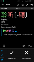
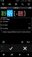
I find the swapping of button positions in the different screens rather inconvenient. Hope the buttons stay in the same positions, especially the SOUND button.
Attachments
pdwalker
状元
we're working on a consolidated backup system for 4.0 (everything would end up in a single database file, even settings
Definitely a useful feature to have. Thanks.
I find the swapping of button positions in the different screens rather inconvenient. Hope the buttons stay in the same positions, especially the SOUND button.
Good point, though I'd be wary of making the popup reader buttons function differently in the flashcard screen versus other screens; there's a decent case to be made for moving the audio button to the top right corner in the popup reader too, though.
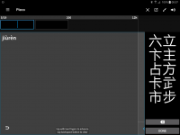
Hello. Thanks for the great app. Apologies if this has been mentioned somewhere... I have Pleco 3.2.47. What irritates me is the following navigation logic:
When you draw a character for look-up (say 子), press “done”, you get to the list of suggestions (containing "子 zi" and "子 zǐ"). But now pressing the system back button "<" gets you out of the app.
This is aggravated if you first select an item from the list (say "子 zi"), then hit the "<" button: you are back to the list. It would be intuitive now to be back to the drawing canvas when hitting "<" again.
--
Or using Pleco's back button "<-" you get back to the list but in its place appears another button. Moreover, I find this button "<-" rather small and too far in the corner, and the text "Pleco" nearby is nonclickable. If you made the "Pleco" text clickable at this point (with the functionality of getting you to the look-up screen), that would be better (because one could immediately click on the text field). Click or tap.
--
Or why not make two-finger-right-swipe (or two-finger tap) to do the go-back function in both cases? Speaking of which: in the two-finger-swipe one has to swipe rather too hard.
And btw, when the animated character strokes are being played, the two buttons "<<" and ">>" don't do anything. It would be good to use them to skip to the previous/next stroke even during the animation. And to just tap the character for play/stop.
The reason for all of this is that my cognitive capacity is already spent on looking up and trying to understand things, so little unintuitive UI moves break the flow (and reduce fun with the app).
Last edited:
Turn on "Back button opens keyboard" in Settings / Miscellaneous to get this behavior. It's a situation where the Android-y thing to do is ambiguous and subject to the user's interpretation; back returns to the previous state but it usually also dismisses the keyboard rather than making it appear, the default behavior is we think more obvious for new users but we certainly recognize that it doesn't fit everyone's internal Android navigation map.
Turn on "Back button opens keyboard" in Settings / Miscellaneous to get this behavior. [..]
cool. thank you!


