Some UI Feedback (mostly for document reader)

In case you're getting near the stage where you work on UI improvements, I have a wish list:

Document reader:
1. In the document browser, I'd love to be able to make the icons in the icon view smaller
2. I really like the new way "lock popup definition to bottom" works, but I wish it retained the screen tap functions that it has when not locked to bottom: tap center to dismiss, tap left and right to move forward/back. I think you mentioned before that you don’t want to dismiss the popup definition entirely when it's locked to bottom because then you need to repaginate, but it would be nice to have it empty out when not in use (or with some faint, generic background text like "tap a word to lookup" or something).
3. I liked the darker default for the popup definition background in 3.x. Having some contrast is nice.
4. In paginate mode, it would be nice to have a setting to display page count even when the page slider is not shown.
5. It's unclear to me why the choice to show/hide the bottom tab bar is linked to other settings. It seems like that could be an independent setting.
6. It would be nice to have an option from the reader settings menu to choose a size for the pop-up definition box from say 3 options: small, medium, large.
7. I like that the change dictionary button in the popup definition box now has some feedback, but I find the flash animation slightly obnoxious. Maybe it could be a little more subtle.
8. I like the new expand entry button because compared to 3.x it makes it clear that you're blowing up what's in the box and not going to the dictionary search page for that character, which give you different results depending on the dictionaries you enable for reader (something it took me ages to figure out on 3.x), but maybe that animation could be a bit faster? It feels slow.
9. 3.x had "make default" and "restore to default" options for all reader settings but here the clipboard reader doesn't have them. I assume that's intentional?

Other feedback:
10. For font sizes, instead of percents I'd much prefer the kind of system Apple uses elsewhere, with 6 or so discrete settings between big and small.
11. In the dictionary page, I still find the larger, left-aligned dictionary titles to be overly intrusive. A main strength of Pleco is that it compiles information from all these different sources, and in my opinion the dictionary UI in 3.x complemented that by letting you scroll through without making the sources of the information too intrusive. Now the dictionary names get in the way much more than they did before (and as others have noted, that in combination with other UI changes reduces the amount of information on screen at any one time by about 2/3).
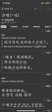
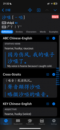
12. Font size inconsistencies between versions: I recently opened a clean install of 4.0 with 3.x data, and some of the font sizes came out differently in 4.0. See the pictures attached.

Thanks
 

Attachments

  • IMG_8064.PNG
    IMG_8064.PNG
    192.3 KB · Views: 40
  • IMG_8062.PNG
    IMG_8062.PNG
    296.3 KB · Views: 39

mikelove

皇帝
Staff member
1) Do you get 2 or 3 columns there now? We adjust it based on the text zoom level - we want to make sure they're wide enough to fit a decent-sized name under each icon.

2) Left and right taps are still available as an option - 'tap side to move' under Settings / Reader. I'm a little unsure about tap to dismiss - it feels like it's creating a lot of extra work versus simply tapping on the next word you want to look up when you're ready to look it up.

3) It should be a bit lighter than the background now - is that not coming through well for you? We were aiming for roughly the same amount of contrast in the opposite direction but if the difference is too small we can adjust.

4) Good point, yes.

5) The thinking there was that since the reader toolbar is going to be on the bottom either way - and therefore we need to paginate around a bottom toolbar - there didn't need to be separate options for the bottom slider bar and toggle.

Do you find the slider visually jarring in some way? (between this and #4 it seems like what you're basically looking for here is the same layout we have now but with the slider hidden) Would it maybe help if we made the circle darker / less obvious?

6) We're thinking about doing a 'simple' settings option for Reader Screens that would most likely have a streamlined version of bubble sizing like that.

7) That's the standard iOS one but we can experiment, it does seem weirdly obvious in night mode.

8) Good point, no reason for it to take that long.

9) Yes, default settings are now handled independently for different document types and since there's only a single clipboard document there's nothing else it could set the defaults for. But we're probably going to retool that around some sort of new 'document profile' system.

10) I think this may also end up with a simplified settings option - I wouldn't want to take away fine grained control here, since at the moment customizing a Presentation is fiendishly complicated and it's going to be very hard for people to tweak this stuff if we don't offer an easy way to do it, but it's definitely too many options.

11) This one is kind of a tricky balancing act - the old layout was consistently mystifying to new users, and it also forced us to put the dictionary slider on the bottom of the screen instead of the side; even in 4.0, before we had the idea to move it there, we were getting considerably more complaints from "power users" about the slider not showing every dictionary than we were about definitions being spaced too widely.

But I am toying with the idea of offering a 'minimize spacing' option in this screen that would both shrink the headers - they'd still be left aligned, but would be just abbreviations and very small - and eliminate the side padding. I don't think it's one I would turn on by default even for people migrating from 3.0, as I really do believe the new layout is better, but at least the option would be there for people who crave the old version's information density.

12) Thanks.
 
1. I get 3 across. I think it looks a bit cramped to have the icons extend to the edges of the text, but that's just me. Maybe two lines of text for the titles would be nice too.

One new thing here: I just realized there's no "Open Pleco Ebook option like there was in 3.x." I would probably still include that somehow. I used it often in 3.x.

2. I have left and right taps enabled but they only work if popup definition is not locked to bottom. With a tap to dismiss, I think for me I just like to be able to read without having anything highlighted on the screen unless I'm actively looking something up.

3. Oh yeah I see there is some contrast. I'd prefer more but I assume that can/will be able to be changed in settings.

5. The slider is about screen space for me. With having the reader locked to bottom I like being able to maximize space for the document. But I was just more reflecting on how it doesn't seem like the choice to show/hide the tab bar needs to be linked to showing the slider. Having a separate option for it would enable the following scenarios:

Lock reader to bottom: no slider but show/hide tab bar (more room for definition)
Lock reader to bottom: have slider and always show tab bar (if you want both always)
Reader not locked to bottom: have slider and always show tab bar (stacked)

The only scenario it wouldn't work for is if reader is not locked to bottom and slider is not shown, because then hiding would force repagination (in that case maybe the option to show/hide could be grayed out)

With the slider design, I'm used to it now, but I do remember when I first started using Pleco I did find it intrusive. But I got used to it.

6. That would be great. Along with that I'd still love the ability to customize what icons show up on the top of the reader box, i.e. replace TTS with Search Text (and maybe be able to include up to 6? there's a lot of good stuff in the share sheet).

7. Oh that makes more sense. Yeah I see now in light mode it's what I'd expect.

11. That minimized view would do it for me—it's more the size of the headings and density than them being left or right aligned. I like the new vertical slider.

Thanks

Also one new thing I noticed: TOC for Chinese History Manual (I have the older version) is not as nice as it was in 3.x, but I assume that will be fixed later. Among other things, the indents in the TOC in 3.x were nice.
 
Last edited:
Some things about Reader > Words:

I love the feature, as I've said before, and even without more tweaking it's already super useful. Right now I'm using it to get a list of all unique words in a text sorted by occurrences and then splitting them sequentially into supgroups so I can make sure I know all the highest frequency words before I read a text.

1. Along with "Entire document" and "Visible text," another nice option would be a page range (e.g. so I can prepare vocabulary for the first five pages of a document without manually making a new document with only the text I want).

2. I'm not sure what the search icon on the side of each word represents.

3. If you sort by default, the list is split by occurrences (so it's sorted by frequency?). If you sort by frequency, that information is not displayed. Or is frequency the frequency of the word in a corpus of modern Chinese?

4. For dump to flashcards, I wonder if there could be an option to make a duplicate card from the dictionary used in reader if the existing card uses a different dictionary. My use case here is reading a Classical Chinese text and wanting to only make cards using the classical dictionaries I've enabled in reader. I have no experience with duplicate cards on 3.x though, so I'm not sure how that works in general. A simpler option would be ignore duplicates and make all new cards.

5. I'm not sure what "Word Count" displays but it's not the number of words in the document.

Flashcards:
6. This was not a 3.x feature, but it would be nice to have an icon in the flashcard organize tab showing you which dictionary a flashcard comes from, either in the list or (probably better) in the detail view.

Also, I love the "back up before running" option for batch in flashcards, having forgotten to do that and messed some things up in 3.x recently.
 
Last edited:

mikelove

皇帝
Staff member
Thanks for all of this feedback!

1) We're kind of trying to land somewhere in between a modern e-book reader interface with just a bunch of giant book covers, and a grid of icons like an app launcher - I'm a little wary of going covers-only like iBooks e.g. does because we might need to translate or otherwise clarify some of them in the label. But two lines might make sense.

With 'open Pleco ebook' - sorry, you mean that you specifically want a sorted list of names in a popup menu? Any downloaded e-book should already show up in the document browser screen, and they should be grouped into folders by collection.

2) Sorry, I forgot that we don't offer that option in that case, because we want you to be able to tap on another piece of text to highlight it and you can't do that if 2/3 of the screen is designated for gesture controls. I suppose we could consider a new mode that was kind of in between - keep the gesture control and the idea of it being open / closed, but with the bubble on the bottom and space on the bottom reserved for it.

5) Hmm, yeah, though in that case maybe it would be best to simply leave the tab bar always hidden with 'lock to bottom' - bottom toolbars plus tab bars don't really go well together in general.

6) That's doable now, but you need to make a custom 'reader screen' and at the moment in addition to being awkward to inject that into everything you also need to do it multiple times for each layout configuration, both of these are problems we're working on though.

Chinese history: the intent with having the TOC collapsible was to make it easier to navigate, since it's a very long book and getting to the precise chapter you want in book 13 or wherever took a tremendous amount of scrolling in the old app. Maybe it would help if we offered a way to toggle all of the sections open / closed?

Other post:

1) Makes sense, though page ranges are a little dicey because they're reflow-dependent.

2) It searches for the word in the text. But instead of just searching for that text string like the regular search box, it gets its search results from the segmenter, so it'll only highlight it when it also segmented the document that way.

3) Frequency is the corpus frequency, yes. There should be a "# occurrences" option there in the simplified sort screen but it seems to be missing - if you set the order to 'custom' and then 'add sort field' you should see it as an option there.

4) Yeah, I think 'ignore duplicates' would probably make more sense here.

5) How does it differ? Any chance it's distorted by the presence of English words?

6) Probably makes more sense in the detail view, yes.
 
1. With lots of personal documents purchased ebooks can get lost, so it might be nice to filter by purchased ebooks vs. personal documents, but it's not a big deal.

2. Yeah I think that would be my ideal but I'll also probably get used to the way it is now.

6. Chinese History -- oh I see now that the TOC is expandable. I had missed that before. That basically solves my problem. A button for expand/collapse all would be nice but like a luxury feature.

Other post:

2. Okay, the search option doesn't seem to work for me (the icon flashes when I tap it but nothing happens). I don't need to use it, I was just wondering. The tap area for it also seems small. Most of the time I thought I was hitting it I was just tapping on the word to expand the entry.

5. Example: I opened the sentence 我是美国人 without any punctuation in the clipboard reader. The word list with default sort order and no filters is correct, showing the distinct words segmented according to the dictionaries I have enabled for reader, but the word count is showing 32 total and unique words.
 

mikelove

皇帝
Staff member
Search option: that's odd, what type of document is this?

Word count: yeah, I'm seeing 6 instead of 32 for that but definitely too many, thanks.
 
Search doesn't work in any type of document—personal txt file, clipboard, or Pleco ebook. But it seems to be doing something behind the scenes because when I tap it for a character in Chinese history it takes longer to unflash, presumably because that book is so long. (But nothing changes and later nothing is highlighted in the document.)
 

mikelove

皇帝
Staff member
I can't seem to reproduce this problem, unfortunately. Could you make a backup of your flashcard database (Organize, Import/Export, Backup Database) and then email that to me (mikelove at pleco dot com)?
 
2) Sorry, I forgot that we don't offer that option in that case, because we want you to be able to tap on another piece of text to highlight it and you can't do that if 2/3 of the screen is designated for gesture controls. I suppose we could consider a new mode that was kind of in between - keep the gesture control and the idea of it being open / closed, but with the bubble on the bottom and space on the bottom reserved for it.
After further use, another observation on tap to move/dismiss selection when reader is locked to bottom: Without that function, you can't select an adjacent character without tapping somewhere else first or using the bottom arrow. I'm building the habit of tapping somewhere else first, but having those tap areas on the screen would make that situation easier, as well as make things easier in general (especially after years of muscle memory).

Something else I've mentioned before but had a new thought on:
I'm not sure how other people use them, but the only thing I really use the <-| arrow for is to reduce the selection to a single character (and then I use the > to get to the character I want; I basically don't use the |-> at all). A more elegant way to do that would be a button to toggle single or multi-character select (maybe to optionally replace those arrows).

One more request:
- Option to increase line spacing like there’s one to increase paragraph spacing.
 

mikelove

皇帝
Staff member
Thanks!

After further use, another observation on tap to move/dismiss selection when reader is locked to bottom: Without that function, you can't select an adjacent character without tapping somewhere else first or using the bottom arrow. I'm building the habit of tapping somewhere else first, but having those tap areas on the screen would make that situation easier, as well as make things easier in general (especially after years of muscle memory)
OK, but in theory wouldn't it we better if we disabled selection handles in that mode and instead allowed you to tap on adjacent characters more easily? I just feel like the tap to dismiss / tap again to re-select is going to annoy a lot more people than it helps - my impression is that the ability to select new characters by tapping on them is a big part of why people like 'lock to bottom' in the first place.

I'm not sure how other people use them, but the only thing I really use the <-| arrow for is to reduce the selection to a single character (and then I use the > to get to the character I want; I basically don't use the |-> at all). A more elegant way to do that would be a button to toggle single or multi-character select (maybe to optionally replace those arrows).
We've played around with a few ideas on that, just not sure what we'd like to ship, and after the experience of everybody hating the new top toolbar I'm a little nervous to make any changes to the bottom one. Also, in situations where we can't support resize handles - like the Web Reader and maybe also Lock-to-Bottom - having the ability to precisely shrink and expand a selection is actually kind of important/necessary, even if it's only used occasionally.

- Option to increase line spacing like there’s one to increase paragraph spacing.
We do offer an option for that in 'custom' settings, I'm not sure if it's something we'd want to promote to simple settings.
 
OK, but in theory wouldn't it we better if we disabled selection handles in that mode and instead allowed you to tap on adjacent characters more easily? I just feel like the tap to dismiss / tap again to re-select is going to annoy a lot more people than it helps - my impression is that the ability to select new characters by tapping on them is a big part of why people like 'lock to bottom' in the first place.
Maybe. I don't think I used it in that mode when the handles were still gone to see. I like the side taps because you don't need to be precise (just tap a few times until you get to the next character you want to look up), but that'll depend on the user. But generally for all this stuff these don't need to be the defaults, just options for them would be nice. But I don't know how much work it is for you to implement and you obviously have to prioritize, so thanks anyways regardless of how it turns out.
 
Top