New App Icon

Spyral

举人
Probably the least important thing, but because I see it all day I decided to make this thread anyway.

I personally think the white border around the new icon looks really weird, kinda like it‘s inside a folder. I believe it would look better without the border.

Again nothing big, but it‘s bugging me a bit.
 
Last edited:
I agree. In general the icon looks a bit more cartoonish than the last one, which I always thought was really elegant, but I have no sense for what kind of icons are most likely to get/keep new users (since I assume everyone currently using Pleco is going to keep using it regardless of the icon).
 

Shun

状元
I like the roundness of the new icon’s font, though I agree, it may be nice to let users switch between a few different icons, with the current one as default. Personally, I like a shiny gold look for the 魚 with the KaiTi font on a red background, with a golden rounded rectangle border around it. Here's a quickly cooked-up example, everything (thickness, height, color) can be modified:

Icon draft 4.png Icon draft 5.png

https://www.gimp.org/tutorials/Golden_Text/

This is more a tongue-in-cheek suggestion, and the red corners would have to become transparent.
 
Last edited:

gregash26

秀才
I'm with lookslikerain. As soon as I saw the new icon, I was really sad. :( If I had to update the old icon, I'd possibly change the character font color to plain white like the new one. I'd maybe update the blue background. But otherwise I wouldn't have touched it. And I hope I don't hurt anyone's feelings when I say the character in the new logo looks like the comic sans of Chinese.

But I have absolutely no experience with graphic design so feel free to ignore this entire post. lol
 

mikelove

皇帝
Staff member
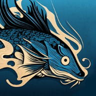
The new icon was sort of a hacked-together last minute thing; originally we had a weird cool obviously-just-a-beta AI-generated Pleco, but we decided using AI art on even a goofy beta icon might be problematic in some circles, so we threw together this one instead.

That being said, we probably are going to switch to something more YuanTi/HeiTi-style like this (albeit perhaps against a different backdrop), because the new thing on Android - and, I suspect, a future iOS update - is to let people change the outlines + color shapes of icons to match their device theme, and we need something that’s bold and clear enough to still be recognizable as a tiny low-contrast shape in the middle of a triangle or whatever.

But that doesn’t mean we can’t also offer the option to switch to the old icon, at least on iOS.
 

mikelove

皇帝
Staff member
(I suppose another option would be to hire a real-life artist who was willing to produce a human-made piece of art based on the idea from this AI one, I don't think we'd be likely to use this as our *default* icon in any case but maybe as another alternate one at least)
 
Top