Liquid Glass UI: Feedback

Spyral

进士
Hi

Just had a quick look at the new UI, looks great!

Two bugs I saw in a flashcard test:

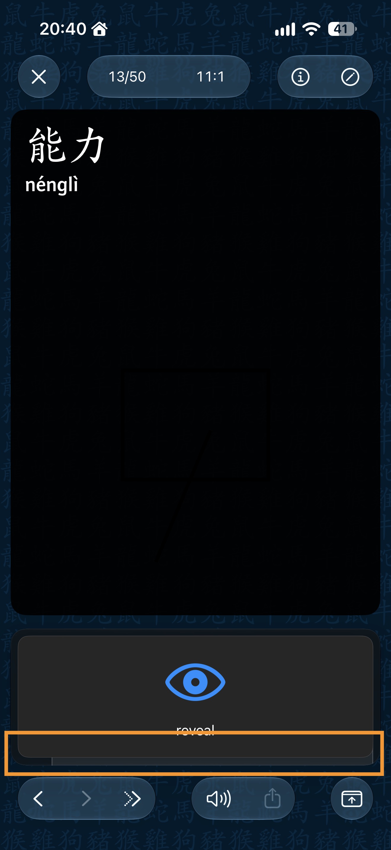
1st there is a visual glitch with a box showing below a box, see picture below.
1789670797213.jpeg


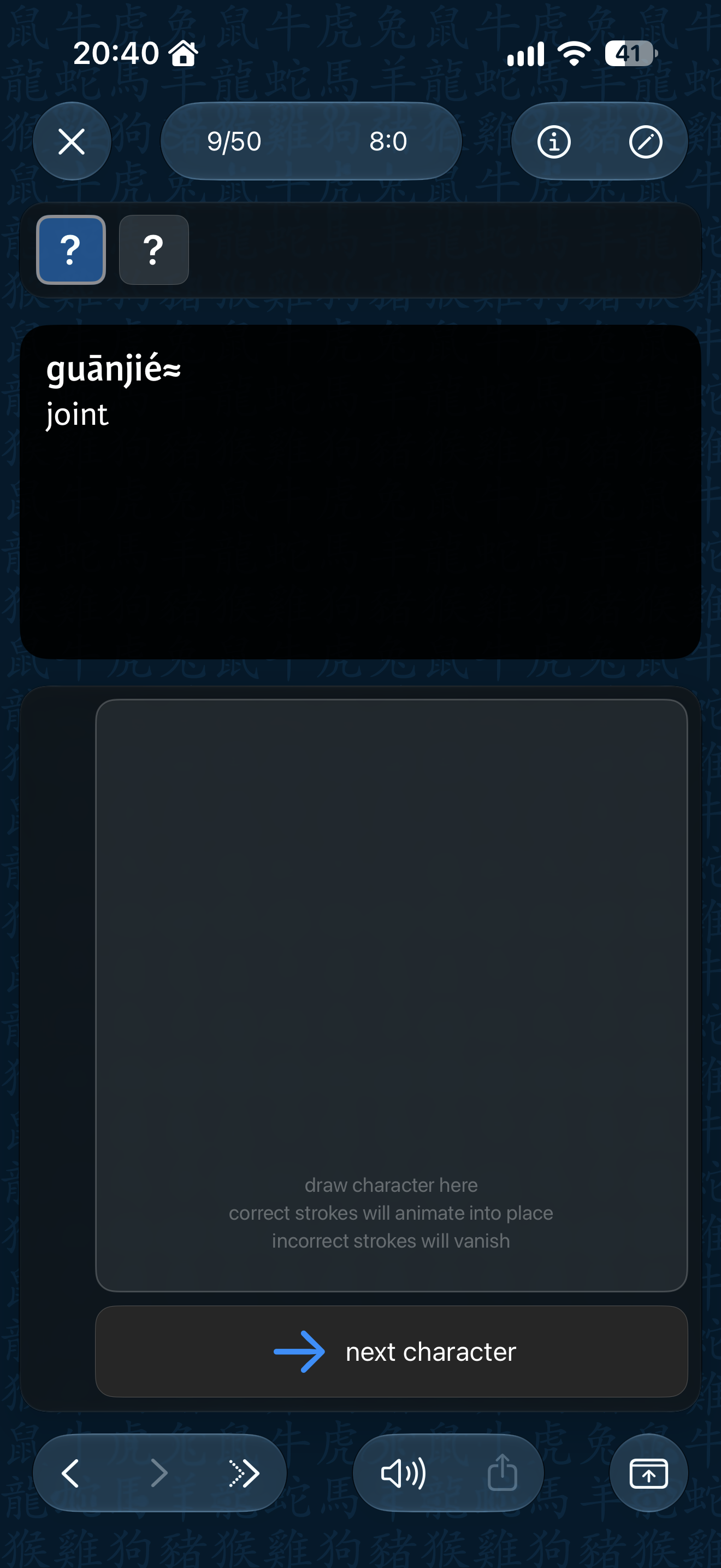
2nd there box to draw characters is not centered, see below.
1789670898654.png


Overall, I personally feel like the test screen now has a bit too many different boxes and boxes inside boxes. But that's maybe just my preference.
 
Overall I think the test screen is much prettier than before, but I was always partial to the 3.0 screen.

The only thing I find to be a bit weird is the floating dictionary entry switcher (the way it partially covers the dictionary entry). But the only alternative I can think of is to either squeeze that menu in at the bottom and move the previous/next/skip buttons to the side like they were in 3.0 (vertically). But maybe either having the dictionary entry stop above that menu or moving the menu so it aligns with the bottom of the entry (instead of 80% alignment) would solve the visual incongruity.

Things I still miss: Being able to reverse the correct/incorrect button order.

One small maybe bug: The back/forward button takes a few seconds to reappear after going back a card and opening the undo card score menu.

One feature request: Allow us to reorder (and disable options) in the undo score menu

Overall, I think the liquid glass UI works really well. Feels natural and inevitable, the way someone said good UI should feel.
 
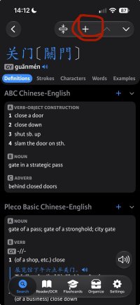
Going to add my feedback here, since it's related and I just saw the interface looking different from yours to mine.
Iphone 15 with iOS 27
On the top right, opening the dictionary overlay or enabling the on-screen drawing is hidden away in a dropout menu. As I'm using this very often, the added additional click is a clear downgrade in usability for me. Just saw Spyrals images they appear directly, so I suppose it's the iPhone 15's screen size triggering this. Still hoping they coul be separate for somewhat smaller screens.
1789706898848.png

Second point, when on-screen drawing is enabled, it's not possible to scroll the definition, so I'd have to click menu, click again the on-screen feature, scroll down, and redo-enable it. Maybe scrolling can be enabled with two finger input, while one finger input draws on the screen.

Otherwise, so far really like the UI update on the flashcard screend (even as a liquid glass contrarian).
 
Another thing I just noticed, is that the selection bubble in the menu bar is slightly to big and hits the edges of the other menu points. I feel like there should be some space between the bubble and the R of OCR here.
IMG_2060.jpeg
 
Overall I like it.

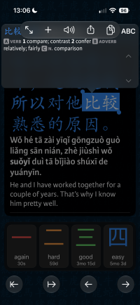
I think the reader popup only counts as a semi-popup, as you're still focusing on the text. As such, I don't think it should fade out the rest of the screen. In this case it would need a more distinct border.
 
I like the UI update, too. If Apple's UI guidelines allow it, in some places, I think it would be better if the buttons were spaced farther apart to allow faster general handling. The arrows at the bottom right could be closer together, so that the touch panel at the lower left could be made wider:

IMG_1453.jpeg
 
The marked part at the top to add a card to a category or create a new card always shows the state of the previous entry for about a second before switching to the current state. In the example, it showed a border around the + from the previous card before switching to the proper represantion of no border. It’s repeatable from the search screen by openning various entries with different card/category states.
 

Attachments

  • IMG_6396.jpeg
    IMG_6396.jpeg
    291.1 KB · Views: 43
Thanks for all the feedback:

@Spyral: these should be fixed in the next build. We've experimented with a layout with fewer boxes and didn't like it but once we get through all the more immediately addressable feedback we can experiment with some other options.

@lookslikerain: yeah, I'm feeling like I'm probably going to have to bow to the inevitable and add a screen of 'expert' options for flash to cover stuff like button order and answer colors that would not be conveniently addressable through a custom test type.

@fiftyfour: we're fixing the top bar overflow in the next update, actually going back to 3 fields too. We're experimenting with moving the drawing box toggle to the bottom right of the definition but if people hate that we'll find somewhere else to put it, it's tricky because only a small % of users actually seem to use that feature but for them it's incredibly important that it be obvious (when upgrading) and easy to reach.

@Spyral again: that bubble size issue is on Apple's side, sadly.

@jurgen85: we experimented with a bunch of looks for that bubble and found we really needed a bit of a background fade to make it visually distinct while still feeling like a Liquid Glass element, we can play around with the levels of darkening though.

@Shun: sadly the new Liquid Glass toolbars don't allow us to customize the spacing between sections so about the only way we could do this would be to have every button be by itself, but I suppose in iPad there's enough room that it might be justifiable and the current split looks a little weird.

@fiftyfour: thanks, these should both be fixed in the next update.

 
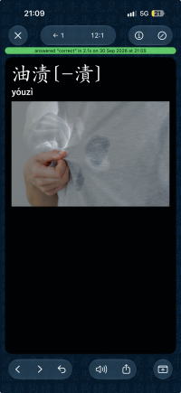
There’s something weird happening with pictures in darkmode in flashcards. Seems like the alpha channel is extracted and inverted?
 

Attachments

  • 1790795401631.png
    1790795401631.png
    1.9 MB · Views: 6
Back
Top