2.5.0 Beta 2 Bug Report / Feedback Thread

Status
Not open for further replies.
I really like the FZKaiti font, but I'd prefer to have a space between the headword and the left bracket... It's something that has bothered me a bit in the previous version of Pleco, too. :)

Maybe use the parentheses system as in Xingothic font?
 

Alexis

状元
I have the simplified headword on with traditional in brackets. When there are a few dashes in a row, they look almost like one big dash and losing the effect of representing individual characters. Perhaps Ascii 250 · might be more clear?
 
Last edited:

alanmd

探花
Not that this is a democracy, but I would vote for a major revision number (3.0). With the extra dictionary functionality, menu navigation, and new fonts it feels to me like a complete rewrite of the app- the screenshots below look nothing like previous versions of Pleco 2.x to me.

IMG_5787.PNG IMG_5783.PNG IMG_5784.PNG IMG_5785.PNG IMG_5786.PNG
 
Last edited:

mikelove

皇帝
Staff member
golden chyld - those parentheses were actually customized in our version of XinGothic to be half- instead of full-width; have to double-check our contract for FZKaiti to figure out if we're even legally allowed to change them in that. (at full-width they'd look terrible)

Alexis - might make sense in fonts other than XG, yes - we already do change the brackets in those thanks to the aforementioned problem and because of that we've already got code in place to reformat headwords depending on the current font. But we'd probably keep it a -, just a more obviously separated one.

alanmd - fair point. I like the blue coloring for headwords - our original design actually had the Pinyin in blue but I think this makes more sense (at least for users who don't care about tone coloring).
 

mikelove

皇帝
Staff member
魏波德 - follow-up question: it looks like that screenshot is actually from the screen that comes up when you add a flashcard to a specific category by tap-holding on the + button; are you sure it was from Settings? Also, does anything happen if you tap on the right side of the items that don't have > next to them. (that's where the collapse / expand triangle would be, perhaps it's simply gone invisible)

Also, why are your toolbars so short? (jailbreak hack?)
 

Entropy

榜眼
Entropy - shade option is still available, Stroke Order should be the third section under Dictionary Definition in Settings.

I see six items: BG, Show outline, Fade strokes, Bold font, Drawing speed, Animate on Next.

If I turn "show outline" off I see a blank page. This can't be intentional.

I have no idea what "Animate on Next" is supposed to do. With 326 DPI, each setting could have some tiny explanatory text (though you should figure out a hack to turn it on so a bunch of people who need reading glasses don't complain about how it's too small.)
And I concur with alanmd; unless you have something miraculous planned for the next version, like telepathy or time travel, you should consider calling this 3.0 (and releasing a 2.5 that's the end of the road for iOS 6, if you ever need to do that.)
 

gabor

探花
I can only join to say, the direction Pleco is going is indeed amazing, it really deserves to be called 3.0, but then again, its up to you guys. :)

A small design change suggestion:
The popups to add unicode fields could be slightly modified to fit into one popup instead of two.
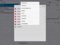
Current: tapping the edit button next to UNI opens the "Customize Fields" popup, then tapping "Add New" opens a popover with all the available unicode fields (screenshot).
Suggestion: all the available fields should already appear in the "Customize Fields" popup with those new green switches next to them, with a Done button in the top left and a Reorder button in the top right (as in manage dictionaries).

This is really just a suggestion, by no way is it a bug, but I kinda feel that this simplifying is exactly where your app is going towards.
 

Attachments

  • image.jpg
    image.jpg
    95 KB · Views: 394

魏波德

Member
魏波德 - follow-up question: it looks like that screenshot is actually from the screen that comes up when you add a flashcard to a specific category by tap-holding on the + button; are you sure it was from Settings? Also, does anything happen if you tap on the right side of the items that don't have > next to them. (that's where the collapse / expand triangle would be, perhaps it's simply gone invisible)

Also, why are your toolbars so short? (jailbreak hack?)

- you are right, it was the "add flashcard to-screen" but its the same thing in the" setting-screen" ...no triangle, and you are right again, its invisible.... when I tap it, the triangles in the subcategory are visible...

-i havent used my ipod touch in a while so I dont even realize my toolsbars are shorter....I probably installed some app from cydia back then
 

Shun

状元
Here's a minor gripe with the PDF reader which may be unique to my machine, or already have been reported.

When reading a PDF file on an iPad 3, the view of the PDF Reader would jump around on the page, either when I pinch-zoom in or out or when I click on a word to see its definition. Sometimes, a word's definition would be shown without me asking when I make the pinch-zoom gesture.

I attach the file it happened with.
 

Attachments

  • WEF_AMNC13_TranscriptLiKeqiang_CN.pdf
    344.4 KB · Views: 468

AdamD

秀才
This is a fabulous piece of software. Incredible.

A few things I've spotted on my 3rd gen iPad:

1. In the dictionary management screen, after tapping 'Reorder' there are two 'Done' buttons. The one on the right saves the new order and leaves the Settings window open; the one on the left closes the Settings window.

kL1Lu4C.jpg


2. When changing font, all but the entry headword change instantly. Not a big deal, but for a while I thought it was either broken or not supported.

3. Changing various entry and list settings don't take effect until you go right out of the search screen and back in. Not a problem, just an observation,
 

mikelove

皇帝
Staff member
Entropy - true, we should probably give you the filled in character when you open Stroke and then reset it when you tap Play. "Animate on next" is an option that should have been removed in the Great Option Purge so now we'll duly remove it in Beta 3.

gabor - the current version feels more intuitive to me since you can reorder the items that are showing without having to fiddle around with all of the other ones. Also more consistent with how Apple generally does this (in Contacts).

魏波德 - we found the culprit - missing icon file for the triangle - so it should be fixed in Beta 3.

afritzse - we're seeing a little bit of that too, we're mostly just trying to get PDF reasonably stable for this release but we'll see if we can do anything about the jumping.

AdamD - thanks! 1) definitely needs to be dealt with (I believe the normal practice is to hide the other Done button in that case), 2 and 3 it sounds like the move to a modal popup for settings has prevented the search screen from getting the signal it's supposed to get when we change settings so that should be easy to fix.
 
When you go to Settings > Font Sizes > Entry Headword and tap on the latter, there's no "check" sign indicating which size is currently selected.

Other items under Font Sizes do have a check, though.
 

dcarpent

榜眼
I've noticed in the Reader reading a Word file that the selection highlight box that surrounds characters when you select them sometimes show two separate overlapping boxes for the same word, for example 出租汽车 has one box around the first three characters and a separte box around the last character. 带来 has two boxes overlapping. The overlapping box obscures part of the character.

Also, any way to get the small arrow command to open the dictionary after selecting a word in the Reader moved to the top right controls that are more visible and accessible? In general I find the all the controls along the bottom of the Reader window too small to be convenient to use.
 

mikelove

皇帝
Staff member
golden chyld - thanks!

dcarpent - yeah, there's no easy way around the box overlapping with the way the system is currently designed, but it's on our list of long-term bug fixes.

There's an option in the configuration screen for the popup reader to flip the top / bottom bars - it would still be on the top left instead of top right, but a bit easier to get at at least.
 

Bendy-Ren

举人
Just wanted to say this looks great from all the screenshots, I'm getting seriously excited. Awesome work. Also, I totally agree about calling it 3.0!
 
Status
Not open for further replies.
Top