Hi there, after a week or so of playing around with the beta I have quite a bit of feedback for both iphone and ipad ") Really loving it so far, it's a brilliant upgrade from v3.
Really loving it so far, it's a brilliant upgrade from v3.
Things I Love:
- The new reader is absolutely phenomenal and is now a top class resource for anyone learning Chinese. In particular the word frequency list for the entire document, tone highlighting, ruby text annotations, and my personal favourite is flashcard formatting - the ability to hide ruby text for any flashcards that I'm currently learning is an extremely useful setting (though I didn't figure it out for a while, that particular setting will definitely benefit from some documentation on release)
- Reader upgrades that I appreciate from v3: the main "bookshelf" page looks lovely, epubs now load much faster, there's now a back button after clicking a link in text, english/pinyin text now renders really nicely (before any pinyin text would render with huge spaces around each letter in v3 for me)
- Unlike a few people here I like the large dictionary name text that separates the different entries in the definition screen
- The new stroke order is fantastic, I like that you can see the entire stroke order at a glance, and the practice option is very handy
- Flashcard tests are great and I especially love the "new learn queue" feature
- The expert settings seem extremely powerful - I've only delved into the custom charts and custom test types so far, and really looking forward to the official release when we get some documentation (no point doing it yet in beta of course)
Feedback:
General:
- I prefer the "compact" display mode when ipad is in split screen mode - I like having the toolbar always at the bottom (I don't really like the ipad sidebar, it's much more tedious to get around) and having the expanding word definitions take up nearly the whole screen rather than a small box. Could there be an option to always use this mode in ipad, even when in full screen? If not, is there a way to force this using the expert settings?
- The popup dictionary definition text removes new lines so that it's continuous text, not sure if this is intended as in pleco v3 it was split into multiple lines according to the dictionary entry. The text is more dense now but hard to parse. If this is intended behaviour, maybe have an option for "compact" vs "comfortable" popup entry style? If not, can this be changed in the expert settings?
- I'd love iCloud sync, though from reading through a few posts here it seems it's not so easy with the database files. It would be great to do my flashcard tests on both iphone and ipad
Reader:
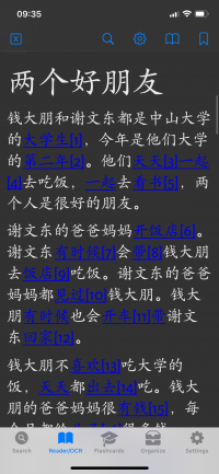
- (see attached image) Please please change the link colour in reader from dark blue to something lighter in night mode (or add option to change link colour). Currently it's unreadable in night mode (when I usually read). I thought it might be my epub, but I tried with multiple files and link colour is always dark blue.
- Just an option, but in reader perhaps if "Enable tap lookup on links" is enabled, make a long press on the link still follow the link? So that lookup and link functionality are both enabled
Flashcards:
- I couldn't quite figure out the option for low and high priority categories in the flashcard test profile, how does this differ from placing categories in order in the "new card queue"?
- When playing around with custom test charts in the expert settings I made a custom chart (converted from the learning dashboard cycle chart) that I called Total Overview that showed Total New, Total Learning, and Total Review for my learning flashcard profile. The values for these were already in the learning dashboard cycle as "New Cards Remaining", "Active Learning Cards" and "Active Review Cards" but not used in the text, so maybe you were already planning on using them later I think these should used in a builtin chart as it's very useful for most people to have an idea of how far through you are in your test profile and chosen test categories etc
- I think another builtin test type called something like "Sentence Review" would be very useful to many people - essentially the same thing as the self-graded
cloze test type but without the missing word (so not cloze anymore). I managed to make my own custom test type doing this by starting with the self-graded cloze test type, converting to custom type and then under configure masked text, unticking "hide masked text" This makes it less of a cloze test and more a straight up translation test which I really like, and utilises the cloze mapping to get the example sentences.
- I think the self graded flashcard option "reveal missing parts separately", visible when converting the self graded builtin test type to a simple test type, should be visible as a built-in option. IMO it's much nicer to go headword -> headword + reading -> headword + reading + definition when doing a self graded test and is common enough to have the option in builtin test settings
- The flashcard test types are fantastic but the naming for some are quite confusing and I had to go through each to see what they actually are. In particular the fill-in-the-blanks headword with order (and to a lesser extent the stroke order), I wouldn't have guessed it was a handwriting test at all. I'd recommend making it really clear what this test is as I think it's a huge selling point for the flashcard add on - there are plenty of people who would use it (see e.g. Tofu Learn which allows for handwriting practice, but has been abandoned and their servers always go down). I know I was thrilled when I discovered this test type!
Bugs:
- Typo under the definition settings: "Exclude begininng from containing" should be "Exclude beginning from containing"
- ABC Chinese-English not rendering italics correctly (seen for entry 宫 gong1 - <i>wuyin</i>)
- Definition screen - where there are examples (using example block style=bar) inside of a "note" box, the example bar overlaps with the example text (seen in Tuttle Learner's Chinese-English for 会 hui4). This could be a result of my font sizing though?
- Some text in Tuttle Learner's Chinese-English entry not rendered correctly (seen for 没 mei3 - examples say stuff like: See [`sc:关系|py:guan1xi5`.-w_zho](pleco:e?d=PTUL&... etc
- When on the flashcard reveal page (before moving to next card), if you change the dictionary from the set one (@) then select play audio for an example sentence in the definition, the audio plays correctly but the word highlighting (which should highlight the words as they are spoken) always snaps back up to the headword and then highlights random bits of the screen rather than the words in the example sentence
- Bug in display of "Due" number in statistics for Drill flashcard test profile, when using filter condition "incorrect" (i.e. choosing cards from profiles where the cards have been incorrect within a set time period). If the filter is choosing cards from more than one profile, the Due number of cards is incorrect and shows the number of cards due from only a single profile (can't figure out how it chooses which profile). For example, in my case I have two learning profiles (for words and characters), my drill profile gets the cards from both profiles that were tested as incorrect within the past 7 days. If I have 2 words wrong and 6 characters wrong, the number due in the drill stats is always 2 when it should be 8 (but actually doing the test gives me all 8 flashcards from both profiles, just seems to be a bug in the stats display).
Really loving it so far, it's a brilliant upgrade from v3.Things I Love:
- The new reader is absolutely phenomenal and is now a top class resource for anyone learning Chinese. In particular the word frequency list for the entire document, tone highlighting, ruby text annotations, and my personal favourite is flashcard formatting - the ability to hide ruby text for any flashcards that I'm currently learning is an extremely useful setting (though I didn't figure it out for a while, that particular setting will definitely benefit from some documentation on release)
- Reader upgrades that I appreciate from v3: the main "bookshelf" page looks lovely, epubs now load much faster, there's now a back button after clicking a link in text, english/pinyin text now renders really nicely (before any pinyin text would render with huge spaces around each letter in v3 for me)
- Unlike a few people here I like the large dictionary name text that separates the different entries in the definition screen
- The new stroke order is fantastic, I like that you can see the entire stroke order at a glance, and the practice option is very handy
- Flashcard tests are great and I especially love the "new learn queue" feature
- The expert settings seem extremely powerful - I've only delved into the custom charts and custom test types so far, and really looking forward to the official release when we get some documentation (no point doing it yet in beta of course)
Feedback:
General:
- I prefer the "compact" display mode when ipad is in split screen mode - I like having the toolbar always at the bottom (I don't really like the ipad sidebar, it's much more tedious to get around) and having the expanding word definitions take up nearly the whole screen rather than a small box. Could there be an option to always use this mode in ipad, even when in full screen? If not, is there a way to force this using the expert settings?
- The popup dictionary definition text removes new lines so that it's continuous text, not sure if this is intended as in pleco v3 it was split into multiple lines according to the dictionary entry. The text is more dense now but hard to parse. If this is intended behaviour, maybe have an option for "compact" vs "comfortable" popup entry style? If not, can this be changed in the expert settings?
- I'd love iCloud sync, though from reading through a few posts here it seems it's not so easy with the database files. It would be great to do my flashcard tests on both iphone and ipad
Reader:
- (see attached image) Please please change the link colour in reader from dark blue to something lighter in night mode (or add option to change link colour). Currently it's unreadable in night mode (when I usually read). I thought it might be my epub, but I tried with multiple files and link colour is always dark blue.
- Just an option, but in reader perhaps if "Enable tap lookup on links" is enabled, make a long press on the link still follow the link? So that lookup and link functionality are both enabled
Flashcards:
- I couldn't quite figure out the option for low and high priority categories in the flashcard test profile, how does this differ from placing categories in order in the "new card queue"?
- When playing around with custom test charts in the expert settings I made a custom chart (converted from the learning dashboard cycle chart) that I called Total Overview that showed Total New, Total Learning, and Total Review for my learning flashcard profile. The values for these were already in the learning dashboard cycle as "New Cards Remaining", "Active Learning Cards" and "Active Review Cards" but not used in the text, so maybe you were already planning on using them later
I think these should used in a builtin chart as it's very useful for most people to have an idea of how far through you are in your test profile and chosen test categories etc- I think another builtin test type called something like "Sentence Review" would be very useful to many people - essentially the same thing as the self-graded
cloze test type but without the missing word (so not cloze anymore). I managed to make my own custom test type doing this by starting with the self-graded cloze test type, converting to custom type and then under configure masked text, unticking "hide masked text"
This makes it less of a cloze test and more a straight up translation test which I really like, and utilises the cloze mapping to get the example sentences. - I think the self graded flashcard option "reveal missing parts separately", visible when converting the self graded builtin test type to a simple test type, should be visible as a built-in option. IMO it's much nicer to go headword -> headword + reading -> headword + reading + definition when doing a self graded test and is common enough to have the option in builtin test settings
- The flashcard test types are fantastic but the naming for some are quite confusing and I had to go through each to see what they actually are. In particular the fill-in-the-blanks headword with order (and to a lesser extent the stroke order), I wouldn't have guessed it was a handwriting test at all. I'd recommend making it really clear what this test is as I think it's a huge selling point for the flashcard add on - there are plenty of people who would use it (see e.g. Tofu Learn which allows for handwriting practice, but has been abandoned and their servers always go down). I know I was thrilled when I discovered this test type!
Bugs:
- Typo under the definition settings: "Exclude begininng from containing" should be "Exclude beginning from containing"
- ABC Chinese-English not rendering italics correctly (seen for entry 宫 gong1 - <i>wuyin</i>)
- Definition screen - where there are examples (using example block style=bar) inside of a "note" box, the example bar overlaps with the example text (seen in Tuttle Learner's Chinese-English for 会 hui4). This could be a result of my font sizing though?
- Some text in Tuttle Learner's Chinese-English entry not rendered correctly (seen for 没 mei3 - examples say stuff like: See [`sc:关系|py:guan1xi5`.-w_zho](pleco:e?d=PTUL&... etc
- When on the flashcard reveal page (before moving to next card), if you change the dictionary from the set one (@) then select play audio for an example sentence in the definition, the audio plays correctly but the word highlighting (which should highlight the words as they are spoken) always snaps back up to the headword and then highlights random bits of the screen rather than the words in the example sentence
- Bug in display of "Due" number in statistics for Drill flashcard test profile, when using filter condition "incorrect" (i.e. choosing cards from profiles where the cards have been incorrect within a set time period). If the filter is choosing cards from more than one profile, the Due number of cards is incorrect and shows the number of cards due from only a single profile (can't figure out how it chooses which profile). For example, in my case I have two learning profiles (for words and characters), my drill profile gets the cards from both profiles that were tested as incorrect within the past 7 days. If I have 2 words wrong and 6 characters wrong, the number due in the drill stats is always 2 when it should be 8 (but actually doing the test gives me all 8 flashcards from both profiles, just seems to be a bug in the stats display).