When the keyboard isn't open, I have no problems.
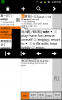
When the keyboard is open, I still have plenty of useful space to use the dictionary without dismissing the keyboard via the 'back' button. (I'd have even more if I could get rid of that bothersome input bar, as described in the other thread.) In this context, when I click a character inside the definition, the popup definition has its bottom obscured by the popup definition arrows, which have been forced higher due to the keyboard. Fine, but the popup definition isn't scrollable in this context, which I request. Furthermore, when I hit 'back' in this context, it closes the keyboard, but leaves the popup definition arrows obscuring the bottom of the popup definition, which still can't be scrolled. The popup definition arrows ought to shoot back to the bottom of the screen once the keyboard's been closed, thus freeing up the popup definition for normal use. If I haven't been clear, there's a screenshot attached showing the popup definition arrows continuing to ride high even though there's no keyboard, rendering the popup definition much less useful than it should be.
When the keyboard is open, I still have plenty of useful space to use the dictionary without dismissing the keyboard via the 'back' button. (I'd have even more if I could get rid of that bothersome input bar, as described in the other thread.) In this context, when I click a character inside the definition, the popup definition has its bottom obscured by the popup definition arrows, which have been forced higher due to the keyboard. Fine, but the popup definition isn't scrollable in this context, which I request. Furthermore, when I hit 'back' in this context, it closes the keyboard, but leaves the popup definition arrows obscuring the bottom of the popup definition, which still can't be scrolled. The popup definition arrows ought to shoot back to the bottom of the screen once the keyboard's been closed, thus freeing up the popup definition for normal use. If I haven't been clear, there's a screenshot attached showing the popup definition arrows continuing to ride high even though there's no keyboard, rendering the popup definition much less useful than it should be.