mikelove said:
If we could find a good font to license at a reasonable rate to embed in our software we'd certainly consider doing so, but a lot of Chinese fonts actually look like crap on the iPhone's screen owing to Apple's particular approach to anti-aliasing - it makes regular Roman alphabets look much better than in Windows, gorgeous and well-proportioned like printed type, but it tends to make Chinese characters just look "fuzzy"; we tested embedding a few of the Chinese fonts that come with Windows in our iPhone software and they were just plain awful, almost unreadable for the more complicated characters.
mikelove said:
Thanks! Door's still not entirely closed, Apple could always add an API for live font installation, or we could find a Chinese font that looks pretty on an iPhone screen and can be licensed for a reasonable rate.
...
I believe that's happening because those PDF files have embedded Chinese fonts - interesting that they're rendering that well, though. Do you happen to know which fonts they're using in the documents? (you can probably find this out by opening them in Acrobat Reader and pulling up the document info screen)
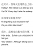
I looked closer at those PDFs and I think I started to understand better the problems that you described earlier. For example, when I opened this PDF file in Windows at 100% zoom level, I didn't like how it looked at all. It did look beautiful to me at my iPad, but I guess it was only because I already zoomed in a bit from the default "fit whole page" view. And the problem is exactly as you described, some of the strokes look "fuzzy" indeed. A Chinese character looks good only when it is big enough.
Well, I have a suggestion, but I don't know if you find it useful. What you could do is, first, pick a nice Chinese fond (something like here:
http://www.pleco.com/manual/images/wmtutorial/selfreveal.gif, or better!) and embed it into the Pleco application, second, give your users a possibility to choose (in settings) which font they would like to use for each of the main parts of the interface, the default (current) one or the one with serifs. It is very important to let them make this choice separately for different parts (areas) of the interface. For example, if that were the case, I would certainly choose the new font (with serifs and variable stroke thickness) for the headwords of the flashcards (where I can adjust the font through the flashcard settings to make it big enough to look beautiful), but perhaps not for the main dictionary. I think, headwords of the flashcards
is the area where a font with "correct" strokes is needed most. (When I'm trying to memorize a character, I keep looking at it for a long time, try to repeat the stroke sequence in my mind, then I look at it again, and so on. That's exactly where a well balanced image of the character, with nice and naturally looking strokes is most important for me, and I guess for many other users of Pleco as well.)
Generally, the problem with fuzzy looking fonts when the characters are small enough is more important for older devices (3G and below) rather than for iPad and 4G devices. I just got my new iPod Touch 4G and I must say, the pixel there is so small and indiscernible that it is quite possible that a natural font could looks good (not fuzzy) even for the main dictionary entries. (BTW, did you try it on iPhone/iPod 4G?) Well, I'm sure you want to support all your users no matter what generation of iDevice they use, so giving us a choice of which font and where to use through settings sounds reasonable. (Well, provided that you decide to implement this feature at all, of course!)
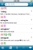
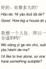
As for the PDFs I mentioned before, they are from the chinesepod web site. (The PDFs with lessons.) I'm sure you are well familiar with the chinesepod web site, but just in case, here's a link to a PDF with a sample (and therefore open for everybody) lesson:
http://s3.amazonaws.com/chinesepod....ed632e0f1558fa046eb5/pdf/chinesepod_A1126.pdf") Of course, the font is embedded in the PDF file, but I think it is still a task for the programmer to render it like this. Yesterday, I tried opening the same document in Stanza and the font looked very bad even when zoomed in. (I think I'll attach a screen-shot for that too.) So it is certainly not about some standard API from Apple for rendering PDFs.
Of course, the font is embedded in the PDF file, but I think it is still a task for the programmer to render it like this. Yesterday, I tried opening the same document in Stanza and the font looked very bad even when zoomed in. (I think I'll attach a screen-shot for that too.) So it is certainly not about some standard API from Apple for rendering PDFs.