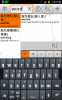
I get no utility out of being able to select the dictionary at both the top and bottom. I'd like to simply leave it on PLC most of the time. On my Galaxy Note, the extra place to choose takes up 20% of the space that would be available to show more from the definition window. I'm attaching a screenshot that also illustrates the problem I raised in another thread where English input no longer automatically switches the lookup language from Chinese to English.
Since it would be annoying to be emailed every time there's activity on the user interface feedback thread, I'm putting this interface issue in a new thread. I again recommend Tapatalk so that Pleco users can track forum issues in a mobile way. Tracking and participating on the forum from a phone is quite difficult.
Since it would be annoying to be emailed every time there's activity on the user interface feedback thread, I'm putting this interface issue in a new thread. I again recommend Tapatalk so that Pleco users can track forum issues in a mobile way. Tracking and participating on the forum from a phone is quite difficult.