2.3 / User Interface Enhancements

nico176

Member
Re: 2.2 / User Interface Enhancements

Hi Mike!

First I want to say having reader and flashcards in the iPhone version of pleco is just awesome! Thank you so much.

Though for me the most used function of pleco is still word lookup in the dictionary. When I compare my workflow now and before on the Windows Mobile version I feel like I'm spending too much time inputting and altering my search in the search textbox to finally find what I'm looking for.

While on WM moving the cursor was a fast way of altering the search this is not working well on the iPhoneOS. The TAP action is too imprecise (or not working at all) and the TAP-HOLD-MOVE CURSOR-RELEASE action is just way too slow.

Some of these things have been mentioned earlier and I know you guys are aware of these issues:

viewtopic.php?f=17&t=2097&p=16644&hilit=cursor#p16644

Still I think here is the right place to mention this again, since I'd love to see some improvement on this part of the pleco user interface in a future version.


EXAMPLE

When translating a text it happens that I stumble on a phrase or a sentence, where the word separation is not entirely clear and I have to check each character 字 and each possible compound word 词.

下雨天留客天天留人不留

For the sequence "下雨天" it takes a lot of moving the cursor and deleting and reinputting to look up "下雨天" and "下雨" and "雨天" and each character.


SOLUTION

I guess there are different possible solutions to this:

1. The 'stupid' one:

Improving cursor movement control by adding some kind of arrow left/right buttons to HWR, Rad and Key so things could get sped up.

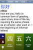
Looks like adding custom buttons to the system keyboard is somehow possible(-->attachment).

Also the behavior of the cursor as it is right now (reset cursor to the end of line when switching input methods) doesn't feel right to me.

2. The 'intelligent' one:

Once a sequence like "下雨天" has been input there should be the possibility of changing the compound size (1 "下" "雨" "天", 2 "下雨" "雨天", 3 "下雨天", 4) and cycling between the possible entries. Maybe automatic compound recognition like in the reader could be used here too.
 

Attachments

  • screen.jpg
    screen.jpg
    160 KB · Views: 2,130

mikelove

皇帝
Staff member
Re: 2.2 / User Interface Enhancements

Adding buttons to the keyboard is actually relatively easy - just overlay it with our own buttons - but I agree that's a rather crude solution. I actually favor something like MDBG's approach - break down the input into its look-up-able component pieces and list all of them in the search results. I generally prefer that to approaches that require extra work on the part of the user; the software should figure out what they want without being told.

Resetting the cursor position when switching input methods is unavoidable, unfortunately; we have to use Apple's input field to use Apple's keyboard, but we need our own input field for our separate handwriting / radical input methods (especially handwriting, where the recognizer would be extremely laggy / constantly halting after stroke inputs if we used Apple's field).
 

Vzzzbx

进士
Re: 2.2 / User Interface Enhancements

It's good that you mentioned an overhaul of the settings, Mike, because I've found the most difficult aspect of using the software to be finding the right setting.

A good example of this is the Panels menu: while the organisation within that menu is sensible, I'm still not 100% clear on what constitutes a panel, and frequently a setting I've tried to locate has not been in this section when I thought it would be, or vice versa. As a result, I sometimes can't remember where to find settings that I change frequently, like toggling Traditional Chinese characters.

I write technical documents and user guides (in English!) for a living, so I'm acutely focused on how users interact with information. Even for a technical audience, I come at it from the viewpoint of someone who knows what (s)he wants to do but can't articulate it. Such an approach would be perfect here.

Off the top of my head, then, here's a very cack-handed example of the sort of structure I'd implement (with really bad ASCII indents):


Chinese Characters
-----> Recognise Simplified
------------> Include Rare
-----> Recognise Traditional
------------> Include Rare
------------> Include Hong Kong

Text Sizes
-----> Dictionary list (portrait)
------------> Headword
------------> Pronunciation
------------> Definition
-----> Dictionary list (landscape)
------------> Headword
------------> Pronunciation
------------> Definition
-----> Dictionary entry (portrait)
------------> Headword
------------> Pronunciation
------------> Definition
-----> Dictionary entry (landscape)
------------> Headword
------------> Pronunciation
------------> Definition

Colours
-----> Colour schemes
------------> Standard Mode colours
------------> Enable Night Mode
------------> Night Mode colours
-----> Tone colours
------------> Entry tone colour
------------> List tone colour
------------> Configure colours...

Layout
-----> Dictionary (portrait)
------------> Show definition
-----> Dictionary (landscape)
------------> Show definition


What I've done here is to start with the conceptual things people can identify when they want to change a setting – writing/typing, text size, colours – then drill down from there. As an added benefit, options which are not clear to new users may become self-documenting by dint of where they are in the menu.

By the way, I'm thinking of all implementations, not just the iPhone interface with which I'm familiar.

In response to the discussion about removing settings: Adding to nihao pengyou's suggestion, I would definitely add an Advanced option to some screens which, when switched on, displays all the extra stuff. Much like the way in which the Dictionary's Show definition option presents extra options when switched on. That way, Linux-weaned freaks like me get all the control they need, while the average Mac user (I'm one of those, too!), free of the tyranny of choice, can plug on without fear of breaking anything they don't know how to fix.
 

character

状元
Re: 2.2 / User Interface Enhancements

I wonder if it would help to think of use cases for series of operations. Then think about how those operations could be optimized for users.

Some examples for beginners:

1) Entering a list of vocabulary as flashcards
- Is there a good way to toggle sorting by frequency to make the most likely results appear up top?
- Are there assumptions which could be made (clear the search box, jump to main screen after adding a flash card)?

2) Looking up unknown words by entering a series of characters into the search box
- Is there a way to provide easy selection of a subset of the search box to look for different words?
- Is there a way to present different sets of results to make the likely breakdown of the characters into words?
 
Re: 2.2 / User Interface Enhancements

Regarding the wiki...

As I had mentioned before, and now repeat, you are welcome to all the files/source, etc. of my wiki. I'd then just drop support for it on my server. You can contact me by PM or email if you want to pursue this option.
 

mikelove

皇帝
Staff member
Re: 2.2 / User Interface Enhancements

Vzzzbx - thanks for the very detailed post.

"Panels" is kind of mishmash, yes - we were trying to keep the number of top-level sections to just 5 (post-flashcards), so it was born out of the ashes of two other sections called "Input" and "Char Info." We'd probably be better off with "Input" merged in to the giant "Dictionary" section, but when we redesign settings we want to do it all in one go and not force people to keep re-learning things too many times.

I think the biggest mistake really may have been that overall structure - one section for each of the three major tabs (dict / reader / flash) plus a "general" tab for anything that isn't a "panel." The problem is that there's so much interconnection between those sections - dictionary display screens come up in all three, flashcards can be added from any of them, etc - that it's really not a logical division for people anymore.

However, while a conceptual breakdown like yours is good for finding how to change a setting that the user things / knows must exist somewhere - if you want to change the font in X, you go to the "font sizes" panel regardless of what X is - it's not so good for discoverability; if you've just started using such-and-such feature and want to see if there's a way to tweak this particular thing you don't like about it, you're not going to find it if that feature's settings are scattered across half a dozen different screens.

So I think I still prefer something that breaks down commands into different screens, just in a more logical way - a screen of settings just for the popup reader, e.g., another one for Char Info, an "Input" screen with separate subscreens for handwriting / radical / keyboard, etc. Color schemes are kind of a special case since that entire feature "lives" in Settings - we'd probably still want to lump all of the color settings together in the same place - but with font sizes I'm not so sure; entry list font sizes should definitely be located on the same screen that you configure entry lists' layout, e.g.

"Advanced" is certainly a must, though, that seems clear.

character - there's no frequency list built into Pleco yet, though it seems clear we need to find a way to add one one way or another in 2.2 - still haven't found a good word frequency list for Chinese anywhere, so we're about ready to assemble our own text corpus and build it ourselves for lack of a better option.

Clearing the search box / jumping to the main screen after adding a flashcard might be a good new option, but not something on by default - having things suddenly happen that aren't directly associated with what the user just did is usually a Bad Idea. So this would be an "Advanced" option to improve efficiency for heavy flashcard system users rather than a new user thing.

The word breakdown feature is a must-have, though - we may even put an off-by-default-because-we're-not-that-confident-in-it preliminary version of it in 2.1.1 just to get it out there, from all of the forum posts and emails this seems to be causing more aggravation than any actual bug at this point.

stephanhodges - thanks, but code-wise I think we'll use something that integrates with whatever CMS (leaning towards ExpressionEngine) we use for the website redesign; I'll let you know about moving content over, though.
 
Re: 2.2 / User Interface Enhancements

Mike, yes, you're right. Most of what I discussed can be covered by implementing and "advanced" feature. I'm very glad to see that you're heading in that direction.

And you're right that in a mobile UI, it's hard/impossible to imagine how to indicate for the user the context and consequences of one's preference choices. I was just imagining some ideal world, without tough built-in constraints... the user manual, which I need to read again, is where that kind of info should live.

Just to put all of this in context though: the flashcards module, even as it exists now, is breathtakingly elegant and such a pleasure to use. It actually makes me want to study more flashcards, more often. That's unexpected.

You've managed to make something that's aesthetically pleasing, easy under the thumbs, and that shapes a complicated series of repetitive tasks into crystal clear, pleasant-to-execute, and unexpectedly rewarding activity. Most of these design tasks are working with series of compromises, but in this case you seem to have managed to create something close to ideal, at the first go.

- Shelly
 

mikelove

皇帝
Staff member
Re: 2.2 / User Interface Enhancements

Thank you! That's really wonderful to read, particularly after the frantic 4-month effort to get the flashcard module ready (an effort from which I personally am still recuperating :) ) - if you'd seen the UI in mid-March you'd have thought very differently of it. Here's what the design looked like on 3/17:


Basic elements were (mostly) there, but the aesthetics were just awful; the breakthrough came a couple of days later when we decided to basically just combine the color / background of Pleco.com with the button style of the iPhone in-call status menu.
 

Attachments

  • badflashscreenshot.png
    badflashscreenshot.png
    38.4 KB · Views: 2,043

Lurks

探花
Re: 2.2 / User Interface Enhancements

I'd just second that, suggestions around the UI feel like splitting hairs (like the character selection system I spoke of earlier) in what is overall a really pleasant interface to something really rather complex. Quite frankly it's astonishing that you guys have gone zero to hero on the Apple platform in such a short time period.
 
Re: 2.2 / User Interface Enhancements

To add my two cents worth, as I have said elsewhere in the forums, I am a settings freak, and the shear number of configuration options available in Pleco's various incarnations is one of the many outstanding features I love about the application. As an example, though I did not push for the setting, I am one of the people that use the "smaller" option in settings\dictionary\overall interface\portrait screen layout. I find this option makes it easier for me to tell which entry I am looking at in the list when split panel is on. If "smaller" is off, any words that start with more than two identical characters cannot be differentiated without adjusting the font size and since my eyesight is not perfect I would prefer not to switch to a smaller font size. That said, I do support organizing settings into categories such as Basic Settings, Advanced Settings, Miscellaneous Settings, or any other category that may make Pleco's settings more friendly for those who want to be able to configure some of the most convenient settings without being overwhelmed by the plethora of configurations available.

On another note, I would like to submit the following feature request. Please excuse me if this has already been mentioned. Though this should probably be posted in a different section, the request is slightly related to UI in the sense that it could help reduce the number of settings one would be required to make when using flashcards efficiently. Why not make it so that the flashcard profiles can be saved, imported and exported? In this way, there could be a forum similar to the Flashcards Exchange where users could upload/download pre-configured flashcard profiles with an explanation of the learning method the particular profile is configured for. This ability could take the complexity out of creating flashcard profiles for those who don't really understand or want to understand the science behind the various flashcard algorithms (Weighted; Repetitive Spacing; Frequency Adjusted; etc), yet still want to have various profiles in order to study tones, characters, pronunciation, definitions, etc. In a sense, this feature is already implemented in a limited manner by the 3 default profiles available in the Flashcards module so I imagine it is a feasible request.

Regards,

Darrol
 

mikelove

皇帝
Staff member
Re: 2.2 / User Interface Enhancements

Lurks - thanks!

hairyleprechaun - thanks!

Importable / Exportable flashcard profiles have been on the to-do list for a long time, but they're a bit problematic because unlike the rest of the data in flashcard export files they're both version- and platform-dependent; it'll take some work to come up with a system to properly tag them / translate them between versions. Which means in general it's more likely we'll add support for importing / exporting them in 2.3 or a later release once the various settings changes we're working on have stabilized a bit.
 

Vzzzbx

进士
Re: 2.2 / User Interface Enhancements

Cheers for the lengthy reply, Mike.

mikelove said:
[...] I think I still prefer something that breaks down commands into different screens, just in a more logical way - a screen of settings just for the popup reader, e.g., another one for Char Info, an "Input" screen with separate subscreens for handwriting / radical / keyboard, etc. Color schemes are kind of a special case since that entire feature "lives" in Settings - we'd probably still want to lump all of the color settings together in the same place - but with font sizes I'm not so sure; entry list font sizes should definitely be located on the same screen that you configure entry lists' layout, e.g.

I agree. My example was off the cuff, but if there's a structure that makes sense to novice and experienced users — let's pretend such a holy grail exists for the moment — you're hitting two birds with one stone: that users can find anything intuitively, and that the trickier setting labels are self-documenting.

Settings screens are hard to design, though, and in a world where most people don't even know what an Edit menu is for, anything's an improvement.
 

mikelove

皇帝
Staff member
Re: 2.2 / User Interface Enhancements

Thanks! Self-documenting labels would definitely be nice - we made a little progress on that front in 2.1 by cramming a bit more text into each, but in 2.2 we may finally have to break down and add (i) icons (in spite of Apple's distaste for them) or at least have a couple of lines of explanatory text below the most complicated ones.

And interesting article, but doing away with menu bars as he suggests is exactly what Microsoft did with Office 2007 and they don't seem to have established a new paradigm with that yet - very few other companies have followed their lead and killed the menu bars in their apps. The menu concept is definitely in need of replacement, though, and may get it as we start to see more and more elements from iPhone-style UIs make their way onto desktops. (Apple's already been putting more and more iPhone UI paradigms into their software - look at the latest version of iTunes, or at the new web-based MobileMe mail app)
 

gato

状元
Re: 2.2 / User Interface Enhancements

GoodReader's settings menu is an example of more detailed description beneath the settings. First preference would still be to provide self-explanatory setting labels, I think.
 

mikelove

皇帝
Staff member
Re: 2.2 / User Interface Enhancements

Well the question is how you make labels self-explanatory with so little space - that's what those separate explanations are useful for.
 

Vzzzbx

进士
Re: 2.2 / User Interface Enhancements

mikelove said:
[...] in 2.2 we may finally have to break down and add (i) icons (in spite of Apple's distaste for them) or at least have a couple of lines of explanatory text below the most complicated ones.
Apple uses the latter in the iPhone Settings area, so at least you've got a defence there!

mikelove said:
And interesting article, but doing away with menu bars as he suggests is exactly what Microsoft did with Office 2007 and they don't seem to have established a new paradigm with that yet - very few other companies have followed their lead and killed the menu bars in their apps. The menu concept is definitely in need of replacement, though, and may get it as we start to see more and more elements from iPhone-style UIs make their way onto desktops. (Apple's already been putting more and more iPhone UI paradigms into their software - look at the latest version of iTunes, or at the new web-based MobileMe mail app)
I don't agree with the article's contention that we should scrap menu bars altogether. Menu bars have a perfectly valid function, particularly in complex software.

The real problem is that menus like File and Edit are rapidly becoming dumping grounds for functions that don't have a clear home. I use InDesign CS3 in my work, and am forever failing to locate important functions because they've been shoved into a random menu (hyperlinks are in the Window menu!) or three levels deep in a completely illogical place. Like just about anything, menus are fine if they're designed properly.

I really like the Ribbon in Office, but it suits the application. A similar ribbon-style device wouldn't make sense in a game or a browser. The same goes for Apple's left-menu paradigm: unless you're using a wide screen, it would be too expensive in apps where space matters, like DTP.

That brings us back to the iPhone. Its main problem — inherently — is that there's no screen space. That's why there's no perfect solution for settings, either within apps or for the device as a whole (but you know that).
 

mikelove

皇帝
Staff member
Re: 2.2 / User Interface Enhancements

That's true about File and Edit; we actually dumped a lot of functions into the "Dict" menu in our Windows Mobile software once Microsoft changed the Windows Mobile UI to only support a maximum of two menus. Everyone expects a File and Edit menu now for a few common functions, and lacking enough space for more than half a dozen or so other menus it often turns out that the best place to put some particular command is File or Edit. I'm leaning towards using a ribbon for the desktop version of Pleco, actually, it seems to be quite easy to implement in MFC and would definitely help with making all of our various options more readily accessible to the user.

Desktop OS user interfaces are in need of a redesign in general to better accommodate the wider mix of screen sizes they're running on - there've been nice improvements in a few areas, Windows 7's ability to resize windows to one half of a (wide) screen by dragging them to the left or right is an utterly fantastic feature that I'm eagerly waiting for Apple to copy in Mac OS 10.7 "Norwegian Forest Cat," but Mac doesn't support much resolution-independence outside of its web browser, and while Windows 7 tries to do so with its DPI setting, very few windows applications seem to handle DPI changes correctly.
 

Vzzzbx

进士
Re: 2.2 / User Interface Enhancements

If you're restricted to two menus, it makes perfect sense to break common sense in order to just put things somewhere. The other extreme is to have 15-20 menus and utterly bamboozle the user. At home I've been using a thing called TextWrangler which has so many menus that I don't even attempt to use them.

Mark Shuttleworth has already announced his intention to move (I think) all menus and taskbars to the left in the next Ubuntu release for netbooks, the logic being that there's not enough vertical real estate as it is. Grand logic, in my view. Editing documents has always been a stupid exercise on a screen that's wider than its height.

That half-maximise function is indeed a brilliant idea, by the way. I found myself wanting to half-maximise (tile?) two windows yesterday, even though I've never used Windows 7.
 

psucom

举人
Re: 2.2 / User Interface Enhancements

It would be nice to have the option to hide the headword in the flashcards when filling-in-the-blank with characters. There are the options of Show All, No Xrefs, Defn Only, but this does not provide a fully satisfying solution; in all three of these options one occasionally still finds the answer to the flashcard puzzle right on the flashcard prompt. What I might propose would be to replace any appearance of a headword on a given flashcard with a symbol such as ~ before it is displayed, and possibly make this an option if needed. Headwords consisting of more than one character may be slightly more involved.
 

mikelove

皇帝
Staff member
Re: 2.2 / User Interface Enhancements

psucom - we'd been planning to do that through changes to data files, but until that's ready it might be best to search for / remove headwords from definitions automatically, yes; thanks for the reminder on that, there's still time to include something like it in 2.1.1.
 
Top