Larger Popup Definition Bubbles

Shun

状元
Hi,

in a situation like this, could one make the Popup Definition bubble a little larger?
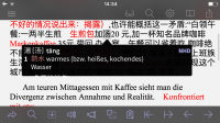
image.png

Or is it impossible for the Popup Definition function to determine where on the screen it is invoked? If the dictionary definition is short, then small would be preferable, of course. (so one can see more material behind it)

Thanks!
 

mikelove

皇帝
Staff member
We don't really want it to be constantly getting taller and shorter, that's the problem - we generally try to size it so that it would be able to maintain that height even if it was pointing to text in the precise middle of the screen, as it seems to be doing correctly here. If people were just looking up one word at a time it would be less of a problem, but it really looks terrible to have it resizing itself as you go through text word-by-word (we've tried it).
 

Shun

状元
I remember I had already brought that up some years ago. :) I only look up selected words. As an alternative, how about making it a setting (off by default) named "Adaptive bubble size", or similar, under Settings > Popup Definition? I think the extra usefulness would be considerable (one tap action less required: no scrolling), especially on iPads, where the bubble is only somewhat larger. Perhaps one could even make it an on-off setting with a control for "Maximum bubble size", so users would get the exact look they want.

I'm fond of the Latin saying "de gustibus non est disputandum" meaning "In matters of taste, there can be no disputes.", so this would be a case for a setting to adapt the app to one's taste.
 
Last edited:

mikelove

皇帝
Staff member
The problem with any off-by-default option is getting enough people to turn it on for it to be worth the time to develop. In this particular case I'd rather come up with something more universally appealing, for example an 'expand' button that would turn the popup bubble into kind of a mini Pleco definition screen (and perhaps stick to that until you hide it again).
 

Shun

状元
Yes, I would love that. (perhaps using a vertical "<<" symbol where it fits) Tapping the ">" button at the top left to get to the full definition page means one can't see any context anymore. I think the way you suggest would be one of the most intuitive and unobtrusive ways of integrating this function with the existing interface.
 
Top